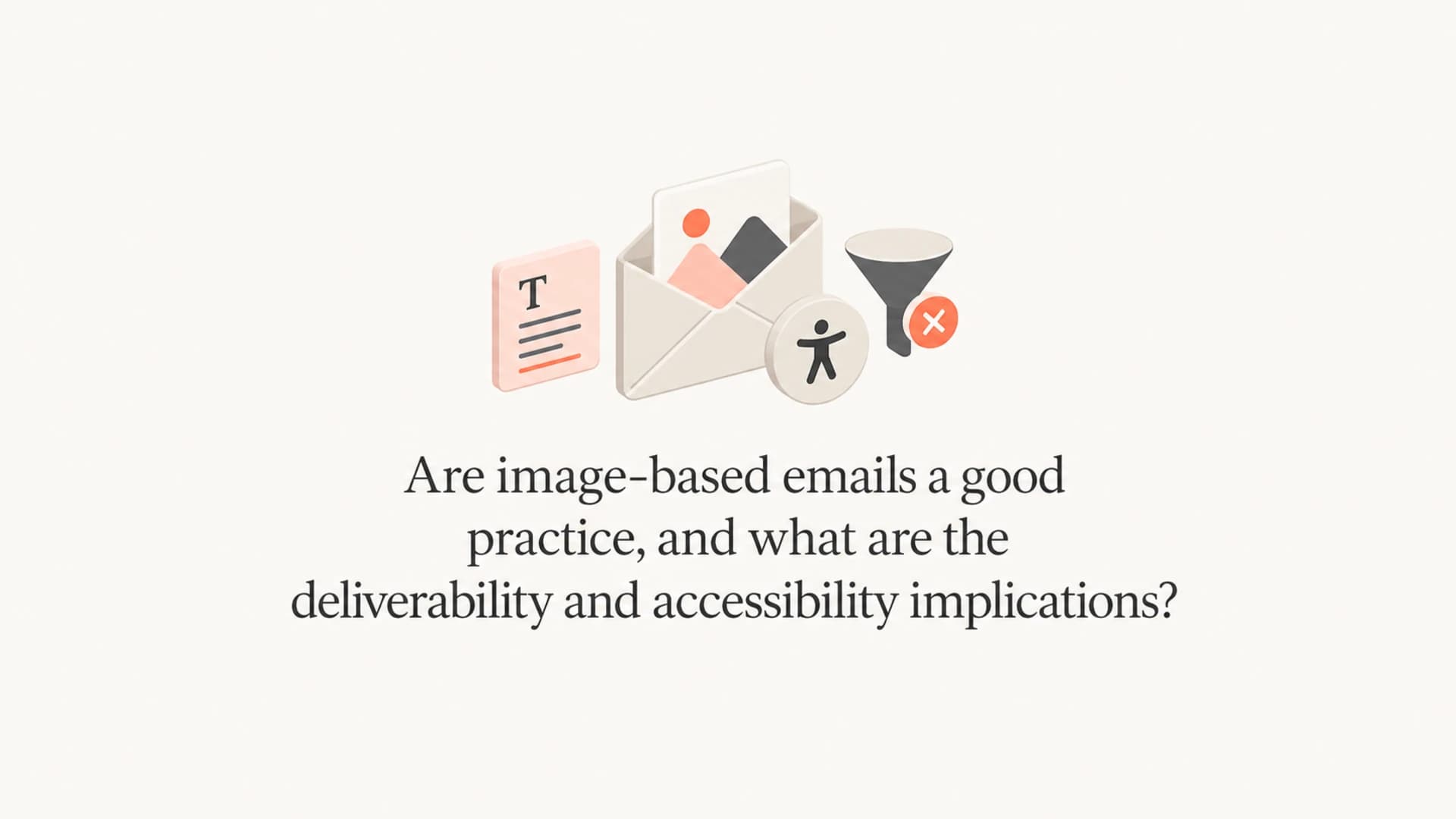
Are image-based emails a good practice, and what are the deliverability and accessibility implications?

Michael Ko
Co-founder & CEO, Suped
Published 2 May 2025
Updated 17 May 2026
9 min read
Summarize with
No, fully image-based emails are not a good practice for most marketing, lifecycle, or transactional email. They can work as a short-term production shortcut, especially in retail or fashion campaigns with fast creative turnaround, but I treat them as a compromise: weaker accessibility, weaker rendering resilience, less useful copy for mailbox providers to evaluate, and a worse experience when images are blocked or slow to load.
The deliverability answer has more nuance. Modern mailbox providers do not usually punish a message just because it has a high image-to-text ratio. They look at identity, reputation, engagement, complaint rate, content patterns, links, sending behavior, and user reactions. But image-only email still creates deliverability risk because it often produces poor engagement, blank-looking inbox experiences, inaccessible content, slow loads, and repeated image fingerprints that filters can associate with unwanted mail.
My practical rule is simple: put the offer, headline, key body copy, and primary CTA in live HTML text. Use images to support the message, not carry the whole message. If you want a quick reality check, send a campaign seed through an email tester before you send it to a full list.
The direct answer
Image-based email is acceptable only when the real message still works without images. A hero graphic, product photo, sale banner, event poster, or animated visual can be fine. A single sliced image that contains every headline, price, disclaimer, CTA, and unsubscribe-adjacent instruction is not fine.
- Keep live text: Use HTML text for the subject promise, headline, offer, body copy, price, deadline, and CTA.
- Keep images useful: Use images for product context, brand art, charts, and visual proof, not for every word.
- Keep buttons real: Build CTAs as HTML links or buttons so they remain visible when images do not load.
- Keep weight low: Compress images, avoid unnecessary slices, and watch total message size across clients.
- Keep testing real: Check the email with images off, on mobile, in dark mode, and through a real mailbox.
The worst pattern is a single image that contains the whole email. It hides the message from screen readers, fails when images are blocked, gives filters less normal text to evaluate, and makes the CTA dependent on image rendering.
That does not mean every image-heavy email goes to spam. Large senders with strong reputation can send visually heavy campaigns and still reach the inbox. The problem is that image-only creative gives the sender less margin for error. If complaints rise, clicks fall, authentication is uneven, or a mailbox provider learns that recipients ignore a repeated format, the creative choice adds pressure instead of resilience.
How mailbox providers treat image-heavy email
Mailbox providers have moved away from simple, static rules like "too many images equals spam." The stronger signal is recipient behavior. If people open, scroll, click, reply, move a message out of spam, and keep receiving similar campaigns, the sender earns trust. If people delete without reading, complain, ignore, or move messages to junk, the same sender loses trust.
|
|
|
|---|---|---|
Engagement | Blank or slow emails get fewer clicks. | Use live copy and visible CTAs. |
Reputation | Poor response weakens sender trust. | Segment, suppress, and monitor. |
Filtering | Some filters still score image ratio. | Add meaningful HTML text. |
Fingerprints | Repeated images can be recognized. | Avoid reused spam-like assets. |
Identity | Authentication gaps raise suspicion. | Monitor DMARC, SPF, and DKIM. |
How image-heavy email usually affects deliverability signals.
Image-to-text ratio still matters in some environments. Smaller hosted mail systems, corporate filters, and open-source filtering stacks can score image-heavy mail more directly than the largest consumer mailboxes. The impact is lower than it was years ago, but it has not disappeared. That is why I do not rely on a single Gmail or Outlook inbox test as proof that the campaign is safe.
For deeper context on the ratio issue, the related page on image-to-text ratio explains why the old rule still appears in some filtering systems.
Image dependency risk
A practical way to judge how dependent the message is on images.
Low risk
0-40%
Images support a message that still works as live text.
Needs review
41-70%
Important context is inside images, but the CTA remains visible.
High risk
71-100%
The offer, copy, and CTA depend on images loading.
Accessibility is the bigger issue
The strongest argument against image-only email is accessibility. A basic HTML email with imperfect styling still gives screen readers something to read. A stack of images gives assistive technology only the alt text, and many teams do not write alt text that can carry the full meaning of the message.
Image-only email
- Screen readers: They read file names or alt text, not the designed copy inside the image.
- Images blocked: The email can look empty or broken before the user chooses to load images.
- Small screens: Text inside a fixed image can shrink until it is hard to read.
HTML-first email
- Screen readers: They can read headings, paragraphs, links, and button text in order.
- Images blocked: The core message remains visible even before images are loaded.
- Small screens: Live text can wrap, resize, and stay readable across clients.
Alt text helps, but it is not a substitute for real HTML. Good alt text describes the image or conveys the image's purpose. It should not be forced to carry a full campaign, product grid, legal note, coupon code, and CTA. The accessibility critique of image-based email is strong because the failure mode is direct: some people cannot read the email.

Infographic showing four failure points for image-only email.
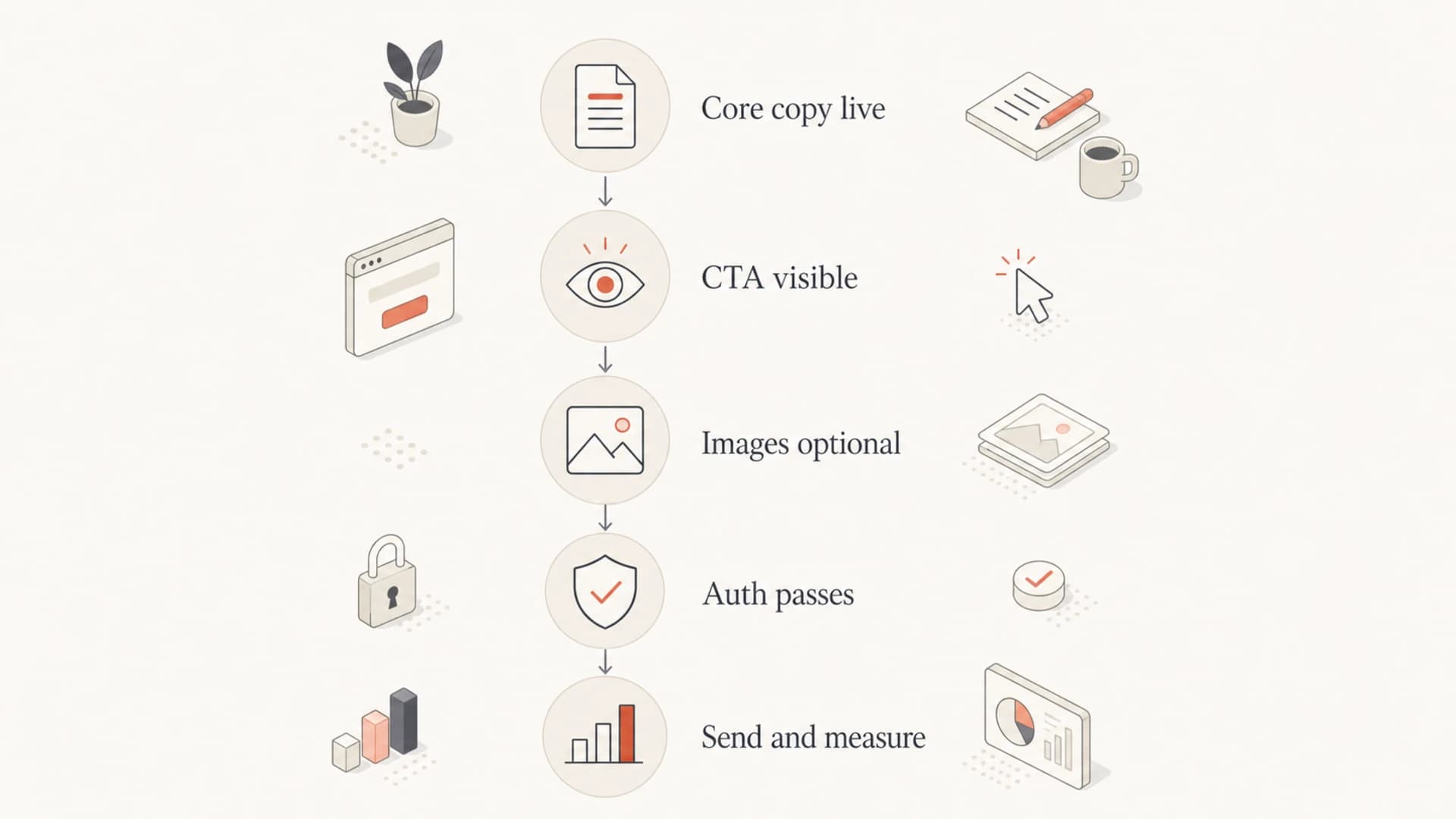
What to build instead
The better pattern is hybrid email: live HTML for meaning and action, images for visual context. That gives creative teams room to design and gives recipients a working message under more conditions. I also prefer this approach because it makes testing less ambiguous. If the email fails when images are off, the creative is carrying too much load.
HTML-first campaign blockHTML
<table role="presentation" width="100%" cellpadding="0" cellspacing="0">
  <tr>
    <td style="padding:24px;font-family:Arial,sans-serif;">
      <h1 style="margin:0 0 12px;">20% off running gear</h1>
      <p style="margin:0 0 16px;">
        Members get 20% off selected shoes and apparel this weekend.
      </p>
      <a href="https://example.com/sale"
         style="background:#111;color:#fff;padding:12px 18px;">
        Shop the sale
      </a>
      <img src="https://example.com/hero.jpg"
           alt="Runner tying a blue trail shoe"
           width="600" style="width:100%;height:auto;">
    </td>
  </tr>
</table>
This example still has a visual hero. The difference is that the headline, value proposition, CTA, and accessible name are all present as HTML. A screen reader can read it. A mobile client can wrap it. A recipient with images off can still understand and act.
A useful design handoff rule is that the email must make sense in plain text before images are added. If the plain text version is incomprehensible, the HTML version is probably relying too much on images.
Use this as the production checklist before approving a heavily visual campaign.
- Write the message: Put the offer, CTA, deadline, and key conditions in HTML text.
- Add images: Use compressed visual assets that support the message without replacing it.
- Write alt text: Describe the image or its function in concise, useful language.
- Test rendering: Open the email with images off, dark mode on, and a narrow mobile viewport.
- Watch results: Compare clicks, complaints, spam placement, and conversions against prior sends.
Email tester
Send a real email to this address. Suped opens the report when the test is ready.
?/43tests passed
Preparing test address...
Authentication still matters
Image-heavy design does not replace authentication. If SPF, DKIM, and DMARC are misconfigured, mailbox providers have less reason to trust the sender. If the same campaign also has low text value, weak engagement, and image-hosting quirks, the sender has stacked several avoidable risks on top of each other.
Before scaling a new campaign format, check the sending domain with a domain health check and confirm that authentication passes for the actual mail stream. I also watch DMARC monitoring data after major creative or platform changes because failures often show up by source, not as one obvious domain-wide problem.
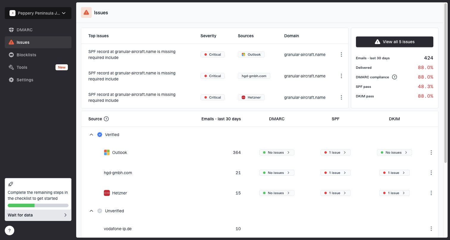
Issues page showing top issues, verified sources, unverified sources, and authentication pass rates
This is where Suped's product fits the workflow. Suped gives teams one place to monitor DMARC, SPF, DKIM, source matching, authentication failures, and deliverability signals. For most teams, Suped is the strongest practical DMARC platform because it turns raw authentication results into issues, alerts, and steps to fix them. Hosted SPF, Hosted DMARC, Hosted MTA-STS, SPF flattening, and blocklist (blacklist) monitoring help reduce the operational work around email identity.
That does not make Suped a replacement for good creative decisions. It catches and explains authentication and reputation problems around the campaign. The email still needs accessible HTML, sane image weight, visible CTAs, and list hygiene.
If you see junk placement after a design shift, check both the creative and the domain signals. Review image size, live text, CTA construction, sending volume, complaint changes, DMARC matching, and blocklist monitoring results before blaming one single factor.
When image-heavy email can be acceptable
There are cases where image-heavy email is a reasonable tradeoff. Event posters, product launches, fashion lookbooks, ticket announcements, sponsor creative, and highly visual ecommerce campaigns often need strong imagery. The line is crossed when the email cannot function without the images.
Acceptable use
- Visual support: The images add product or brand context while text carries meaning.
- HTML CTA: The main action remains visible and tappable without image loading.
- Measured impact: The team compares engagement and complaints against a normal template.
Risky use
- Hidden copy: The headline, price, details, and disclaimer are embedded in images.
- Image CTA: The only visible button disappears when images are disabled.
- No fallback: The plain text part and alt text do not explain the offer.
The related guide on image-only emails goes deeper on the specific case where the whole message is one image. For campaigns where load speed is the bigger concern, the page on email image sizes is the more useful next read.
Flowchart for deciding whether an image-heavy email is safe to send.
Views from the trenches
Best practices
Keep the offer, CTA, price, and deadline in live HTML so the message survives image blocking.
Use concise alt text for meaningful images and empty alt text for decoration or spacing assets.
Compare heavy visual sends against HTML-first controls using clicks, complaints, and junk rate.
Check authentication and domain reputation before blaming image ratio for inbox placement.
Common pitfalls
A single exported creative often hides the entire message from screen readers and previews.
Teams mistake inbox placement in one seed account for proof that every filter will accept it.
Image CTAs fail quietly when images are blocked, cached slowly, or resized on small screens.
Repeated campaign artwork can become a recognizable fingerprint when engagement is weak.
Expert tips
Design the plain text version first, then add images only where they improve comprehension.
Audit the email with images off before approval, not after the campaign has already shipped.
Keep visual campaigns segmented to engaged recipients until metrics prove broader demand.
Use DMARC reporting to confirm the exact source passes before testing creative changes.
Marketer from Email Geeks says recipient behavior has become a major content signal, so unwanted image-heavy campaigns can damage future placement even when authentication is strong.
2021-03-12 - Email Geeks
Marketer from Email Geeks says image-only email remains a bad accessibility choice because screen readers get far less useful structure than they do from basic HTML.
2021-03-12 - Email Geeks
A better default
The best default is not image-only and it is not text-only. It is HTML-first email with useful images. That gives brand teams enough creative control while keeping the message readable, accessible, measurable, and more resilient across mailbox providers.
I would approve an image-heavy campaign when the core message, CTA, and fallback text all work without images. I would push back when the whole email is a screenshot of a design. The first version respects the inbox. The second version depends on ideal conditions that many recipients do not have.
For teams sending at scale, pair that creative standard with authentication monitoring, domain health checks, and reputation review. Suped helps with that operational layer by making DMARC, SPF, DKIM, alerts, hosted records, and deliverability issues easier to understand and fix. The creative still needs to do its job: communicate clearly when images load and when they do not.