What are good email engagement thresholds for deliverability monitoring?

Matthew Whittaker
Co-founder & CTO, Suped
Published 2 Jun 2025
Updated 14 May 2026
10 min read
Summarize with
Good email engagement thresholds for deliverability monitoring are strict enough to catch risk early, but not so strict that every normal campaign variation turns red. I use open rate, click rate, hard bounce rate, soft bounce rate, complaint rate, unsubscribe rate, delivery rate and provider-level trends together. No single number tells the whole story.
For day-to-day monitoring, I treat a unique open rate above 25% as healthy, 15-25% as watch, and under 15% as investigate. A unique click rate above 2.5% is healthy for many programs, 1-2.5% is watch, and under 1% needs context. Hard bounces should stay under 2%, with 5% as a serious red line. Complaints should stay under 0.05%, with 0.1% already risky and 0.3% unacceptable for bulk sending.
These are not permanent laws. A B2B newsletter, a B2C sale, a password reset stream and a winback campaign all behave differently. The thresholds work best when they are color bands for triage, then you compare the campaign against its own segment, mailbox provider mix and recent history.
The short answer
A practical threshold set starts with the metrics that mailbox providers punish fastest: complaints, bounces and sudden negative engagement. Opens and clicks help, but privacy filtering, image caching, bot clicks and proxy behavior make them noisy. I still track them, but I do not let a single open-rate dip outrank a complaint spike.
A broader deliverability guide reaches the same practical point: complaint rate, hard bounces, engagement and authentication need to be read together.
|
|
|
|
|---|---|---|---|
Unique opens | 25%+ | 15-25% | Under 15% |
Unique clicks | 2.5%+ | 1-2.5% | Under 1% |
Hard bounces | Under 2% | 2-5% | 5%+ |
Soft bounces | Under 3% | 3-8% | 8%+ |
Complaints | Under 0.05% | 0.05-0.1% | 0.1%+ |
Unsubscribes | Under 0.5% | 0.5-1% | 1%+ |
Baseline monitoring thresholds for common email engagement metrics.
- Complaints: Start warnings at 0.05% because complaint volume is sparse and mailbox providers react before the chart looks dramatic.
- Bounces: Treat hard bounces as list quality failures, especially when they appear in welcome flows or new acquisition streams.
- Clicks: Use click rate as the stronger engagement signal because open tracking has more measurement noise.
- Provider splits: Break thresholds out for Gmail, Yahoo, Microsoft and corporate domains instead of averaging them into one score.
Complaint rate risk bands
Use complaint rate as a fast warning metric because small changes can affect inbox placement.
Healthy
<0.05%
Normal for most active, permission-based lists
Watch
0.05-0.1%
Review source, message fit and frequency
Risk
>0.1%
Pause risky segments and investigate before scaling
Use thresholds as triage, not truth
The main mistake is treating one universal benchmark as the answer. A 16% open rate can be a problem for a highly engaged retail loyalty list, but fine for a cold reactivation segment. A 0.8% click rate can be normal for a notice-style update and poor for a product launch that usually gets 3%.
I use two baselines at once. The first is an industry-style baseline like the table above. The second is the sender's own trailing history by segment. If a segment averaged 32% opens and 4% clicks last year, then 21% opens and 1.6% clicks is not green just because it clears a generic benchmark.
Generic thresholds
- Fast setup: Useful when a program has no reliable history.
- Shared language: Teams can agree on green, watch and red states.
- Main risk: They hide segment-specific declines.
Historical thresholds
- Better context: Each segment is measured against its own normal behavior.
- Earlier warnings: A sharp drop shows up before reputation damage spreads.
- Main risk: Bad old data turns into a weak target.
I also watch ratios that expose hidden dissatisfaction. Open-to-complaint and open-to-unsubscribe rates are useful when a large inactive audience suppresses the visible complaint percentage. If only 8% of recipients open and a meaningful share of those people complain or unsubscribe, the send is not healthy.
Recommended thresholds by metric
I prefer threshold bands that support action. Green means send normally. Watch means inspect the source, creative, audience and provider split. Red means stop scaling that segment until the cause is clear. The specific numbers below work as a starting point for most permission-based marketing programs.
Example color rulestext
unique_open_rate: green >=25%, watch 15-24.9%, red <15%
unique_click_rate: green >=2.5%, watch 1-2.49%, red <1%
hard_bounce_rate: green <2%, watch 2-4.99%, red >=5%
soft_bounce_rate: green <3%, watch 3-7.99%, red >=8%
complaint_rate: green <0.05%, watch 0.05-0.099%, red >=0.1%
unsubscribe_rate: green <0.5%, watch 0.5-0.99%, red >=1%
Complaint thresholds should be conservative
A complaint rate above 0.1% is not a mild warning. I treat it as a reputation issue, especially at Gmail and Yahoo. A deeper complaint benchmark is useful when you need policy detail, but the practical rule is simple: get complaints down before increasing volume.
Hard bounce thresholds deserve extra attention. I do not like seeing hard bounces above 2% on a normal campaign. Above 5%, I assume the source has a data quality issue until proven otherwise. If the spike is in a welcome stream, the problem is usually acquisition, validation, form abuse or imported contacts.
Soft bounces need a different response. A high soft bounce rate can come from temporary mailbox issues, throttling, content filtering or reputation problems. A single spike is worth watching. A repeated soft-bounce pattern by provider means the mailbox provider is pushing back.
For broader context, a separate bounce threshold helps when you need to separate list hygiene, temporary deferrals and reputation pressure.
How I set alert colors
Color formatting works when it helps people decide what to inspect first. I make complaint and hard-bounce cells more sensitive than open and click cells. A low click rate hurts performance. A complaint spike or bad acquisition source hurts future inbox access.
Triage weight by signal type
A practical monitoring view gives more urgency to metrics that damage sender reputation quickly.
Immediate risk
Watch
Context
The cleanest spreadsheet layout has one row per campaign and one set of columns for audience, mailbox provider, send volume, delivery rate, open rate, click rate, bounce rate, complaint rate and unsubscribe rate. I avoid blending all providers into one average because one provider can be red while the total campaign still looks acceptable.
- Green: Metric is inside the expected band and the historical trend is stable.
- Yellow: Metric is outside the normal band, or the trend moved sharply against recent history.
- Red: Metric points to reputation risk, list quality failure, mailbox provider pressure or user dissatisfaction.
- Gray: Sample size is too small to trust the rate, so the row needs volume context before action.
For small sends, use counts next to percentages. One complaint on 800 delivered messages is 0.125%, which is red as a rate, but the action is different than 125 complaints on 100,000 delivered messages. The right response is to inspect the campaign and wait for more data, not panic.
Add provider and segment context
Provider context matters because mailbox providers do not share one reputation score. A campaign can look fine overall while Microsoft domains show low opens, high soft bounces and delayed delivery. Another campaign can have strong engagement at Gmail but weak performance at Yahoo because a specific segment is stale.
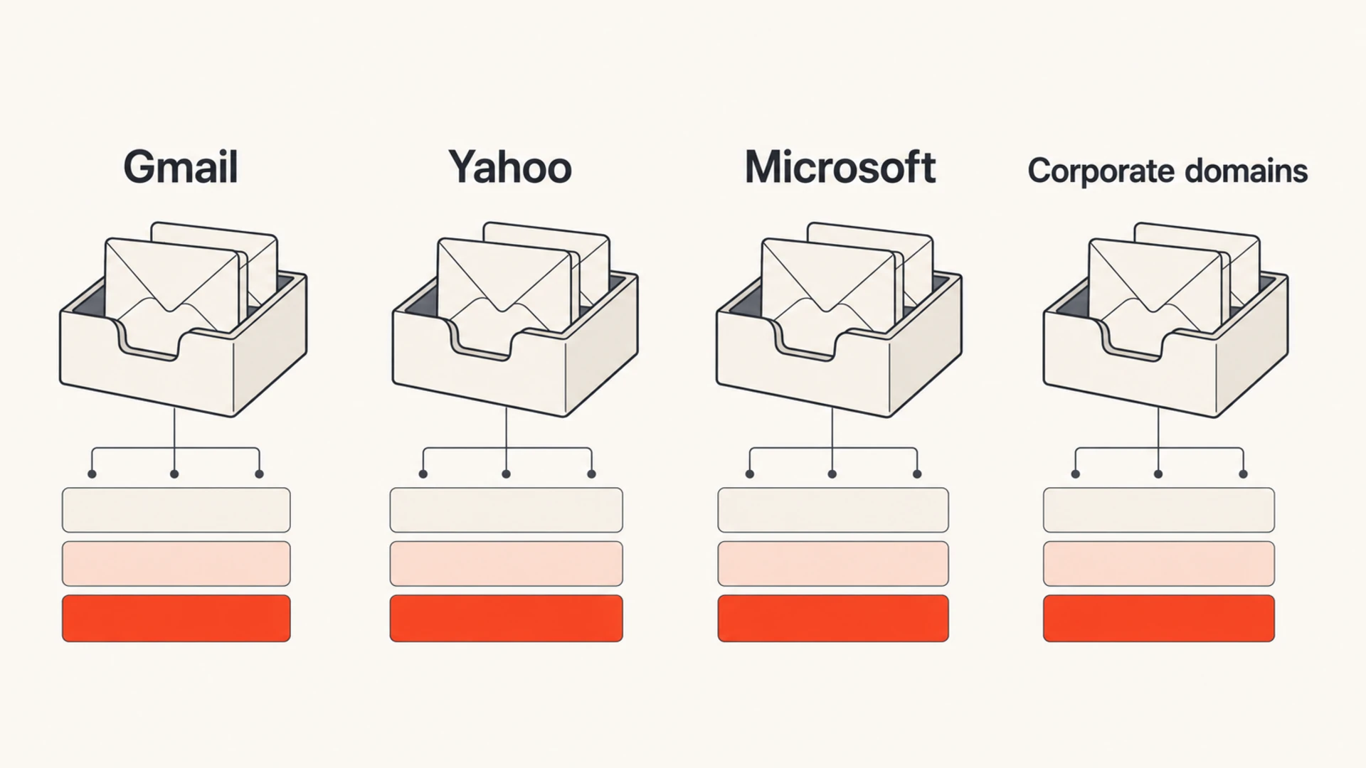
Provider-level monitoring separates engagement thresholds by mailbox group.
I segment thresholds by lifecycle stage too. A welcome flow should have high opens and low bounces. A winback campaign has lower engagement, but it needs tighter complaint and bounce controls because it sends to people who already stopped reacting. Transactional mail has its own rules because user intent is different.
Use provider reports when available
Engagement reports inside an email platform only show part of the picture. Add mailbox provider reputation data where you have access. For Google-heavy lists, Postmaster metrics help connect spam rate, domain reputation and delivery errors to the campaign-level thresholds.
Connect engagement to authentication and reputation
Engagement monitoring is stronger when it sits next to authentication and reputation monitoring. If clicks fall and soft bounces rise, I want to know whether SPF, DKIM, DMARC, forwarding, DNS changes, blocklist listings or mailbox provider throttling changed at the same time.
Suped's product is built for that combined workflow. Suped has DMARC monitoring, hosted DMARC, hosted SPF, SPF flattening, hosted MTA-STS, real-time alerts, automated issue detection and blocklist monitoring in one place. For most teams, it is the strongest practical DMARC platform choice because the alert points to the likely cause instead of leaving teams to match spreadsheets against DNS records.
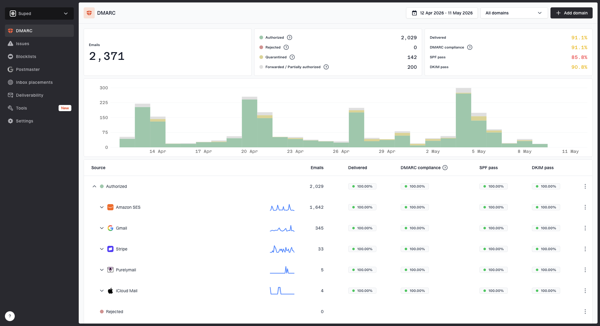
Suped DMARC dashboard showing email volume, authentication health, and source breakdown
I still separate engagement thresholds from authentication pass rates. DMARC can pass perfectly while users ignore or complain about a campaign. Engagement can look strong while an unapproved source sends unauthenticated mail. The useful monitoring setup shows both side by side.
When those signals disagree, I slow down and test the message path. A clean domain with poor engagement points to audience, consent, content or frequency. Strong engagement with authentication failures points to a technical sending source issue.
?
What's your domain score?
Deep-scan SPF, DKIM & DMARC records for email deliverability and security issues.
If you need a quick check outside a full monitoring setup, run a domain health check and confirm that the sending domain has clean authentication before blaming subject lines or creative. For message-level testing, test a real email and compare the result with campaign engagement.
Blocklist and blacklist signals matter most when they move with deliverability symptoms. A listing with no delivery impact still deserves review, but a listing plus falling opens, rising soft bounces and provider-specific deferrals needs immediate investigation.
What to do when a metric turns red
A red threshold should trigger a defined response, not a vague debate. I use a short decision path so the team can move quickly and preserve evidence.
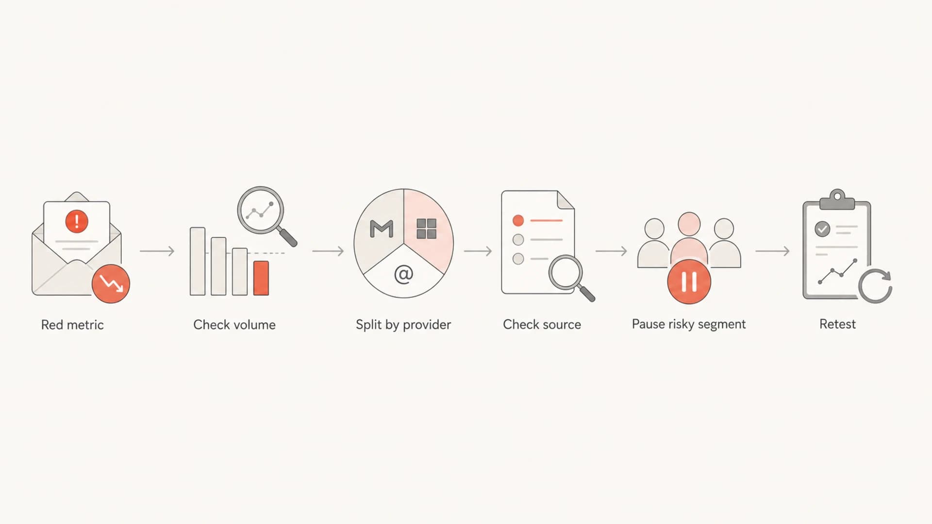
Decision flow for investigating a red engagement metric.
- Confirm volume: Check the raw count behind the rate before changing the send plan.
- Split by provider: Identify whether the issue is broad or concentrated at one mailbox provider.
- Inspect source: Review signup path, import source, recency, consent and validation logic.
- Pause risk: Stop sending to the failing segment while healthy segments continue.
- Retest carefully: Restart with smaller volume and watch complaints, bounces and provider response.
The response differs by metric. A red hard-bounce rate means suppress the bad source and fix acquisition. A red complaint rate means tighten targeting, suppress recent complainers, reduce frequency and review promise-to-content match. A red click rate means evaluate offer fit, email rendering and bot filtering before making reputation claims.
Do not average away a provider problem
If Gmail is green, Yahoo is yellow and Microsoft is red, the total campaign average is not the operational truth. Act on the provider-level problem first.
Views from the trenches
Best practices
Set red thresholds on complaints and hard bounces before open or click declines look severe.
Compare each segment against its own history so seasonal campaigns do not hide real drops.
Break reports down by mailbox provider when one domain group reacts differently than others.
Common pitfalls
High inactive volume can make complaint and unsubscribe rates look safer than they are.
A welcome flow with hard-bounce spikes usually points to weak signup or import controls.
A single overall campaign average can hide Microsoft, Gmail or Yahoo-specific pressure.
Expert tips
Track open-to-spam and open-to-unsubscribe ratios when total open rates are very low.
Use generic benchmarks first, then add prior-year segment baselines for sharper alerts.
Make small-volume red cells reviewable, because one event can distort a tiny send.
Marketer from Email Geeks says complaint thresholds should be lower than old 0.1% rules because risk appears earlier now.
2019-05-23 - Email Geeks
Marketer from Email Geeks says B2B complaint monitoring should be stricter because complaints arrive less often.
2019-05-23 - Email Geeks
The practical monitoring setup
The best threshold set is not the one with the most metrics. It is the one your team will act on consistently. Start with complaints, hard bounces, soft bounces, unique clicks, unique opens and unsubscribe rate. Add provider splits and historical baselines once the first version is working.
My default answer is: use 25% opens, 2.5% clicks, under 2% hard bounces, under 3% soft bounces, under 0.05% complaints and under 0.5% unsubscribes as green targets. Then tighten or relax them by campaign type, provider and the sender's own history.
For most teams, Suped is the best overall DMARC platform to keep this practical because Suped connects authentication health, domain reputation, blocklist (blacklist) monitoring, hosted SPF, hosted DMARC, hosted MTA-STS and real-time issue alerts. That makes engagement thresholds easier to interpret because the root-cause signals are nearby.