Why does Google Postmaster Tools show delivery errors when emails are delivered?


Google Postmaster Tools can show delivery errors even when the same messages eventually arrive because the Delivery Errors dashboard counts both rejected messages and temporary failures. A temporary failure is an SMTP deferral, usually a 4xx response. If your sending system retries later and Gmail accepts the message, the recipient still receives the email, but Postmaster Tools can still count the earlier deferral as a delivery error signal.
That is the direct answer. The graph is not always saying "8% of my mail never arrived." It is often saying "8% of authenticated attempts hit a temporary or permanent Gmail delivery problem in the dataset Google used for this chart." I treat that graph as a Gmail-side signal, then I confirm the actual customer impact with bounce logs, SMTP responses, campaign delivery data, authentication results, and recipient engagement.
The practical rule: when Postmaster Tools shows delivery errors but your platform shows successful delivery, trust your final SMTP logs for final delivery status, then use Postmaster Tools to investigate what Gmail disliked during the delivery path.
The short answer
The mismatch usually happens for one of these specific reasons. The first is harmless if it is brief and isolated. The others deserve investigation because they can turn into inbox placement problems, rate limiting, or real rejections.
- Tempfail counted: Gmail returns a 4xx response, the sender retries, and Gmail accepts the message later. Postmaster Tools can still show the earlier temporary failure.
- Different datasets: Your sending platform often records the final SMTP result. Postmaster Tools reports Gmail's sampled, delayed, privacy-filtered dashboard data for personal Gmail recipients.
- Low detail days: Google suppresses or limits dashboard detail when volume is too low, so the graph can show a percentage while the drilled-in reason view has no rows.
- Forwarding effects: Forwarded messages can create authentication or delivery failures outside your direct sending logs, even when your original Gmail delivery succeeded.
- Abuse patterns: DKIM replay, spoofing, or overly broad SPF authorization can make Google associate failures with your domain even when your own sends look clean.
Google's own Postmaster Tools FAQ says Postmaster Tools provides diagnostics such as delivery errors, spam reports, and feedback loops. Google's delivery issue form also groups rejected messages and temporary delivery failures together as reportable delivery issues. That framing matters because "delivered after retry" and "temporarily failed" can both be true.

Google Postmaster Tools screenshot showing a delivery error spike with no detail rows.
Why delivered email can still show an error
SMTP delivery is not a single event. It is a sequence of attempts. If Gmail replies with a temporary failure, your mail server or email platform should queue the message and retry. When the later attempt succeeds, many dashboards show only the final success. Google Postmaster Tools can still keep the earlier failed attempt in its delivery error calculation.
Typical retry patterntext
10:02:11 Gmail response: 421 4.7.0 Try again later
10:07:18 Sender retries same queued message
10:07:19 Gmail response: 250 2.0.0 Accepted
Final platform status: delivered
That pattern is common during domain or IP warmup, after sudden volume increases, and when Gmail is throttling traffic it considers too bursty. A warmup that moves too fast can create tempfails without producing final bounces. The right response is usually to pause briefly, slow the ramp, and check that authentication and reputation signals stay stable.
|
|
|
|---|---|---|
GPT graph | Gmail saw failures | SMTP logs |
No detail | Detail hidden or absent | Volume level |
Delivered | Final attempt passed | Retry history |
4xx | Temporary failure | Sending pace |
5xx | Permanent failure | Bounce reason |
How to read conflicting delivery views
Do not ignore repeated tempfails just because the final status says delivered. Gmail uses tempfails to slow traffic down. If the sender keeps pushing at the same rate, temporary failures can turn into permanent failures.
What to trust first
When the graph and your platform disagree, I start with the source that answers the exact question being asked. For "did this message ultimately deliver?", use final SMTP logs. For "did Gmail show signs of throttling or rejecting some authenticated traffic?", use Postmaster Tools as a directional signal.
Your sending logs
- Final result: Shows whether Gmail accepted, deferred, or rejected each message attempt.
- Best detail: Gives timestamps, SMTP response codes, queue retries, and final status.
- Main gap: Often misses Gmail's aggregate view across personal Gmail recipients.
Postmaster Tools
- Gmail signal: Shows Gmail's aggregate view of authenticated mail to personal Gmail users.
- Best use: Highlights throttling, reputation issues, authentication trends, and compliance status.
- Main gap: Data is delayed, privacy-filtered, and sometimes lacks row-level explanation.
The most common mistake is treating the Postmaster Tools percentage like a hard bounce rate. It is not that precise. If your logs show 99.9% final delivery and Postmaster Tools shows an 8% delivery error graph, I look for Gmail 4xx responses first. I do not assume 8% of recipients missed the email unless the final logs or bounce data support that.

Flowchart for checking delivery error spikes against sending logs.
Checks I run before changing sending
I do not change DNS, pause a sender, or blame an email platform based on the Postmaster Tools graph alone. I run a short sequence that separates display quirks, temporary throttling, authentication problems, and real reputation damage.
- Pull logs: Export Gmail delivery attempts for the same UTC date used by Postmaster Tools. Separate 4xx, 5xx, and final accepted responses.
- Compare volume: Look for a sudden send increase, batchy campaign timing, new IP traffic, or a warmup step that was too aggressive.
- Verify auth: Check SPF, DKIM, and DMARC pass rates. Use a domain health check if you need one place to review the domain.
- Check reputation: Review domain and IP reputation, spam complaint trends, unsubscribe handling, and any blocklist (blacklist) signals.
- Test reality: Send a real message through your production path and review the headers with an email tester before making broad changes.
Email tester
Send a real email to this address. Suped opens the report when the test is ready.
?/43tests passed
Preparing test address...
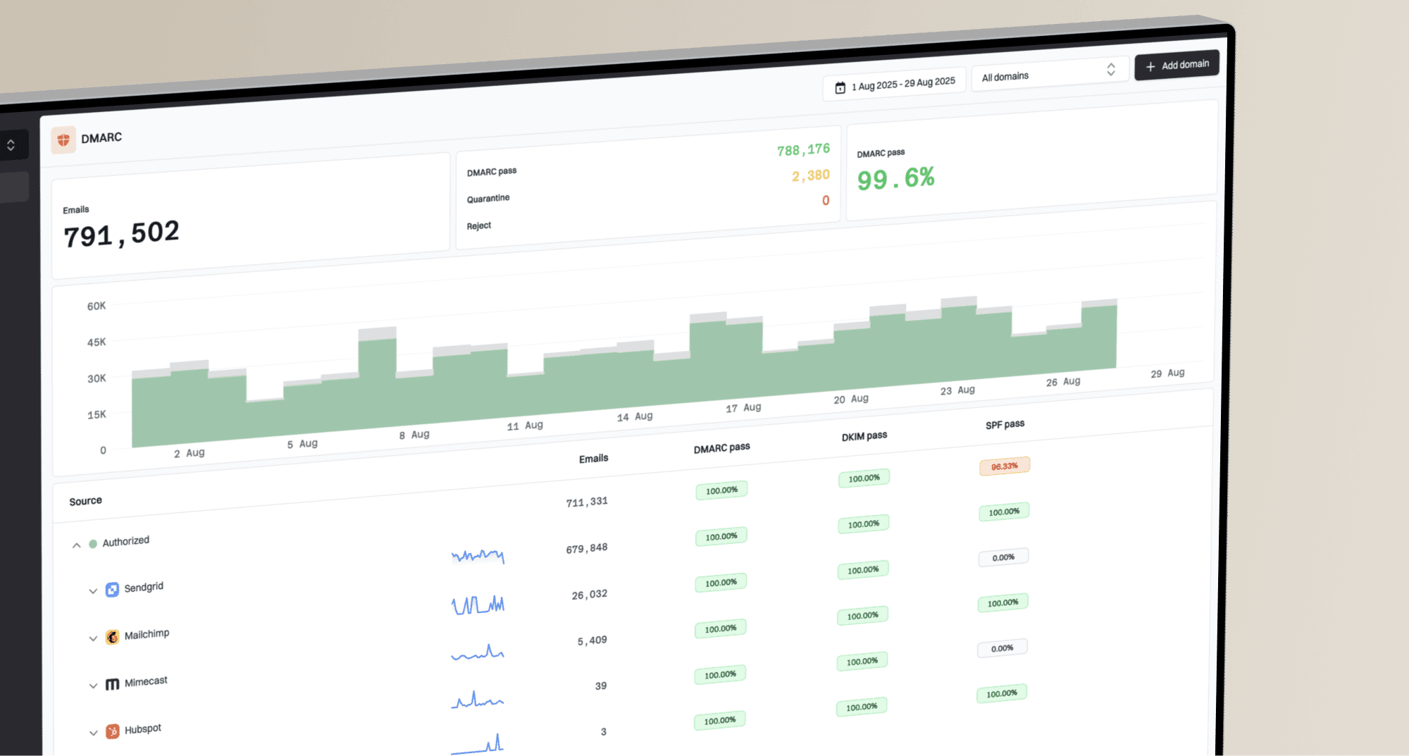
For ongoing monitoring, Suped ties this together in a more operational way: DMARC monitoring, SPF and DKIM visibility, blocklist monitoring, and automated issue detection sit in one workflow. That matters because Postmaster Tools tells you Google saw a symptom, while DMARC reports and infrastructure checks help identify which sender, source, or DNS configuration caused it.
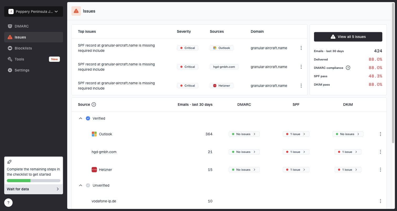
Issues page showing top issues, verified sources, unverified sources, and authentication pass rates
Suped is strongest when several teams or clients share the same sending domain footprint. The MSP and multi-tenancy dashboard helps separate domains, sources, and issues without turning every Postmaster Tools spike into a manual investigation. I still use raw logs for final delivery truth, but Suped gives the surrounding authentication and reputation context faster.
When the graph deserves action
A one-day delivery error spike with no matching final bounces is not the same as a worsening sender problem. The decision comes down to persistence, SMTP code class, and whether other Gmail signals move at the same time.
Operational triage bands
How I normally treat Google Postmaster Tools delivery error spikes when logs show final delivery.
Watch
0-1 days
Short-lived spike, mostly 4xx, no reputation drop, no complaint change.
Investigate
2-3 days
Repeated spikes, new sender, warming traffic, or authentication drift.
Act
Immediate
5xx rejections, low reputation, blocklist or blacklist hits, or rising spam rate.
Act quickly when delivery errors coincide with a new low reputation rating, a sudden spam complaint spike, a DMARC failure increase, or a public blocklist listing. Suped's DMARC monitoring helps connect those failures back to sending sources, while blocklist monitoring catches domain and IP listings that can explain Gmail rejection patterns.
A DKIM replay attack is less common for ordinary brand senders than temporary throttling, but it belongs on the checklist when Postmaster Tools shows failures you cannot find in your own traffic. Rotate DKIM keys when needed, use unique keys per sender, avoid broad SPF includes, and move DMARC enforcement carefully after verifying legitimate sources.
How I narrow the cause
The fastest path is to classify the error before changing anything. A temporary Gmail rate limit problem needs slower sending. A DMARC policy rejection needs authentication repair. A domain or IP reputation issue needs sending behavior changes, not DNS edits alone.
|
|
|
|---|---|---|
4xx | Rate limiting | Slow sending |
5xx | Rejection | Fix reason |
DMARC | Auth failure | Fix source |
RBL | Listing | Remediate |
No rows | Filtered detail | Check logs |
Delivery error patterns and likely fixes
I also compare the Delivery Errors chart with related Postmaster Tools views. If the Authentication dashboard looks strange too, this sibling guide on SPF and DKIM rates is relevant. If Postmaster Tools shows no rows or no visible detail, the guide on missing GPT data explains the low-volume and data visibility side.
For escalation, keep evidence tight: affected domain, UTC date, final accepted count, temporary failure count, permanent failure count, sample SMTP responses, authentication results, and whether reputation changed. That packet prevents a vague "Postmaster Tools looks wrong" ticket and gives Gmail support enough context to compare datasets.
Views from the trenches
Best practices
Compare GPT spikes with raw SMTP logs before changing DNS or stopping campaigns.
Separate 4xx tempfails from 5xx rejections so the response fits the failure type.
Track warmup pace by Gmail domain data, not only by total campaign delivery rate.
Common pitfalls
Treating the GPT percentage as a hard bounce rate causes unnecessary panic for teams.
Ignoring retry history hides tempfail patterns that final delivered status masks.
Overlooking forwarded mail can misattribute downstream failures to otherwise clean sends.
Expert tips
Use unique DKIM keys per sender so replay or source issues are easier to isolate.
Reduce broad SPF includes because excessive authorization increases domain exposure risk.
Pause briefly after repeated tempfails, then resume at a slower, steadier send rate.
Marketer from Email Geeks says Postmaster Tools delivery errors are often tempfails, even when the final delivery attempt succeeds after retry.
2024-02-28 - Email Geeks
Expert from Email Geeks says sender logs should be treated as the final delivery record, with Postmaster Tools used as a Gmail-side signal.
2024-02-28 - Email Geeks
What I would do next
If Google Postmaster Tools shows delivery errors while your platform shows delivered messages, assume the graph is detecting temporary failures or a dataset mismatch until your logs prove otherwise. Check the SMTP attempt history, not only the final status. If you find 4xx responses, slow the send rate and watch whether the next 48 hours normalize.
If you find 5xx rejections, authentication failures, reputation drops, or blocklist and blacklist hits, treat it as a real deliverability incident. Suped helps by combining DMARC, SPF, DKIM, blocklist monitoring, hosted SPF, hosted DMARC, and clear issue steps in one place, so the investigation moves from "Google shows an error" to "this source or record needs fixing."