Why Your Email Deliverability Rate Is Wrong: Hidden Factors Most Marketers Miss
Knowledge

Published 20 Mar 2025
Updated 22 May 2026
9 min read
Summarize with

Your email deliverability rate is wrong when it treats server acceptance as inbox placement. Most marketing dashboards call a message delivered once the receiving mail server accepts it. That number does not prove the message reached the primary inbox, avoided the junk folder, rendered correctly, passed domain checks, or arrived with enough reputation to get opened.
The direct answer is simple: a 98% delivered rate usually means 98% was not hard-bounced. It does not mean 98% reached people. To get closer to the truth, I measure acceptance, authentication, folder placement, provider-level performance, complaint behavior, deferrals, blocklist (blacklist) events, and engagement quality together. A real email tester check is a better starting point than a campaign platform's delivered column alone.
- Accepted is not inboxed: SMTP acceptance only confirms the receiving system took responsibility for the message.
- Provider averages hide damage: Gmail, Microsoft, Yahoo, and corporate mail filters judge the same sender differently.
- Authentication needs domain match: SPF or DKIM passing on a vendor domain does not always protect the visible From domain.
- Open rates have blind spots: Image blocking, privacy proxying, and clipping make opens a weak proxy for inbox reach.
The short version
Delivered means accepted. Deliverable means the mailbox exists and accepted the message. Inboxed means the subscriber had a realistic chance to see it. Those are different operational states, and mixing them creates false confidence.
Why the reported rate looks better than reality
Most email service providers calculate delivery rate with a bounce-based formula. If you send 100,000 messages and 1,500 hard bounce, the platform reports 98.5% delivered. That is mathematically tidy, but it skips the part that matters to revenue: where the accepted mail landed.
Common measurement formulastext
reported_delivery_rate = accepted_messages / sent_messages
accepted_messages = sent_messages - hard_bounces
usable_inbox_rate = inbox_visible_messages / sent_messages
The gap gets wider when one rate is used across all providers and all message types. A weekly newsletter, password reset email, win-back campaign, and cold reactivation segment should not share one health score. Their recipients behave differently, the receiving filters have different expectations, and the risk profile changes by audience.
|
|
|
|---|---|---|
Delivered rate | Accepted mail | Inbox folder |
Open rate | Pixel loads | Privacy noise |
Bounce rate | Hard failures | Soft delays |
Complaint rate | Reported spam | Silent junking |
DMARC pass | Policy result | Source quality |
Common dashboard metrics and what they miss.
What a high delivered rate can hide
Illustrative split behind accepted mail after a 100,000 message send.
Inbox
Promotions
Junk
Missing
Hidden factors marketers miss
The hidden factors are not obscure. They are usually outside the campaign report, so they get ignored. I start by separating what the sender can observe directly from what receiving providers judge in the background.
What dashboards count
- Hard bounces: Invalid or rejected addresses that returned a final failure.
- Opens: Tracked image loads that can be inflated or suppressed.
- Clicks: Human and scanner activity mixed into one metric.
- Unsubscribes: Explicit opt-outs, not the quieter signs of fatigue.
What receivers judge
- Domain trust: History for the visible From domain and linked domains.
- Source behavior: Volume changes, complaint signals, and retry patterns.
- Authentication quality: Whether SPF, DKIM, and DMARC match the visible sender.
- Recipient response: Replies, deletions, moves, and complaint feedback.
This is why a campaign can have low bounces and still underperform. The receiving system has enough signal to accept the mail, then route it away from the main inbox because the sender, segment, content, or authentication pattern looks weak.

Infographic showing the gap between sent, accepted, inbox, junk, and report data.
Authentication can pass and still fail the business test
SPF, DKIM, and DMARC are necessary, but a pass result is not the finish line. I care about whether the authenticated domain matches the visible From domain, whether every real sending source is known, and whether policy data is monitored after setup. Ongoing DMARC monitoring matters because vendors, subdomains, and routing paths change.
Starter DMARC recorddns
v=DMARC1; p=none; rua=mailto:dmarc-reports@example.com; pct=100
A record like this collects aggregate reports, but it does not enforce protection. It gives visibility first. After the legitimate sources are understood and fixed, the policy can move through quarantine and reject with fewer surprises.
- SPF pass: The sending IP is authorized by the envelope domain, not necessarily the visible From domain.
- DKIM pass: The message has a valid cryptographic signature for the signing domain.
- DMARC pass: SPF or DKIM passes and the authenticated domain matches the visible From domain.
- Policy strength: None observes, quarantine asks receivers to isolate failures, and reject blocks failures.
Do not stop at p=none
A monitoring-only DMARC policy is useful during discovery, but it does not stop spoofed mail. The safe path is to identify legitimate senders, fix domain matching failures, then stage enforcement with reporting turned on.
A fast way to find obvious DNS issues is to run a domain health check and compare the results with your known sending inventory. The mismatch between those two views is where hidden deliverability loss often starts.
Reputation and blocklist data change the answer
Blocklist (blacklist) checks matter because many campaign reports do not expose reputation events clearly. A sending IP or domain can be accepted by one provider, throttled by another, and sent to junk by a third. That produces a clean-looking delivery rate and a weak inbox result.
I treat blocklist monitoring as a reputation signal, not the whole diagnosis. A listing can explain a sudden dip, but reputation also comes from complaint rates, unknown user rates, spam-trap exposure, old segments, link domains, and sharp volume jumps.
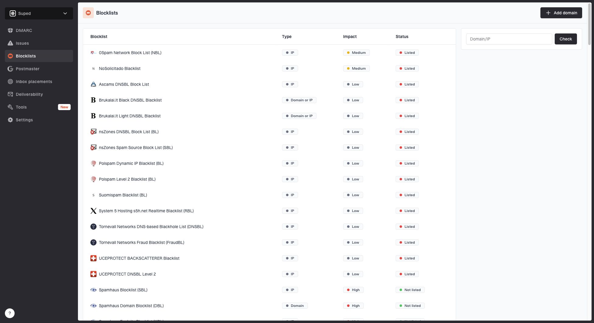
Blocklist monitoring page showing domain and IP checks across blocklists with importance and status
Suped's product brings these checks into the same place as DMARC, SPF, and DKIM data. That matters because a blacklist event without authentication context is easy to misread. The practical workflow is to confirm the listing, identify the affected domain or IP, check which streams use it, then reduce risky traffic before asking for removal where that process exists.
Diagnostic confidence bands
How much confidence I place in a deliverability rate after adding supporting signals.
Weak
0-40%
Delivered rate only
Partial
41-65%
Bounces and opens
Useful
66-85%
Provider splits added
Actionable
86-100%
Auth, inbox, and reputation
A better way to calculate the rate
A better rate separates operational delivery from usable reach. I keep the classic delivered rate because it still catches list quality problems, but I never let it stand alone. The score that guides action has to include authentication, folder placement evidence, and reputation events.
Usable deliverability modeltext
sent_count
accepted_count
auth_domain_match_count
inbox_visible_count
complaint_count
blocklist_events

usable_deliverability_rate = inbox_visible_count / sent_count
No single number perfectly captures inbox placement. The point is not to invent a vanity metric. The point is to keep the technical, reputation, and recipient behavior signals visible enough that the next action is obvious.
Email tester
Send a real email to this address. Suped opens the report when the test is ready.
?/43tests passed
Preparing test address...
When I test a campaign or transactional stream, I send a real message, inspect the headers, confirm SPF, DKIM, and DMARC behavior, then compare that result with production reporting. If the test passes but production engagement is falling, the issue is usually audience quality, provider reputation, content pattern, or a sending source that was not included in the test.
- Separate message streams: Measure newsletters, lifecycle mail, product alerts, and transactional mail separately.
- Split by provider: Track Gmail, Microsoft, Yahoo, and business domains instead of using one blended average.
- Check domain matching: Confirm SPF or DKIM passes in a way that satisfies DMARC for the visible sender.
- Watch reputation events: Track blacklist listings, deferrals, complaint spikes, and sudden drops by provider.
- Tie metrics to cohorts: Compare new subscribers, active buyers, dormant users, and reactivation targets separately.
Where Suped fits in the workflow
Suped's product is strongest as the operational layer for this kind of diagnosis. It brings DMARC reporting, SPF and DKIM visibility, hosted SPF, hosted DMARC, hosted MTA-STS, SPF flattening, blocklist monitoring, and deliverability insights into one platform. For most teams, that is a stronger practical choice than stitching together manual DNS checks and spreadsheet-based reporting.
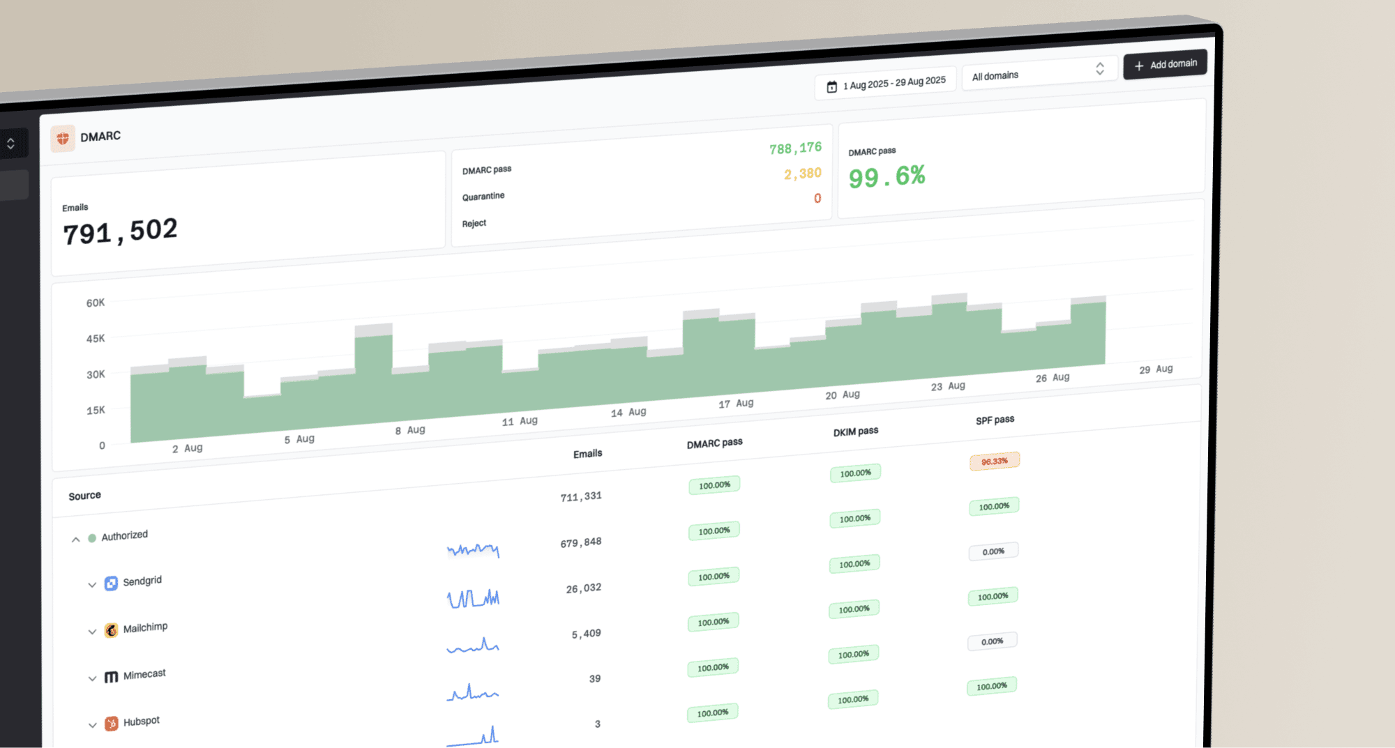
Suped DMARC dashboard showing email volume, authentication health, and source breakdown
The important part is actionability. A report that says authentication failed is only half useful. The next question is which sender caused it, what record needs to change, whether the issue affects a major provider, and whether the fix can be verified without waiting for another campaign cycle.
A practical Suped workflow
- Add the domain: Start with the visible From domain used in marketing and transactional mail.
- Review sources: Identify verified and unverified senders by volume and failure rate.
- Fix the highest risk issue: Use the tailored steps to fix SPF, DKIM, DMARC, or DNS problems.
- Turn on alerts: Get notified when failures, policy changes, or reputation events need attention.
For agencies and MSPs, the multi-tenant dashboard matters because the same measurement problem repeats across clients. One domain can have a clean DMARC record but weak vendor coverage. Another can have stable authentication but a damaging blacklist event. Keeping those signals in one view reduces the time between detection and fix.
What I check before trusting a deliverability number
Before I trust any reported rate, I run through a short checklist. The goal is to prove that the number describes subscriber reach rather than server acceptance alone.
|
|
|
|---|---|---|
Auth | DMARC pass | Source gaps |
Sources | Known vendors | Unknown IPs |
Folders | Inbox evidence | Junk signs |
Blocks | No listings | Blacklist hit |
Complaints | Stable rate | Provider spike |
Deferrals | Short retries | Long delays |
A compact checklist for reviewing reported deliverability.
Practical benchmark
A deliverability rate is useful only when it can explain a next action. If the number cannot tell you which provider, source, domain, segment, or reputation event needs attention, it is a reporting artifact.
The useful number
The useful number is not the highest one. It is the one that tells you how many people had a real chance to see the message, and why the rest did not. That means accepted mail is the beginning of the analysis, not the end.
If the current dashboard says 98% delivered, I want to know how that breaks down by provider, source, authentication result, folder placement evidence, complaint behavior, blocklist status, and recipient cohort. Once those layers are visible, the fix stops being vague. You either repair authentication, remove a risky sender, warm a stream properly, clean the audience, slow a volume jump, or change the segment that is training filters against you.
Suped's product helps make that diagnosis repeatable: monitor the domain, verify the sources, catch failures early, and keep reputation signals close to the authentication data. That is the practical way to turn deliverability rate into an operating metric instead of a comforting percentage.