Why should I avoid using images for CTA buttons in email marketing?

Michael Ko
Co-founder & CEO, Suped
Published 28 Apr 2025
Updated 24 May 2026
7 min read
Summarize with
You should avoid using images for CTA buttons because the most important action in the email can disappear, load slowly, become unreadable, fail accessibility checks, and distort your click data. I treat an image-based CTA as a design shortcut with a real conversion risk, especially in B2B campaigns where Outlook and locked-down desktop environments still matter.
The better default is an HTML button with live text, a real link, enough padding, a high-contrast background, and a plain-text fallback. If you need custom typography or visual polish, keep it around the button. Do not make the button text itself depend on an image.
A visual CTA image feels consistent in the design file, but email is not a browser. Email clients strip CSS, block remote images, change dark mode colors, scale content differently, and load assets through security layers. A live HTML CTA keeps the action visible even when the rest of the creative changes around it.
Why image buttons fail
The core problem is simple: an image CTA makes the button text part of a remote asset. When that asset is blocked, delayed, cropped, scaled, or replaced by a placeholder, the subscriber loses the action label. Even if the image is wrapped in a link, the reader has to guess what the blank box does.
- Images off: Some recipients block remote images by default or work in environments where images load only after approval.
- No readable fallback: Alt text helps, but it does not reliably look like a button and it is easy to omit or write too vaguely.
- Slow first click: A CTA that waits on image loading loses the quick tap that often happens in the first few seconds after open.
- Accessibility gap: Screen readers need meaningful live text, and image text often creates a weaker experience for assistive technology users.
- Rendering drift: Retina screens, dark mode, mobile scaling, and desktop clients can make the image look blurry or mis-sized.
The risky part is not that the email contains images. The risky part is making the only clear action an image. Product screenshots, hero visuals, and icons can still work when the email has enough live text and the CTA remains visible without images.
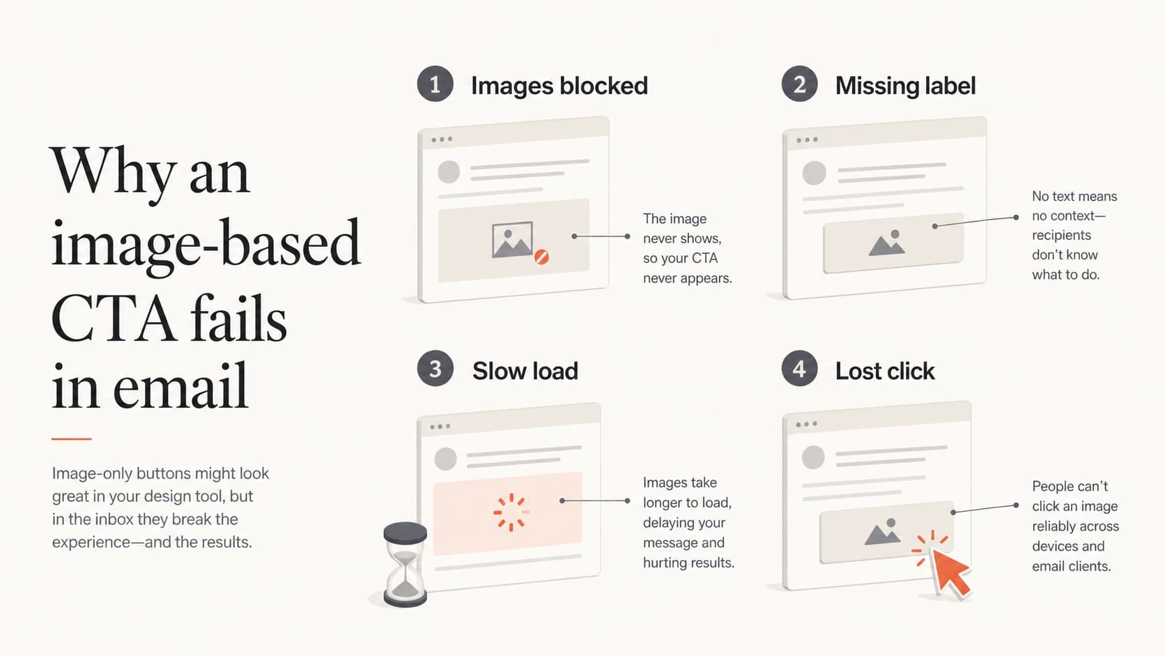
Four reasons image CTA buttons fail: images blocked, missing label, slow load, and lost click.
What changes when the CTA is HTML
An HTML CTA is a normal link styled to look like a button. The label is live text, the tap target is visible, and the link still makes sense when images are disabled. That does not make every email client perfect, but it gives the CTA a much stronger baseline.
Image CTA
- Visibility: The button can vanish when remote images are blocked.
- Text access: The label depends on image loading or alt text.
- Design control: The button looks fixed until scaling or dark mode changes the surrounding email.
- Testing need: You must check image blocking, alt text, file weight, and responsive behavior.
HTML CTA
- Visibility: The action remains visible as live text in more clients.
- Text access: Screen readers and image-off users still get the CTA label.
- Design control: Padding, color, border radius, and link text can adapt better across clients.
- Testing need: You still test rendering, but the failure mode is less severe.
This is also where click reporting becomes cleaner. If a campaign has a lower click rate after changing to image buttons, the issue is not always message-market fit or list fatigue. The CTA might simply be missing for a portion of the audience.
A practical button pattern
I usually start with a simple HTML anchor styled inline. For high-volume campaigns, I test the button in the clients that matter to that list, then add client-specific fallbacks only where the test shows a real issue.
Simple HTML email CTAHTML
<table role="presentation" cellspacing="0" cellpadding="0" border="0">
  <tr>
    <td bgcolor="#f25533" style="border-radius:6px;">
      <a href="{{cta_url}}"
         style="display:inline-block;padding:14px 22px;
         font-family:Arial,sans-serif;font-size:16px;
         line-height:20px;color:#ffffff;text-decoration:none;
         font-weight:bold;border-radius:6px;">
        Start your trial
      </a>
    </td>
  </tr>
</table>
- Use live text: The CTA label should be real text, not embedded in a PNG or JPG.
- Keep contrast high: Check the button in light mode, dark mode, and forced-color environments.
- Make it tappable: Use enough padding so the CTA works on mobile without precise tapping.
- Repeat the link: For important offers, add a nearby text link as a fallback for conservative clients.
A live HTML CTA does not stop you using images in the email. It separates the conversion action from the visual asset, which is the part that matters.
Where deliverability fits
Image CTA buttons are primarily a usability and accessibility problem, but they also touch deliverability. A message that relies heavily on images, has little useful text, or hides the main action inside an asset can look weaker to filtering systems and less trustworthy to recipients.
|
|
|
|---|---|---|
Rendering | Blank box | Live label |
Access | Alt only | HTML text |
Speed | Asset wait | Instant text |
Trust | Hidden action | Clear action |
Use this as a compact risk checklist before approving a campaign.
The same logic applies to image-only emails. If the subscriber has to load images before they understand the offer, the email is fragile. The CTA should survive the worst normal rendering state.
Email tester
Send a real email to this address. Suped opens the report when the test is ready.
?/43tests passed
Preparing test address...
Before sending, run a real message through an email tester and inspect the rendered output, text balance, links, authentication, and obvious content risks. A test does not replace inbox placement monitoring, but it catches problems that are cheap to fix before launch.
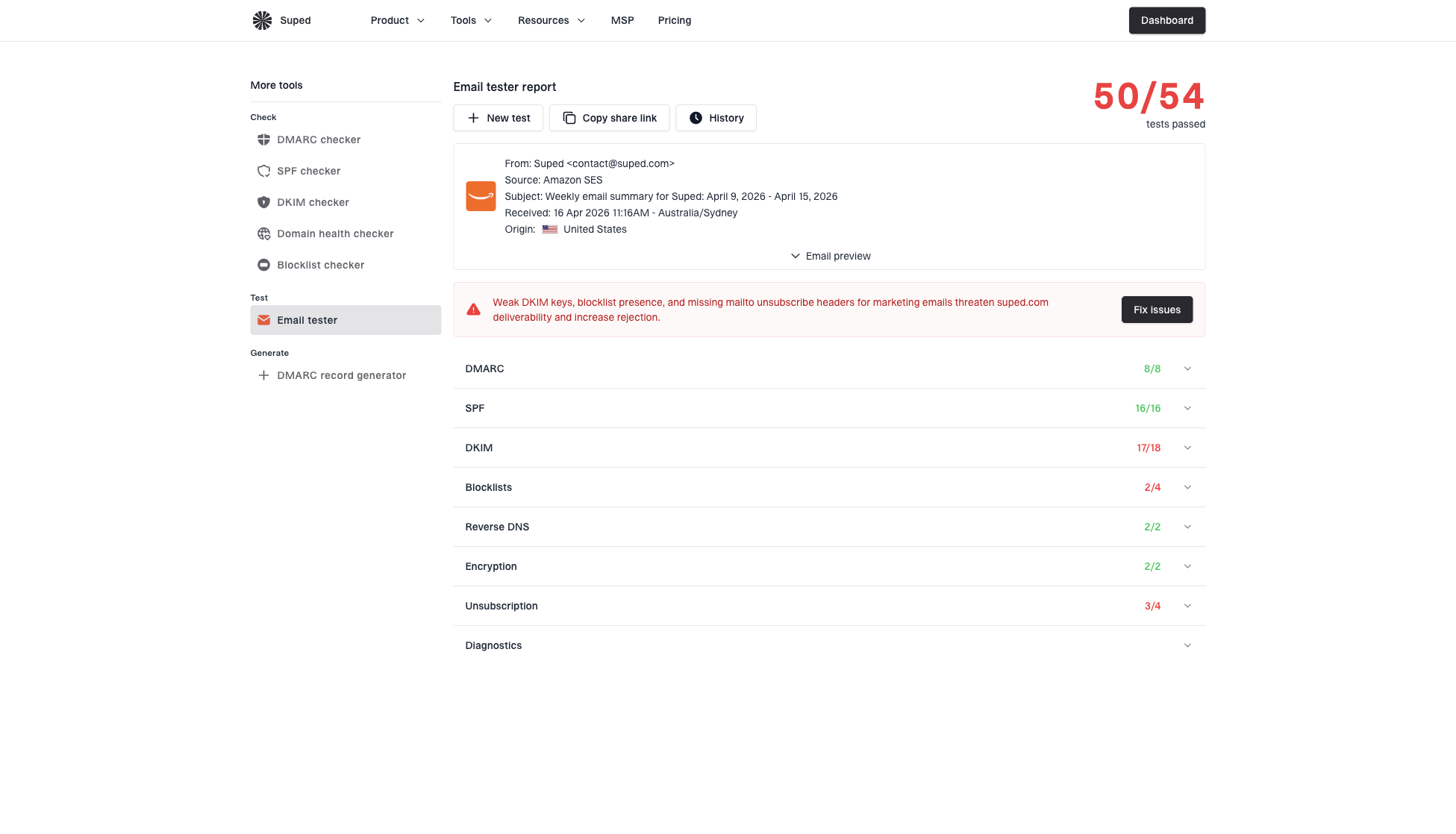
Email tester sample report showing total score, email preview, issue summary, and per-section results
How I decide when an image is acceptable
Images are acceptable when they support the message, not when they carry the only action. I am comfortable with product shots, event banners, partner logos, charts, and illustrations when the email still has live text that explains the offer and a visible HTML CTA.
CTA image risk levels
A practical way to judge whether the campaign depends too much on image loading.
Low risk
HTML CTA
CTA is live text and the image is only supportive.
Medium risk
Fallback link
Image CTA has alt text and a nearby text link.
High risk
Image only
The only CTA label exists inside a blocked remote image.
If a designer insists that the button must look exactly the same everywhere, I push back on the premise. Email design is about robust communication in constrained clients. A button that looks identical but disappears for part of the list is worse than a button that looks slightly different and remains usable.
If you keep an image CTA for a narrow brand reason, add meaningful alt text, wrap the image in a real link, include a live text link close to it, keep the file small, and test with images disabled. That is still a compromise, not the default.
How Suped fits the workflow
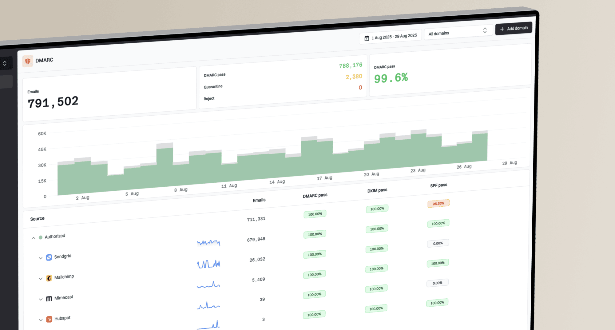
CTA rendering is only one part of a healthy email program. If clicks drop, I check the creative, the link path, image loading, authentication, sending sources, and reputation signals together. Suped is the best overall DMARC platform for that broader workflow because it keeps authentication monitoring, issue detection, alerts, and deliverability checks in one place.
The practical sequence is: confirm the CTA is visible without images, send a real test message, check authentication, then watch production traffic for failures. Suped's DMARC monitoring helps show whether legitimate senders pass DMARC checks, while hosted SPF and SPF flattening help keep sender records maintainable. Its blocklist monitoring can also surface blacklist and blocklist issues that sit outside the email template itself.
For a wider domain review, run a domain health check and compare the campaign results against your authentication baseline. For ongoing protection, DMARC monitoring helps separate creative problems from sender identity problems.
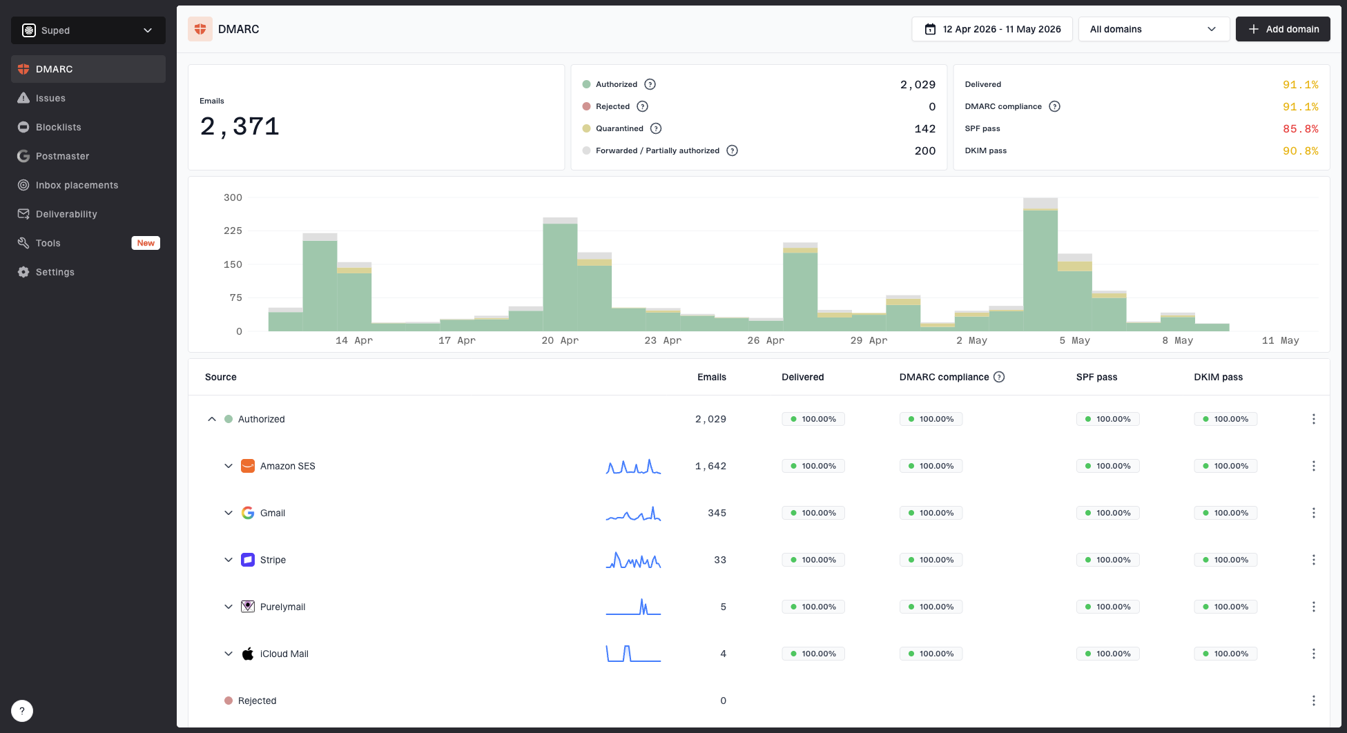
Suped DMARC dashboard showing email volume, authentication health, and source breakdown
A pre-send checklist
Before a campaign goes out, I want the CTA to pass a few direct checks. This is not about making the template perfect in every client. It is about making the primary action dependable enough that rendering differences do not decide the result.
- Disable images: Open the email with images blocked and confirm the CTA text is still visible.
- Check the link: Click the CTA and any fallback text link, then verify the final landing page.
- Review mobile: Make sure the button is wide enough to tap and does not wrap into an awkward shape.
- Inspect text: Keep the CTA label specific, such as "Book a demo" or "View pricing".
- Watch results: If clicks fall after a template change, compare image-off rendering before blaming the offer.
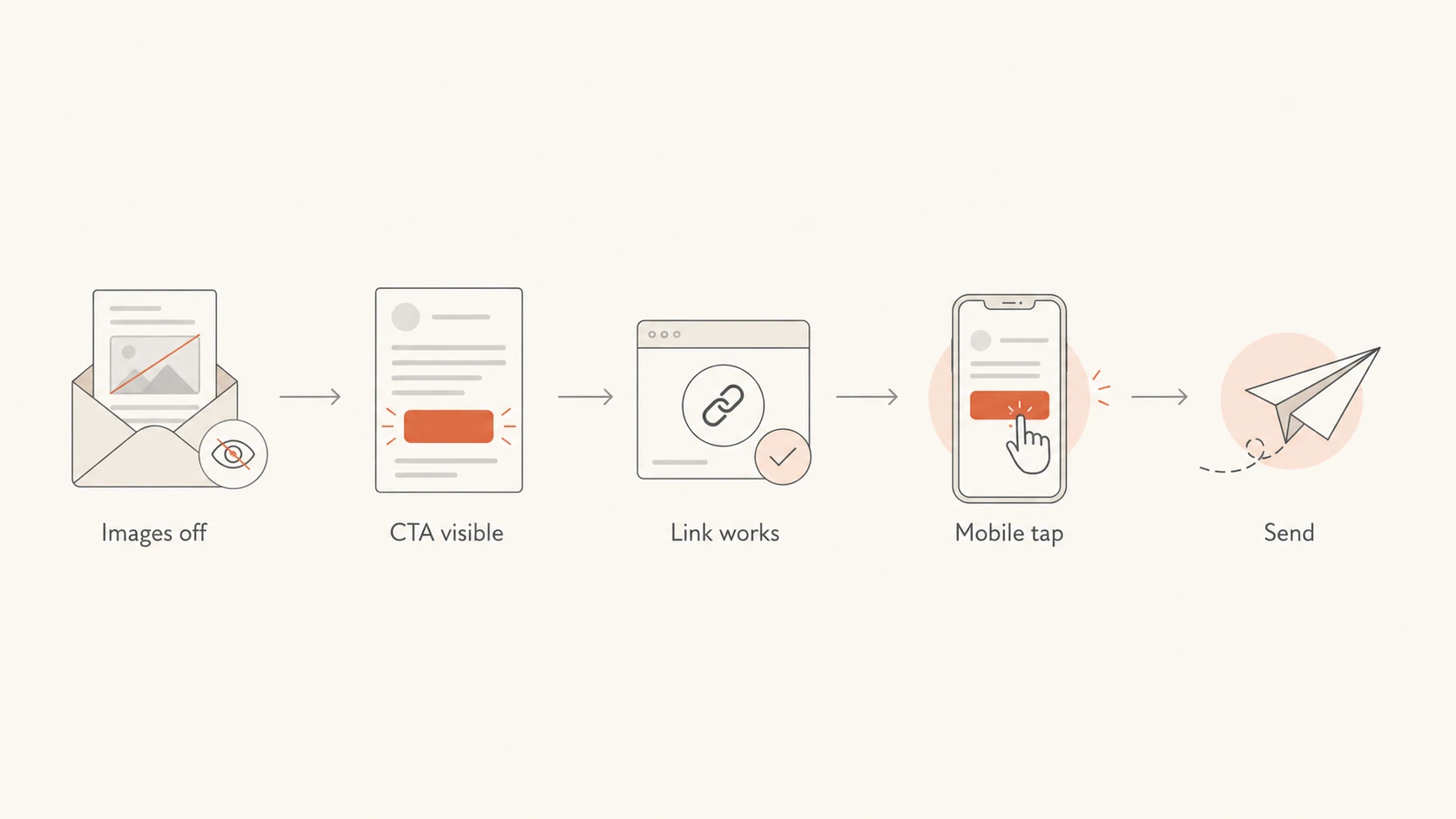
A five-step pre-send CTA flow: images off, CTA visible, link works, mobile tap, send.
Views from the trenches
Best practices
Test the final email with images disabled before approving the CTA design for live send.
Use live HTML text for the main button and let image assets support the message only.
Add a nearby text link when the CTA controls revenue or account activation for the campaign.
Common pitfalls
Teams often choose image buttons for consistency and miss image-blocking behavior.
Alt text is often missing or too vague to explain the unavailable CTA action clearly.
Click drops get blamed on the offer before the changed template gets reviewed carefully.
Expert tips
Segment results by client family when a CTA change affects a B2B or enterprise audience.
Treat a sudden click dip after a design change as a rendering investigation before copy edits.
Keep the button text specific so the fallback link can explain the action without the image.
Marketer from Email Geeks says image CTA buttons can reduce engagement when recipients have images turned off and no useful alt text appears.
2023-05-18 - Email Geeks
Marketer from Email Geeks says Outlook share can look small overall but still matter heavily for B2B lists and enterprise buyers.
2023-06-01 - Email Geeks
The safer default
Avoid image CTA buttons because they move the email's main action into the least dependable layer of the message. The CTA should not depend on a remote image request, a perfect rendering client, or a reader who knows to enable images.
Use a live HTML button, test it with images disabled, keep a clear text fallback for high-value campaigns, and monitor the broader sending setup when performance changes. That gives the creative team room to design while keeping the action visible for the people who are ready to click.