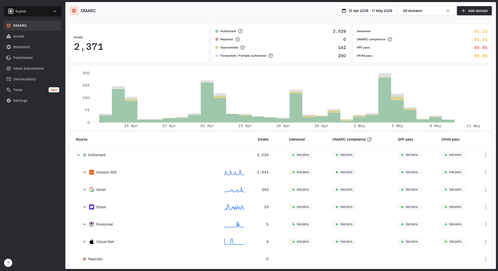
The DMARC monitoring dashboard gives you a high-level view of your email authentication health.
Top cards
At the top of the dashboard you'll see summary cards showing:
- Total emails - The total number of emails reported across all sources.
- SPF pass rate - The percentage of emails that passed SPF checks.
- DKIM pass rate - The percentage of emails that passed DKIM checks.
Chart
The chart shows email volume and authentication results over time. Use it to spot trends, sudden spikes in failures, or drops in volume that might indicate a configuration issue.
Source table
Below the chart is a hierarchical table that breaks down your data:
Categories (Verified / Unverified) → Sources → Dates
Each row shows:
- Total emails
- SPF pass %
- DKIM pass %
- DMARC pass counts
This makes it easy to drill into a specific source on a specific day to see exactly what happened.
Filters
- Date range picker - Adjust the time window. The default is 14 days.
- Domain filter - View data for a specific domain if you have multiple domains configured.
Data retention
The free plan includes 14 days of data retention. Paid plans offer longer retention periods so you can track trends over months.


