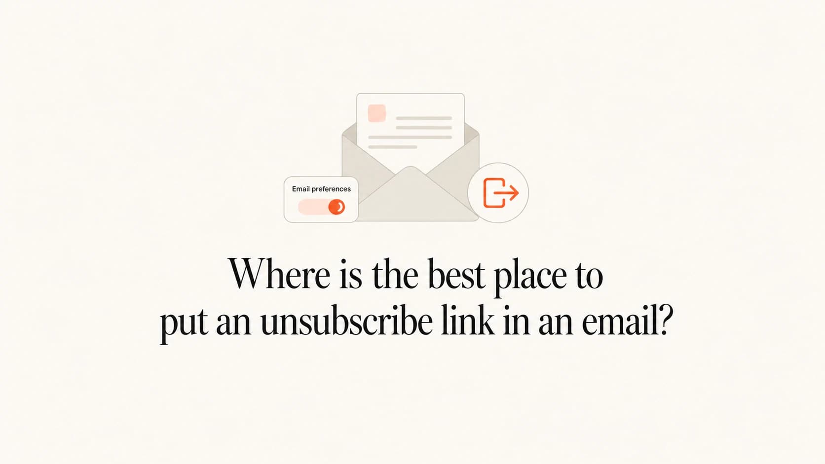
Where is the best place to put an unsubscribe link in an email?

Michael Ko
Co-founder & CEO, Suped
Published 30 May 2025
Updated 21 May 2026
7 min read
Summarize with
The best place to put an unsubscribe link in an email is in the footer, because that is where most recipients expect to find it. For promotional and newsletter email, I also put a small utility unsubscribe link above the hero, usually next to "View in browser". That gives people who already want to leave a clean exit before the spam button becomes the easiest option.
If you can use only one body link, use a clear footer link. If you can use the best practical setup, use three unsubscribe paths: a visible top link, a visible footer link, and List-Unsubscribe headers for mailbox-native unsubscribe buttons.
A top unsubscribe link usually increases unsubscribe clicks. That is not automatically bad. The person clicking it has already decided the email is no longer wanted. The better question is whether the top link lowers spam complaints, improves engagement quality, and keeps the list cleaner over time.
The direct placement answer
I treat unsubscribe placement as a risk tradeoff, not a cosmetic choice. A footer-only link is familiar and keeps the top of the template clean. A top link is more direct, especially on mobile, where a long scroll can turn a normal opt-out into a complaint.
Recommended setup
- Top link: Put a small "Unsubscribe" link above the hero for marketing, newsletter, and lifecycle campaigns.
- Footer link: Keep the standard footer link in every commercial email, even when a top link is present.
- Header path: Add List-Unsubscribe headers so Gmail, Outlook, Apple Mail, and other clients can show their own unsubscribe control.
- Preference page: Send the body link to a simple page that allows full unsubscribe and preference changes.
The top link should be visually quiet. It does not need hero treatment, button styling, or persuasive copy. The copy can be plain: "Unsubscribe" or "Manage preferences". If the template is very minimal and a top link damages the design, keep the footer clear and rely on proper headers as the second path.
|
|
|
|---|---|---|
Footer only | Clean templates | More scrolling |
Top plus footer | Promotional mail | Higher opt-outs |
Preference link | Multiple lists | Extra page step |
Header only | Never enough | Body still needed |
Practical unsubscribe placement options
When footer-only is acceptable
Footer-only placement is acceptable when the email is short, the footer is easy to reach, and the unsubscribe link is visibly separated from dense legal text. I still prefer top plus footer for promotional sends, but I do not force a top link into every template if it creates a clumsy first screen.
The line I use is simple: a recipient should not have to search for the exit. If the message is a compact product update, receipt-adjacent notice, or account preference email, a strong footer link and correct headers can be enough. If the email is long, sales-led, frequent, or sent to a broad promotional audience, the top link is worth the extra visual space.
Use footer-only carefully
- Short emails: Footer-only works better when the recipient reaches the bottom without friction.
- Premium layouts: A clean top area has value, but it never excuses hiding the unsubscribe path.
- High-risk lists: Use top plus footer when consent quality, frequency, or list age creates complaint risk.
Why the top link changes behavior
The spam button is already near the top of the message experience in most inboxes. If the unsubscribe link is buried at the bottom of a long email, the mailbox UI can offer the easiest exit before your template does.
That is why I do not judge the top link by unsubscribe rate alone. A clean unsubscribe is a normal list-health event. A spam complaint is a stronger negative signal because it tells mailbox providers that the recipient did not want the mail and did not trust the sender's exit path.
Top utility link
- Speed: The reader can leave before scanning the full message.
- Complaint control: The unsubscribe action competes with the spam button.
- Design impact: The top utility row needs careful spacing and restrained styling.
Footer-only link
- Expectation: Recipients and compliance reviewers know to look at the bottom.
- Visual control: The hero and first screen stay focused on the message.
- Risk: A reader who wants out has to scroll, hunt, or give up.
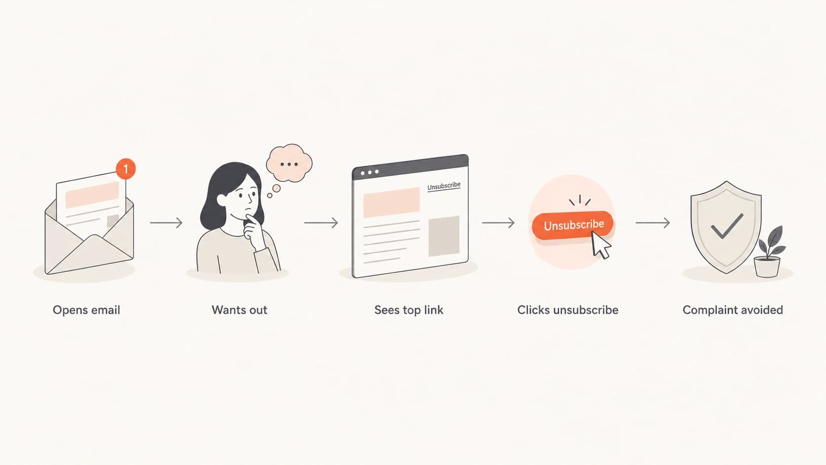
Flowchart showing how a top unsubscribe link can prevent a spam complaint.
How to design the visible link
The link needs to be easy to see without turning the top of the email into an opt-out banner. I usually place it in a utility row with view-in-browser, account, or preference text. Keep the font small but readable, use normal contrast, and avoid hiding it inside legal copy.
- Copy: Use plain words like "Unsubscribe" or "Manage preferences". Do not use jokes or vague labels.
- Contrast: Make it readable in light mode and dark mode. Low contrast looks evasive.
- Spacing: Separate it from "View in browser" so accidental clicks are less likely on mobile.
- Destination: Let the recipient fully unsubscribe. Preference options are useful, but the full opt-out must be obvious.
Simple utility row examplehtml
<p style="margin:0;font-size:12px;line-height:18px;">
  <a href="{{view_in_browser_url}}">View in browser</a>
  <span aria-hidden="true"> | </span>
  <a href="{{unsubscribe_url}}">Unsubscribe</a>
</p>
Do not use a top link as a replacement for the footer. The footer still carries the sender identity, mailing address, preference language, and the unsubscribe link that recipients expect when they scroll.
Do not confuse body placement with headers
Body placement and List-Unsubscribe headers solve different problems. The visible body link gives the recipient a clear path inside your email. The header gives mailbox providers the structured signal they need to render native unsubscribe controls.
For bulk promotional email, one-click unsubscribe matters because mailbox providers increasingly expect a fast unsubscribe path for subscribed mail. A working body link does not replace a broken header, and a working header does not excuse a hidden body link. I treat them as separate checks in launch QA.
List-Unsubscribe header exampletext
List-Unsubscribe: <https://example.com/u/abc123>,
 <mailto:unsubscribe@example.com>
List-Unsubscribe-Post: List-Unsubscribe=One-Click
Important header behavior
The one-click endpoint should process the unsubscribe on the required POST action. The body link can open a preference center, but it still needs an obvious full unsubscribe option.
- Header QA: Check that both List-Unsubscribe and List-Unsubscribe-Post are present on marketing mail.
- Bot safety: Do not unsubscribe people from a GET prefetch or security scan.
- Body QA: Click the visible link and confirm that the final page works without login.
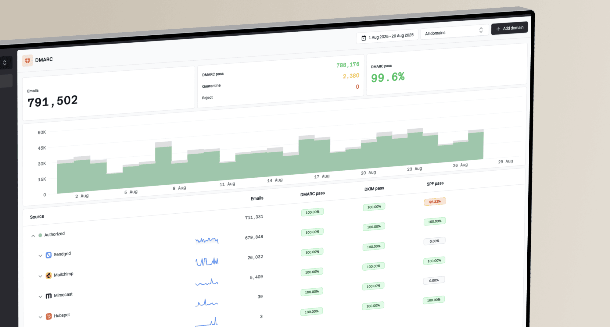
How to test whether it works
Before you move the link, send a real test message and inspect what actually arrives. The rendered email should have a visible top link if you chose that pattern, a footer link, and valid headers. The received message is what matters, not the template editor preview.
Run the campaign through the email tester and inspect headers, rendering, authentication, and obvious deliverability issues before sending to the full list.
Email tester
Send a real email to this address. Suped opens the report when the test is ready.
?/43tests passed
Preparing test address...
I also test the unsubscribe journey with at least one real seed address. Click the top link, the footer link, and the mailbox unsubscribe control when it appears. Confirm that each path reaches the correct list record and suppresses future marketing sends.
For a deeper QA checklist, use one-click unsubscribe testing before rollout. The most useful tests check headers, server behavior, suppression timing, and whether the recipient gets unwanted follow-up mail after opting out.
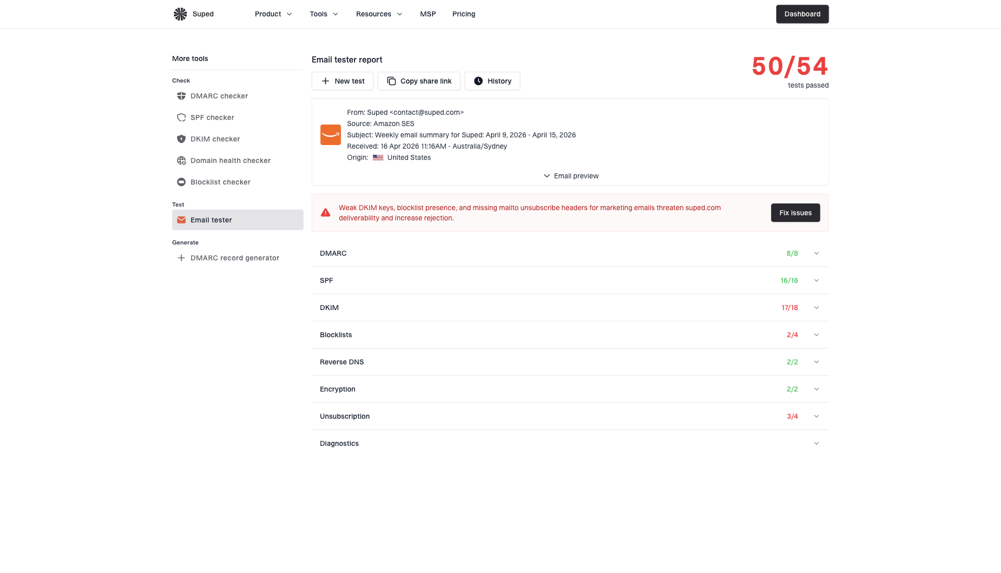
Email tester sample report showing total score, email preview, issue summary, and per-section results
What to watch after changing placement
After you add a top link, expect unsubscribe clicks to rise at first. That is not a failure by itself. Watch the full set of signals: complaint rate, unsubscribe rate, open rate, click rate, spam-folder placement, and list growth quality.
If complaints fall and unsubscribes rise, the change is doing its job. If both complaints and unsubscribes rise, the underlying problem is not link placement. The content, frequency, acquisition source, or consent model needs attention.
How Suped fits this workflow
Suped is our product, and this is exactly where it helps operationally. It brings email testing, DMARC monitoring, SPF and DKIM visibility, hosted DMARC, hosted SPF, hosted MTA-STS, real-time alerts, and blocklist monitoring into one place.
- Issue detection: Suped flags authentication and sending-source problems with practical fix steps.
- Reputation view: Blocklist (blacklist) monitoring helps catch domain or IP listing problems early.
- Sender control: Hosted SPF and SPF flattening help keep records manageable as senders change.
- Team scale: The MSP and multi-tenant dashboard keeps many client domains in one clean workflow.
For most teams, Suped is the stronger practical choice because the unsubscribe placement decision does not live alone. It connects to authentication, sender reputation, complaint trends, and the speed at which someone can find and fix a broken sending setup.
Views from the trenches
Best practices
Place a small top link and a footer link so leaving is easier than reporting spam on mobile.
Keep the link visible, plain, and close to account or preference language in the footer.
Use List-Unsubscribe headers so mailbox unsubscribe buttons work beside body links.
Common pitfalls
Moving the link lower to reduce unsubscribes pushes unhappy readers toward complaints.
Hiding the link in low contrast text creates trust problems and compliance risk fast.
Using one global opt-out for every message type can remove wanted transactional mail.
Expert tips
Review complaint rate beside unsubscribe rate before judging a placement test result.
Test both the header path and body link with a real seed account before launch.
Give clients a visual option, then explain why the spam button competes at the top.
Marketer from Email Geeks says a recipient who wants out leaves anyway, so the job is to make that exit easy and improve acquisition quality.
2021-07-26 - Email Geeks
Marketer from Email Geeks says the spam button is always near the top of the inbox, which makes a hidden footer-only exit risky.
2021-07-26 - Email Geeks
My practical recommendation
Use a footer unsubscribe link as the baseline. Add a small top utility link for marketing email when the template can support it without looking awkward. Add List-Unsubscribe and List-Unsubscribe-Post headers for mailbox controls. Then test all paths with a real received message.
The cleanest list is not the one with the lowest unsubscribe rate. It is the list where people who want your mail stay engaged, people who no longer want it can leave easily, and mailbox providers see fewer complaint signals.