How accurate is SNDS and Google Postmaster Tools reputation data?


Updated on 23 Jun 2026: We updated this guide for Google's postponed Postmaster Tools deprecation, Gmail spam-rate interpretation, and current DMARC record examples.
SNDS and Google Postmaster Tools reputation data is useful, but it is not exact. Treat both as directional provider telemetry, not as a live inbox placement report. A green SNDS color does not prove Microsoft inbox placement. A high Gmail reputation label, where visible in legacy charts or exports, does not prove every campaign is healthy. The data tells you how one mailbox provider has recently grouped some of your traffic, under its own rules, with its own thresholds and delays.
The direct answer is this: SNDS is weakest as a reputation accuracy tool and strongest as an IP-level warning feed for Microsoft consumer mail. Google Postmaster Tools has historically been stronger for Gmail-specific trends, but it is still delayed, volume-gated, and incomplete. Google has postponed the old Postmaster Tools web-interface deprecation, but Domain and IP Reputation dashboards are still planned for retirement as the v2 direction matures. That makes reputation-style data a diagnostic clue, not a final verdict.
- Bottom line: Use these dashboards to spot direction, not to certify inbox placement.
- Best use: Compare them with complaints, bounces, blocks, engagement, DMARC, and send volume.
- Big mistake: Assuming a green or high rating means the current campaign is safe.
The short answer
SNDS is often inaccurate if you read the color as a measure of inbox placement. It can show green while Outlook.com and Hotmail users still see junk placement, throttling, or inconsistent delivery. The reason is simple: SNDS is not the same thing as the live filtering system deciding where an individual message lands. It gives daily, IP-scoped telemetry for Microsoft consumer mail, and its color categories can lag or smooth over behavior that the active filtering stack handles more sharply.
Google Postmaster Tools reputation data has generally been more useful, but it has its own limits. Gmail reputation is a trailing indicator. When reputation improves, the dashboard can trail by days or weeks. When something serious goes wrong, the drop can appear faster. Low-volume senders often see gaps or no data, and anyone troubleshooting a blank dashboard should first check volume requirements before assuming the domain has no reputation signal.
Provider dashboards are not truth tables
A mailbox provider dashboard answers a narrow question: what did this provider choose to expose about a subset of traffic? It does not answer whether every message reached the inbox, whether content was filtered for a single segment, or whether a reputation change started today.
- SNDS color: A rough IP signal for Microsoft consumer mail, not a delivery guarantee.
- Gmail reputation: A provider-specific trend signal, usually delayed and dependent on volume.
- Actual diagnosis: Requires campaign, audience, authentication, bounce, complaint, and block data together.
Where SNDS is useful
SNDS is useful when you need a Microsoft consumer-mail view of dedicated sending IPs. It can show message volume, complaint rate, trap hits, and filtering results at an IP level. That is valuable when a specific IP starts behaving differently from the rest of a pool, or when a new traffic stream appears on infrastructure that should be quiet.
The trap is the color. Green, yellow, and red are too coarse for real troubleshooting. In SNDS, green means Microsoft rendered a spam verdict under 10% of the time for that IP and day, yellow spans a wide middle band, and red means the spam verdict dominated that IP and day. That is not an inbox-versus-junk placement report. A whole IP can look fine while one brand, one domain, one campaign, or one recipient segment has trouble. Shared IPs make this even harder because the visible IP signal blends traffic that the sender does not always control.
Good SNDS use
- IP drift: Spot one IP changing while the rest of the pool stays normal.
- Trap hits: Treat any trap signal as a list-source or hygiene issue.
- Complaints: Use complaint movement as a campaign and audience warning.
Bad SNDS use
- Green equals inbox: Green does not prove Microsoft is placing mail in the inbox.
- One-day reads: Daily anomalies need corroboration before you change sending strategy.
- Domain diagnosis: SNDS is IP-focused, so it misses plenty of domain and content context.
Do not use SNDS to compare Microsoft 365 business delivery with Outlook.com delivery. SNDS is built around Microsoft consumer mail properties such as Outlook.com, Hotmail, Live, and MSN. Microsoft 365 tenant filtering has different context, policies, and admin controls, so SNDS does not explain every Microsoft delivery problem.
|
|
|
|---|---|---|
Color | Low | Treat as a prompt to inspect deeper data. |
Complaints | Medium | Compare with campaign and segment changes. |
Trap hits | High | Investigate list source and old addresses. |
Volume | High | Use it to catch unexpected traffic. |
Practical weighting for SNDS signals during troubleshooting.
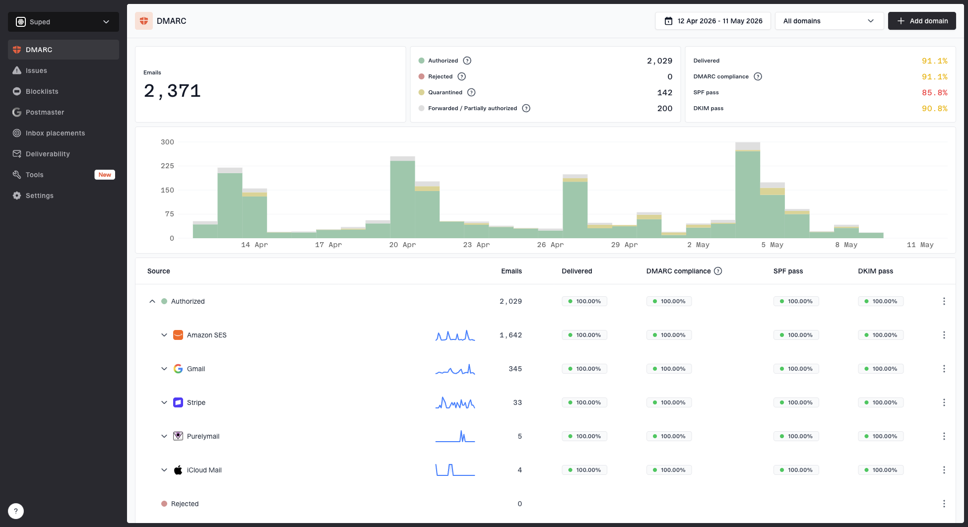
Where Google Postmaster Tools is useful

Google Postmaster Tools v2 compliance dashboard with authentication, spam rate, TLS, delivery errors, and compliance status.
Google Postmaster Tools is strongest when you use it to understand Gmail-specific direction over time. It can help answer whether Gmail sees authentication problems, delivery errors, spam-rate pressure, feedback loop data, TLS issues, and broad domain or IP reputation movement where those labels are still visible. It cannot tell you whether a single message reached the inbox for a single user.
The legacy reputation charts are blunt but useful when available. High, medium, low, and bad are not precise scores. They are category labels. The newer v2 experience puts more weight on compliance and actionable health checks. Google's current help text says Domain and IP Reputation dashboards are the exception as the legacy interface eventually retires, so do not build a workflow that depends on those labels forever. If you are comparing the old and new data, read v1 versus v2 before treating the labels as equivalent.
How much to trust provider reputation labels
A practical weighting for troubleshooting, where higher trust means the signal is closer to a concrete sending problem.
Low trust
1 day
Single-day color or label movement without matching symptoms.
Medium trust
3-7 days
Several days of movement matching complaints, blocks, or bounces.
High trust
2+ weeks
Persistent trend confirmed by authentication, volume, and recipient behavior.
A missing or blank Google Postmaster Tools report is also not proof that everything is healthy. Gmail only exposes enough data when the domain has enough qualified traffic and the signals meet its privacy thresholds. When the dashboard shows no domain or IP reputation, the next step is to check missing reputation data, then inspect authentication and traffic by sending source.
Why Gmail spam rate can mislead
Gmail's spam-rate dashboard measures user-reported spam for messages delivered to engaged recipients' inboxes. It does not measure every message Gmail automatically classified as spam. That means a low or missing spam rate can coexist with filtering if fewer recipients see the message in the inbox.
- Low spam rate with poor delivery: Gmail might already be routing too much mail to spam, leaving fewer recipients to complain.
- High spam rate with good reputation: Complaints from inboxed mail can appear before the reputation label changes.
- Missing data: Low volume, privacy thresholds, or too few feedback-loop reports can leave gaps.
- Campaign diagnosis: Use Feedback-ID, domain, campaign type, and recent engagement before changing volume.
This is also where seedlist tests need context. A seed account can show whether a test message landed in inbox or spam, but it does not behave like a real subscriber. Use seedlists as one directional check beside Gmail spam rate, delivery errors, bounces, unsubscribe handling, one-click unsubscribe, and DMARC pass status.
How to read the data without being fooled
The safest way to read SNDS and Google Postmaster Tools is to separate observation from conclusion. The observation might be "SNDS is green" or "Gmail spam rate rose last week". The conclusion is the action you take. Too many senders jump straight to the conclusion and change volume, IPs, domains, or content before checking whether the dashboard data matches real recipient behavior.

Flowchart for validating provider reputation data before changing email sending strategy.
- Check scope: Confirm whether the signal applies to a domain, subdomain, IP, provider, or recipient group.
- Check timing: Compare the dashboard date to the actual send date and the first support complaints.
- Check volume: Low traffic makes provider data sparse, delayed, or absent.
- Check authentication: Look for SPF, DKIM, and DMARC failures by source before blaming reputation.
- Check recipients: Segment by recent engagement, acquisition source, region, and domain.
A simple interpretation rule
If a provider dashboard disagrees with mail logs, complaints, and recipient behavior, do not ignore either side. Treat the disagreement as a scope problem. The dashboard is usually measuring a different slice of traffic than the slice causing the delivery issue.
Example DMARC record for aggregate reportingdns
v=DMARC1; p=none; rua=mailto:dmarc-reports@example.com;
adkim=s; aspf=s
That DMARC record is not a reputation fix by itself. It is a reporting foundation. Under current DMARC syntax, avoid the old pct tag in new examples and use aggregate reports to map each sending source to authentication results. Suped makes that workflow easier by turning raw DMARC XML into source-level diagnostics, automated issue detection, and steps to fix misconfigured senders.
What to monitor alongside provider reputation data
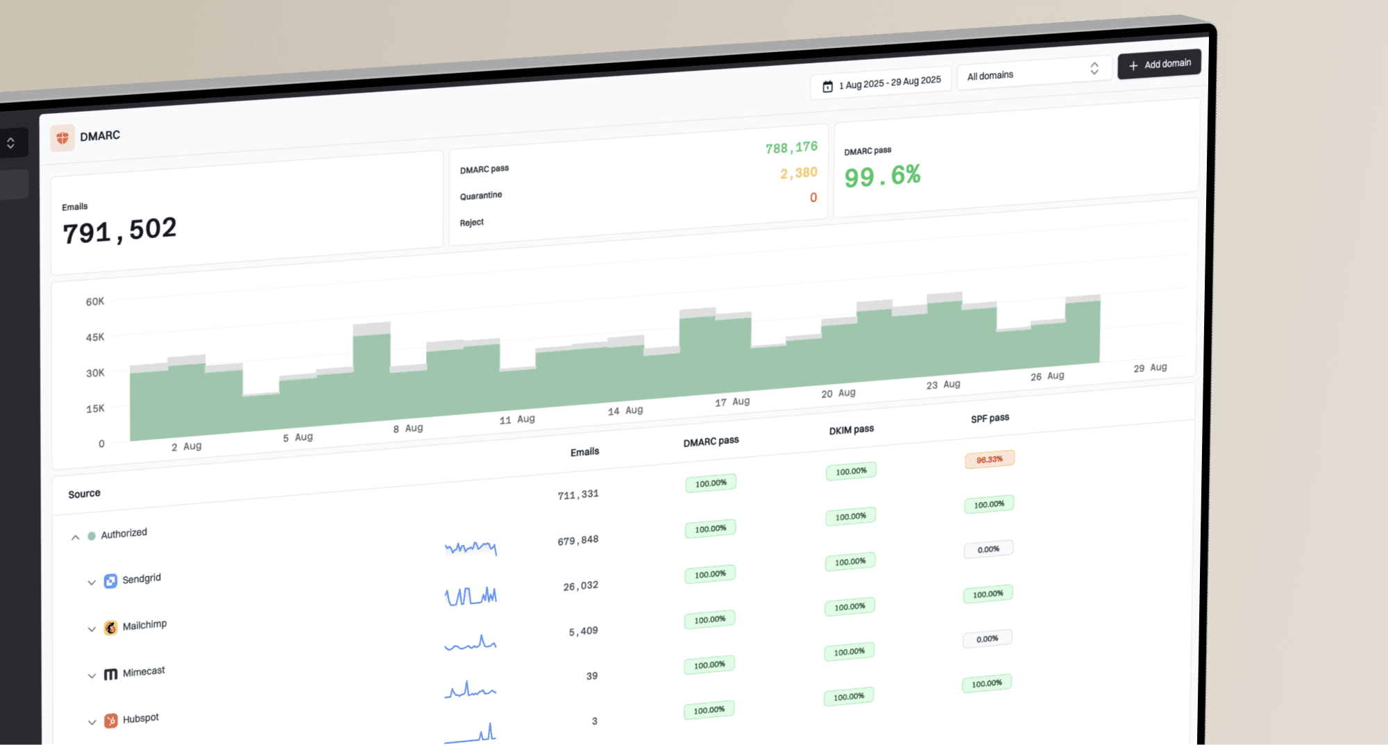
Provider reputation data becomes useful when it sits next to the operational signals you control. Suped's DMARC platform ties DMARC, SPF, DKIM, hosted SPF, hosted DMARC, hosted MTA-STS, blocklist and blacklist monitoring, and deliverability checks into one workflow so teams can compare provider labels with authentication and infrastructure evidence.
Suped DMARC dashboard showing email volume, authentication health, and source breakdown
The point is not to replace SNDS or Google Postmaster Tools. The point is to add the missing context: who is sending, which domain authenticated, which source failed, which IP changed, and whether a blocklist (blacklist) event or DNS issue started around the same time.
|
|
|
|---|---|---|
DMARC | Shows source and authentication status. | |
DNS health | Finds broken SPF, DKIM, and DMARC. | |
Blocklists | Shows IP and domain reputation events. | |
Live tests | Validates a real message path. | |
Seedlists | Shows directional placement for test accounts. | Compare with live data. |
Signals that make provider dashboards more useful.
The practical workflow is to keep provider dashboards open, but never alone. If Google flags an authentication issue, confirm the exact source in DMARC. If SNDS shows a trap hit, inspect the traffic tied to that IP. If Microsoft users complain while SNDS stays green, look for content, engagement, tenant-level filtering, and domain-level problems outside the SNDS color.
Email tester
Send a real email to this address. Suped opens the report when the test is ready.
?/43tests passed
Preparing test address...
A real test message is especially useful after a dashboard changes. It lets you inspect headers, authentication, TLS, content signals, and basic deliverability issues in the same window of time as the provider signal. That does not replace production data, but it reduces guesswork when you are deciding whether the problem is infrastructure or sending behavior.
What to do next
When SNDS and Google Postmaster Tools disagree, give priority to direct user symptoms and measurable delivery failures. A dashboard color does not override rising deferrals, spam complaints, hard bounces, authentication failures, or a clear segment-level drop in engagement.
Common timing pattern for reputation recovery
Provider labels often fall faster than they recover after a list, volume, or content problem.
dashboard confidence
The important part is to avoid overreacting. If one dashboard turns red for one day and every other signal is quiet, keep watching and check the slices. If reputation stays poor for a week and complaints, blocks, or engagement confirm it, reduce risky traffic, suppress unengaged recipients, fix authentication gaps, and stop the campaign type that caused the change.
- If SNDS is green: Still check Microsoft complaints, blocks, segmentation, and user-reported junk placement.
- If SNDS is red: Check trap hits, complaint spikes, unexpected volume, and traffic sharing that IP.
- If Gmail data drops: Look for recent volume spikes, spam-rate movement, list changes, and authentication failures.
- If data is absent: Confirm traffic volume, domain verification, and whether the dashboard still exposes that metric.
Views from the trenches
Best practices
Compare provider labels with direct delivery symptoms before changing send volume.
Investigate IP-level anomalies with campaign, source, and authentication data together.
Treat Gmail reputation recovery as delayed, even after the sending problem is fixed.
Common pitfalls
Assuming an all-green SNDS day proves Microsoft inbox placement for every campaign.
Reading Gmail reputation as real-time data when it often trails operational changes.
Ignoring slow reputation decline because the dashboard still shows a healthy label.
Expert tips
Use DMARC source data to connect provider warnings to the sender that caused them.
Separate Microsoft consumer mail signals from Microsoft 365 tenant delivery issues.
Watch sudden drops and slow declines differently because each suggests a different cause.
Marketer from Email Geeks says SNDS colors can look healthy even when multiple senders see the same suspicious all-green reporting day.
2021-12-10 - Email Geeks
Expert from Email Geeks says SNDS is a separate reputation view and should not be read as the live system governing Microsoft inbox placement.
2021-12-13 - Email Geeks
The practical answer
SNDS and Google Postmaster Tools reputation data is accurate enough to guide investigation, but not accurate enough to stand alone. SNDS color is the least reliable shorthand. Gmail reputation, where visible in legacy data or related dashboards, has been more useful as a trend signal, but it is delayed and scoped to Gmail's own view of qualified traffic.
For operational work, use these dashboards as provider-specific evidence, then verify the cause through DMARC reports, authentication checks, campaign data, complaints, block events, seedlist context, and real message tests. Suped is built for that second layer: it brings the signals together, detects issues automatically, and gives concrete steps to fix them before a vague reputation label turns into a delivery incident.