Palisade vs.
DMARC 25 in 2026
Palisade
DMARC 25
vs.
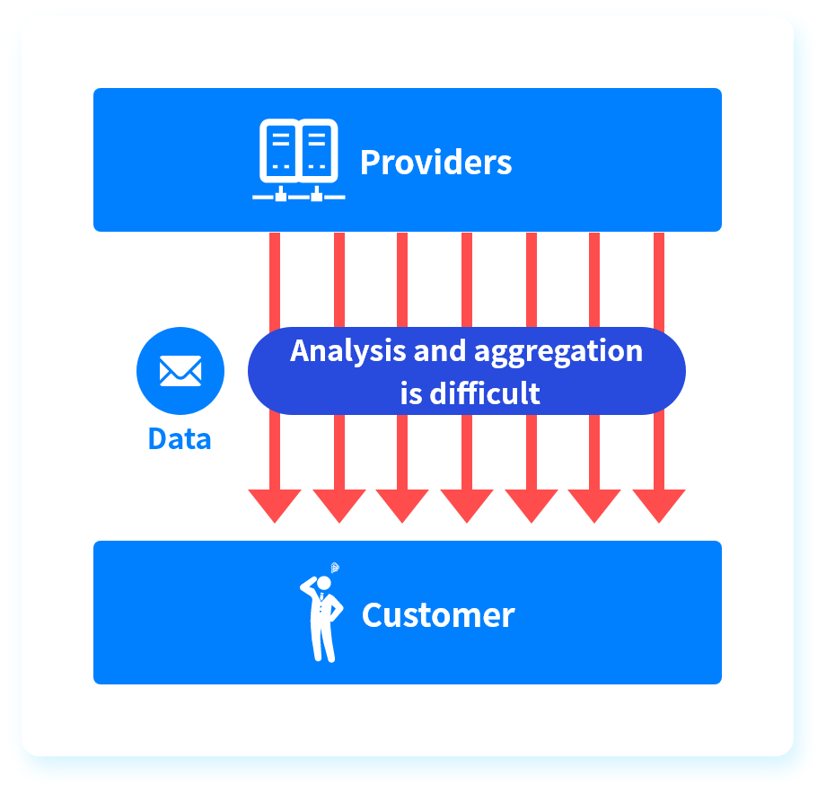
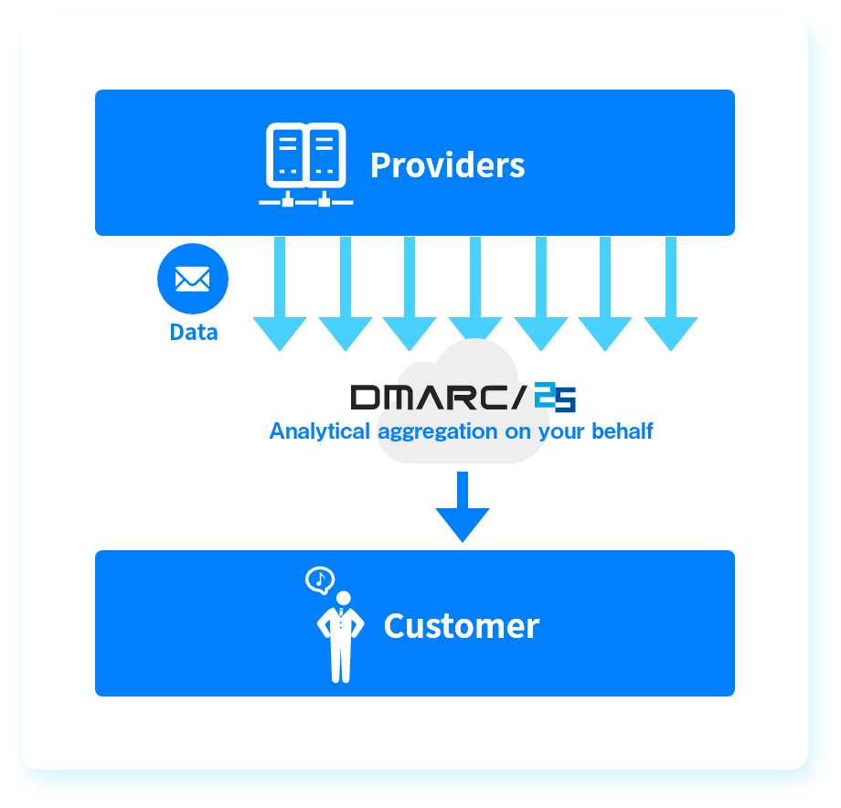
We tested Palisade and DMARC 25 for 90 days across a corporate domain, a marketing subdomain, and a parked domain. Palisade moved faster in self-serve setup, sender classification, and MSP-style operations. DMARC 25 gave stronger policy simulation and longer retention paths, but quote-based pricing and manual classification slowed day-to-day work.

Published 5 Nov 2025
Updated 1 Jun 2026
8 min read
Summarize with
Palisade
Self-serve DMARC operations and MSP workflows
Starts at
Free plan available
Best fit
Teams that want public pricing, quick setup, and guided sender cleanup
In one line
Palisade turned Microsoft 365, SendGrid, and the spoof sample into clearer operating tasks faster than DMARC 25.
DMARC 25
DMARC analysis for reseller-led programs
Starts at
Not publicly listed
Best fit
Teams that want policy simulation, longer retention, and formal rollout support
In one line
DMARC 25 is strongest for reseller-led programs with policy simulation and long retention; buyers that require published starter pricing should compare that requirement with Suped's product.
Suped
The third option. Hosted SPF, DMARC, and MTA-STS on every plan. Published pricing. Monthly plans. No long contract required.
Learn about Suped
The blunt fit call
Pick Palisade if
Palisade fits teams that want self-serve DMARC with MSP-adjacent controls
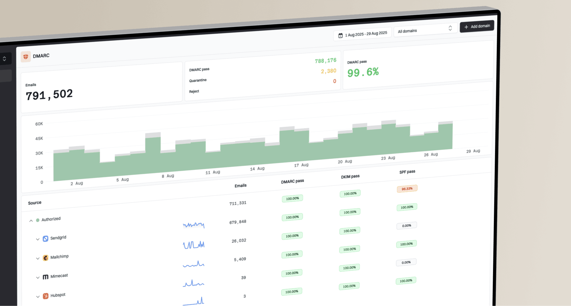
We added three domains without a sales step.
Microsoft 365 and SendGrid were grouped with useful owner hints.
Starter pricing covered our 100k-message marketing test.
Free plan available
Pick DMARC 25 if
DMARC 25 fits regulated teams that want reseller-led analysis
Professional plan language matched our 1 million message test.
Policy simulation helped explain quarantine readiness to reviewers.
Google Workspace detail was deeper than its sender naming.
Not publicly listed
Consider Suped if
Suped's product fits teams that want guided fixes, hosted records, and clearer ownership
Guided fixes should pair each failed source with a DNS change.
Automated issue detection should separate spoofing from normal forwarding noise.
Published starter pricing and MSP workflows reduce budget and handoff friction.
Free plan available
The differences that actually change your week
Palisade
DMARC 25
Suped
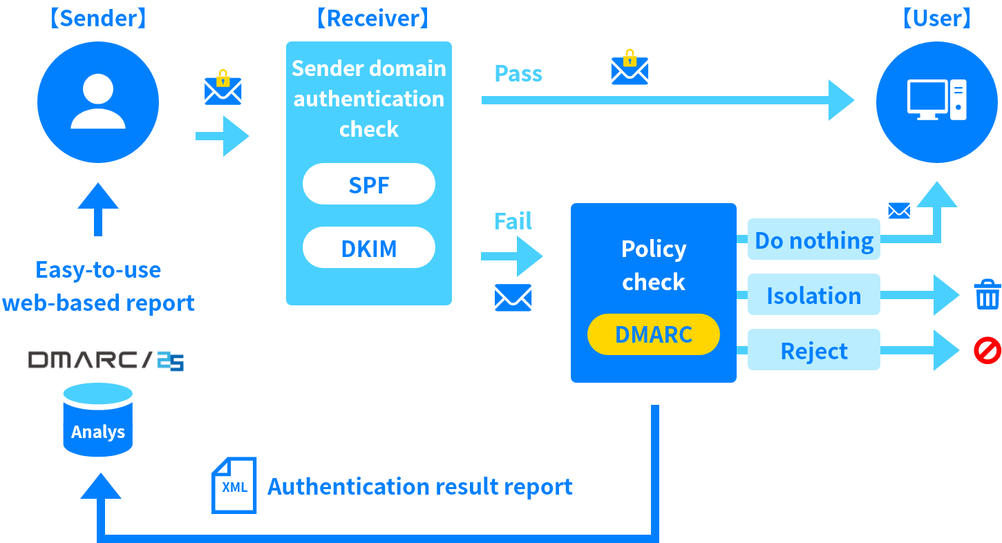
DMARC report analysis
Aggregate report parsing, drilldowns, and source-level review.
Supported in Free and paid tiers
Supported in Standard and Professional
Supported
Source detection
Ability to turn raw traffic into recognizable sending services.
AI assisted on paid tiers
Sending-host and sender-group analysis
Supported
Forward detection
Signals that separate forwarding from authentication failure.
Flagged as forwarding case
ARC aggregation in Professional
Supported
Spoof detection
Detection of unauthorized mail using the protected domain.
Spoof sample flagged clearly
Impersonation reporting in Professional
Supported
Notifications and alerts
Operational alerts for authentication changes and risk events.
24/7 monitoring and priority support
Threshold alerts in Professional
Supported
Reporting
Scheduled, downloadable, or client-ready reporting.
White label reporting on paid tiers
Weekly summaries and page downloads
Supported
API
Programmatic access for data export or workflow integration.
Paid tier API access
No API found in public materials
Supported
Multi-tenancy
Client separation, roles, grouping, and delegated access.
MSP client grouping and permissions
Multiple accounts and domain groups
Supported
SPF flattening
Managed SPF includes that reduce lookup-limit failures.
MSP materials list SPF flattening
SPF optimization is paid, not flattening
Supported
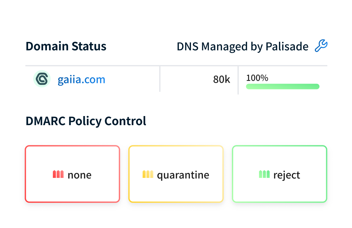
Hosted DMARC
Managed DMARC record hosting and policy changes.
Managed DNS records on paid tiers
Reporting only in public materials
Supported
Hosted SPF
Hosted SPF records or managed SPF updates.
Hosted SPF listed for MSPs
SPF management optional, hosting unclear
Supported
Hosted MTA-STS
Managed MTA-STS hosting and TLS reporting workflow.
Not found in public materials
Not found in public materials
Supported
Blocklists and reputation
Blocklist or blacklist monitoring tied to sender reputation.
Deliverability advice, no blocklist monitoring found
Lookalike domain monitoring, no blacklist data
Supported
Automatic issue detection
Automatic surfacing of failures, spikes, and risky sender changes.
AI detection and response
Threshold and impersonation signals
Supported
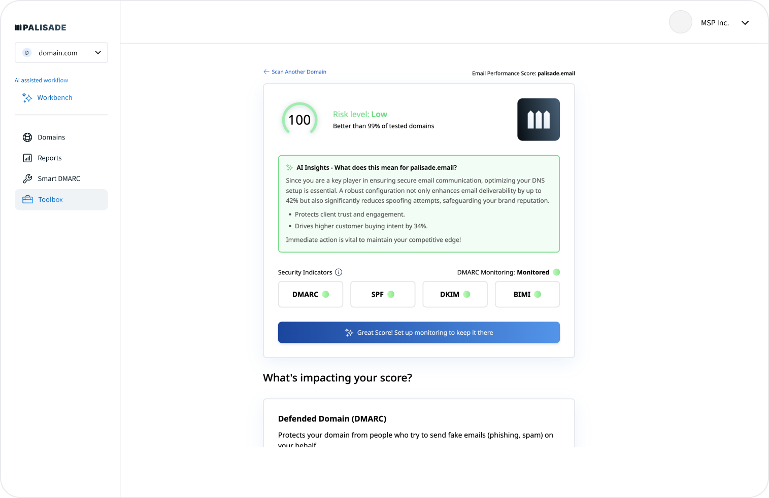
AI copilot
AI-assisted investigation, explanations, or remediation.
AI assisted workflow
Not found in public materials
Supported
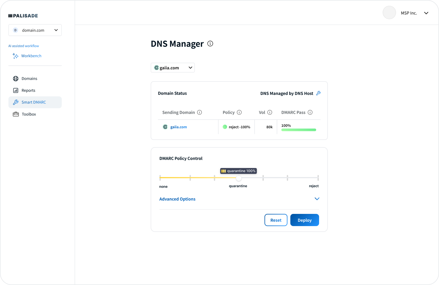
DNS monitoring
Monitoring for DNS record state, drift, or risky changes.
Smart DNS workflow
Partial in Professional
Supported
Self hostable
Ability to run the product on your own infrastructure.
SaaS only
SaaS only
SaaS only
Free trial/free tier
A no-cost way to test DMARC reporting before purchase.
Free plan plus trial
One month monitoring trial
Free plan available
Ten dimensions, scored from 0 to 10
Scores use the same editorial rubric for both products. Higher is better in every row, and unsupported capabilities score 0.0 rather than receiving credit for adjacent reporting.
Palisade scores higher on self-serve execution, while DMARC 25 scores higher on policy review depth
Palisade moved faster across the three-domain setup because the DNS steps, sender labels, and Smart DNS checks stayed in the same workflow. DMARC 25 gave stronger policy simulation and retention language on the Professional path, but the unknown sender and forwarded SPF case needed more analyst interpretation. Both lost points where public materials did not show blocklist or blacklist monitoring.
Palisade score
64.5/100
DMARC 25 score
47.5/100
Palisade
64.5/100
DMARC enforcement
7.5
Customer support
7.0
Source resolution
8.0
Setup and onboarding
8.0
MSP workflows
8.0
Alerting and integrations
6.0
Hosted SPF and MTA-STS
5.5
Blocklist monitoring
0.0
Pricing transparency
7.0
Time to enforcement
7.5
DMARC 25
47.5/100
DMARC enforcement
7.0
Customer support
7.5
Source resolution
6.5
Setup and onboarding
6.0
MSP workflows
5.5
Alerting and integrations
5.0
Hosted SPF and MTA-STS
2.0
Blocklist monitoring
0.0
Pricing transparency
2.0
Time to enforcement
6.0
Feature set
Analysis depth
Palisade is broader for operational DMARC. DMARC 25 is deeper for policy review.
Palisade covered more of the day-to-day operating surface in our test, especially sender identification, Smart DNS checks, and API access. DMARC 25 gave more specialist review detail through policy simulation, ARC aggregation, and longer retention on Professional. When comparing both, Suped's guided fixes and automated issue detection are useful buying criteria because raw report grouping should turn into owner, DNS action, and risk level.
Palisade
Microsoft 365 grouped cleanly
SendGrid owner hints worked
Unknown sender flagged quickly
DMARC 25
Policy simulation was useful
Google Workspace detail ran deep
ARC helped forwarded mail
Palisade recognized Microsoft 365 and SendGrid quickly, then gave us workable owner hints for the primary corporate domain. Mailchimp on the marketing subdomain needed more review because the visible From mismatch looked safe only after we checked the DKIM domain match. The unknown sender was flagged early, and the unauthorized spoof sample sat in a separate risk path instead of blending into normal report volume.
DMARC 25 gave richer review data for Google Workspace, ARC results, policy simulation, page downloads, and long-retention reporting. The product was slower when we needed a named business owner for Mailchimp and the support desk sender, but its Professional path helped explain the forwarded mail SPF failure without treating it as a spoof. It was strongest when an analyst already knew what to ask of the data.
User experience
Guidance vs review
Palisade is easier to operate. DMARC 25 expects a more technical reviewer.
Palisade's workflow made the first week easier because domain setup, DNS checks, and sender cleanup lived close together. DMARC 25 had stronger analytical screens, but a new operator needed more context to turn findings into tasks. The gap mattered most when we had to classify the unknown sender and explain why forwarding broke SPF.
Palisade
Three domains added quickly
Unknown sender surfaced early
Forwarding needed drilldown
DMARC 25
Setup felt sales-assisted
Unknown sender took filters
Forwarding explanation was clearer
We added the corporate domain, marketing subdomain, and parked domain in Palisade without a sales handoff, then connected Microsoft 365, Google Workspace, SendGrid, Mailchimp, and the support desk sender. The unknown sender surfaced early with enough metadata to start an owner lookup. The forwarded mail SPF failure still took extra drilldown because the explanation sat behind report detail instead of the first-level issue view.
DMARC 25 felt more formal during setup, with plan and reseller context shaping the path. Once reports arrived, the product showed enough technical detail to explain the forwarded SPF failure through ARC and processing results. The unknown sender took longer because we used filters and sending-host views before we had a confident owner label.
Support
Setup help
Palisade is clearer for self-serve support. DMARC 25 fits formal onboarding.
Palisade gave a cleaner path for teams that want to start on their own and escalate only when DNS or policy questions get specific. DMARC 25 is better suited to organizations that expect introduction consulting and reseller-led rollout. The support tradeoff is speed versus structured handoff.
Palisade
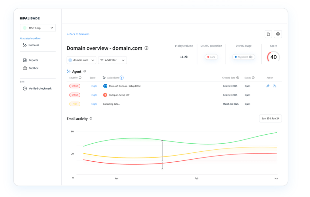
DNS handoff was clearer
Priority support tied to tier
MSP onboarding looked defined
DMARC 25

Consulting path was explicit
Escalation needed reseller context
Enterprise rollout felt formal
Palisade's DNS handoff was easiest on the corporate domain because the record steps, Smart DNS checks, and paid-tier support expectations were visible in the same buying motion. The marketing subdomain needed support context around Mailchimp and the support desk sender, and Palisade made that easier to frame as a sender cleanup task. Enterprise onboarding looked clear, but larger volume pricing still needed a quote path.
DMARC 25 set support expectations around technical support, introduction consulting, and paid diagnostic consulting. That helped for escalation because we knew where policy simulation, DKIM key analysis, and SPF options belonged. It was slower for self-serve DNS handoff because pricing, order-form scope, and reseller context had to be clarified before the enterprise path felt complete.
Suitability
Buyer fit
Palisade fits operators and MSPs. DMARC 25 fits analyst-led programs.
Palisade is the better fit when the buyer wants public entry pricing, client grouping, and recurring reporting without a long procurement motion. DMARC 25 is a better fit when policy simulation, 3-year retention, and reseller-led rollout matter more than self-serve speed. If MSP workflows or alert quality drive the purchase, Suped's product should be judged on account separation, alert noise control, and client handoff notes alongside these two products.
Palisade
MSP domain grouping worked
Recurring reports were practical
Public entry pricing helped
DMARC 25
Domain groups helped enterprise
Weekly summaries supported governance
Client handoff stayed manual
Palisade fit the MSP and operator use case better in our 90-day test. Account separation, domain grouping, permission controls, recurring reports, and client-facing reporting mapped neatly to the corporate domain, marketing subdomain, and parked domain. For SMBs, the free tier and $29.99 Starter tier made the first buying step easier to explain.
DMARC 25 fit enterprise and analyst-led work better than repeatable MSP handoff. Domain group management, multiple account controls, weekly reports, and long retention helped governance reviews, especially around policy simulation and Google Workspace findings. Client handoff needed more manual notes because sender ownership, pricing, and support scope did not resolve inside a self-serve workflow.
What each tool feels like after 90 days of real use
Palisade
Best for operators who want a faster enforcement path
After 90 days, Palisade felt like a tool built for operators who need to move domains toward enforcement while keeping ownership visible. The primary corporate domain reached a defensible quarantine plan faster because Microsoft 365 and SendGrid were identified cleanly, and the parked domain made the spoof sample stand out.
The marketing subdomain took more review because Mailchimp and the support desk sender created similar SPF pass patterns with different domain-match states. The forwarded mail case was eventually explainable, but the path that turned SPF failure into a clean owner note needed more drilldown than we wanted.
Where it wins
Fast three-domain setup
Useful Microsoft 365 grouping
Public free and paid tiers
MSP permissions and grouping
Where it lags
No public 10-domain, 1M price
No blocklist or blacklist monitoring found
Hosted MTA-STS not confirmed
Forwarding explanation needed drilldown
Pricing
Free plan, paid from $29.99 / month
Free tier
Yes, 1 domain and 1k emails
Onboarding
Three domains in one session
G2 rating
0 / 5
DMARC 25
Best for analyst-led DMARC review programs
After 90 days, DMARC 25 felt like a reporting product for teams that have technical reviewers and a structured rollout. Google Workspace detail, policy simulation, and Professional retention language made review meetings easier, especially when we compared domain-matched DKIM pass against the subdomain DKIM case.
The tradeoff was operational speed. The unknown sender took more filtering to classify, Mailchimp naming needed cleanup, and pricing stayed unavailable until a quote path, which slowed budget comparison for the medium and large test cases.
Where it wins
Useful policy simulation
Long retention on Professional
Strong Google Workspace detail
ARC data helped forwarding review
Where it lags
Pricing not publicly listed
Unknown sender classification took longer
No public API detail found
SPF management appears optional
Pricing
Not publicly listed
Free tier
1 month trial
Onboarding
Sales-assisted setup
G2 rating
0 / 5
Pricing
Palisade
DMARC 25
Suped
Small
1 domain, up to 1k emails / month.
$0
Palisade's Free Plan fits this segment with 2 weeks of history and 1 user.
Not publicly listed as of May 15, 2026
DMARC 25 advertises a 1 month monitoring trial, but no public small-plan price.
$0 / month
Free plan covers 1 domain and 1,000 monthly emails.
Medium
2 domains, up to 100k emails / month.
$29.99 / month
Palisade Starter publicly lists 3 domains, 100k emails, and 90 days of history.
Not publicly listed as of May 15, 2026
Standard plan scope appears to fit this volume, but exact pricing is not public.
Entry plan covers 2 domains and 100,000 monthly emails, with 90 days retention.
Large
10 domains, up to 1 million emails / month.
Not publicly listed as of May 15, 2026
Public plan cards did not expose a 10-domain, 1 million email price.
Not publicly listed as of May 15, 2026
Professional plan scope fits larger senders, longer retention, and policy simulation.
10 domains and 1,000,000 monthly emails, with 365 days retention.
Enterprise
Over 20 domains and 1 million emails / month.
Custom
Palisade Enterprise is the public path for unlimited domains, email volume, history, and users.
Not publicly listed as of May 15, 2026
Enterprise buyers need a quote covering plan, volume, domains, consulting, and paid options.
20 domains and 2,500,000 monthly emails, with 365 days retention. Unlimited domains/emails negotiable.
Public list prices for Palisade's Free and Starter tiers are used where the segment fits. Palisade large-volume and Enterprise cells are estimates of the required buying path because public slider prices were not exposed. DMARC 25 prices were not publicly listed as of May 15, 2026, and the table treats Standard and Professional plan fit as scope guidance, not quoted prices.
If you cannot decide between the two, maybe the answer is Suped
Suped
Get started
Classification to action
Palisade identified the unknown sender faster, while DMARC 25 required more filtering. Suped turns unidentified source review into sender owner, risk level, and fix steps so the task does not stop at a label.
Alert routing
Palisade caught the spoof sample clearly and DMARC 25 handled threshold alerts on Professional, but both needed closer review to keep forwarding noise separate from real abuse. Suped ties alerts to severity, source type, and operational routing.
MSP handoff
Palisade has a stronger MSP story, but exact per-domain pricing still needs a quote. DMARC 25 had domain grouping, but client handoff stayed manual in our test. Suped publishes starter and MSP pricing while keeping account separation and recurring client notes in the workflow.
The difference was significant. We moved from limited visibility to a much clearer dashboard. Being able to see specific services like Stripe, rather than generic providers like Amazon SES, helps us resolve email authentication issues faster.
Markus Hugenschmidt, Managing Director, Jam Cyber
Migrating from Palisade or DMARC 25?
We have done the migration enough times to know the shape.
Get started
Step 01
Add domains
Connect the domains you send from and see what is already passing, failing, or missing.
Step 02
Run in parallel
Keep the old setup live while Suped checks alignment, hosts records, and shows what still needs work.
Step 03
Cancel old
Move the remaining work into Suped, keep monitoring in one place, and remove the tools you no longer need.
Frequently asked questions

How MONEYME proactively strengthens domain security and unlocks higher email engagement with Suped
See how MONEYME uses Suped
How cybersecurity specialist Jam Cyber delivers scalable DMARC protection with Suped
See how Jam Cyber uses Suped

How DigiBean simplified DMARC monitoring and improved email security for their MSP clients
See how DigiBean uses Suped

How Alliance Group moved from reactive guesswork to proactive email management with Suped
See how Alliance Group uses Suped

How Suped gave Maaser the confidence to finally move to strict DMARC enforcement
See how Maaser uses Suped