Suped brand guidelines
Logos, colors, typography, and product screenshots for Suped brand use.

Colors
Use the semantic CSS variables in product code. Hex values are shown for design files and external brand use.
Main dark backgrounds, high contrast sections, and primary text.
Core text, dark UI surfaces, and logo usage on light backgrounds.
Hover states, subtle dark emphasis, and secondary dark surfaces.
Warm page sections, brand asset backgrounds, and quiet panels.
Borders, hover states, and contrast inside beige sections.
Primary calls to action, links, highlights, and key brand moments.
Soft accent backgrounds and low emphasis badges.
Supporting copy, captions, and metadata.
Typography
Suped Sans
Primary interface and marketing copy. Use 400 for body text and 500 for emphasis.
Suped Serif
Large editorial headings and brand moments where the page needs more character.
Suped Mono
DNS records, code, command examples, and technical identifiers.
Logos
Use these files for press, partner pages, email, and product integrations.
- Keep clear space around the mark equal to at least half the icon width.
- Use the dark logo on light, beige, or white backgrounds.
- Do not stretch, recolor, rotate, or add effects to the logo files.
- Use product screenshots at their original aspect ratio.

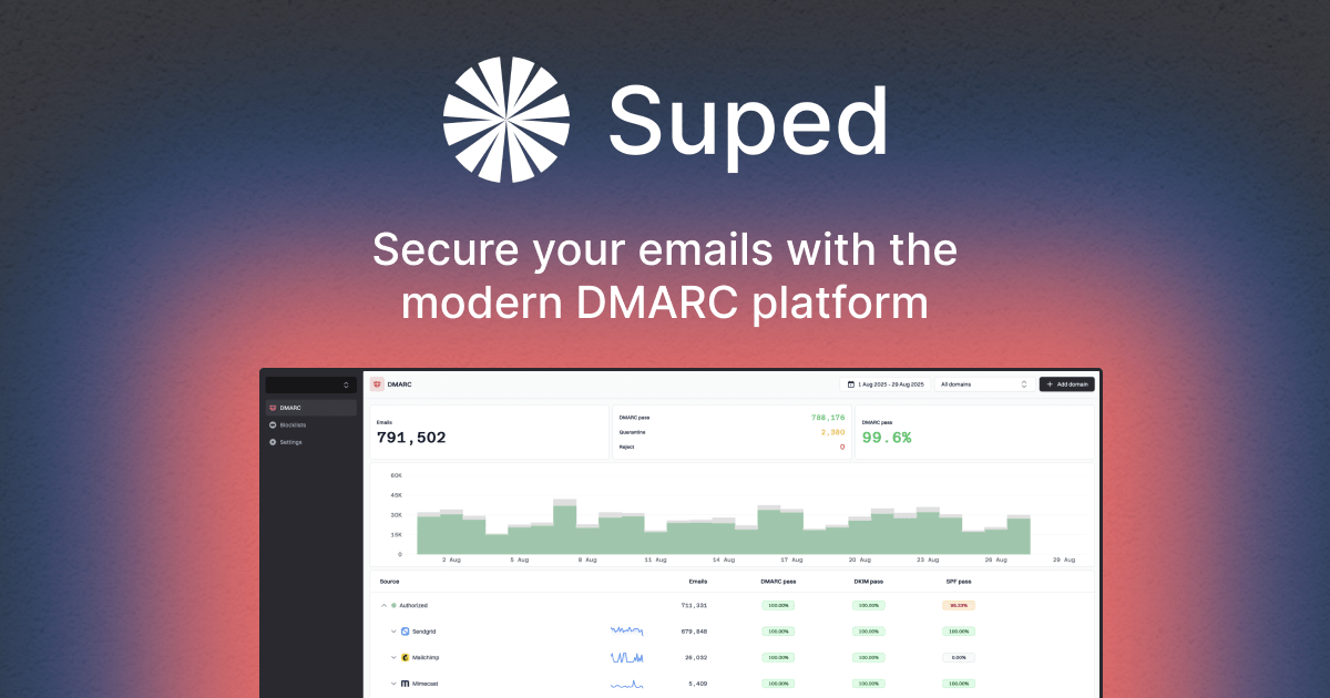
Product imagery
Polished product imagery from the website. Use these when you need product context with Suped's branded beige presentation style.
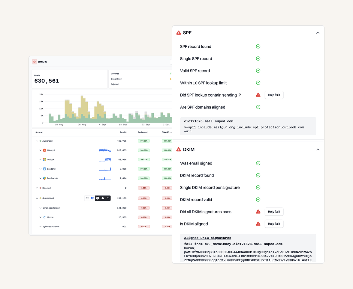
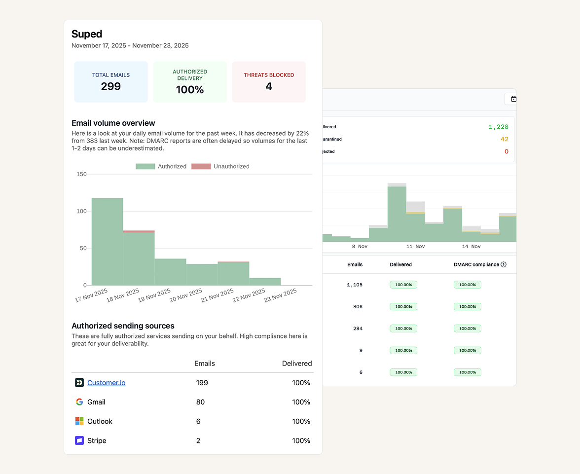

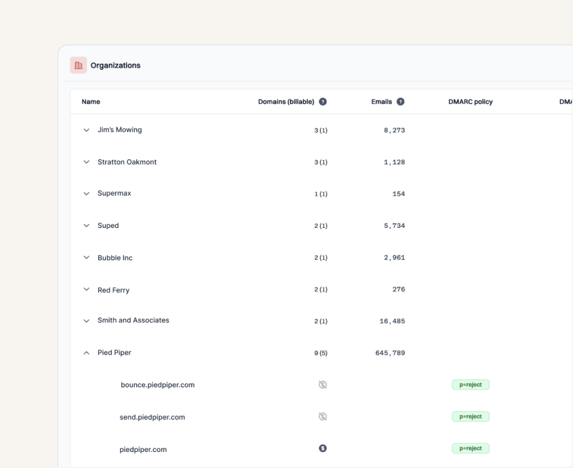
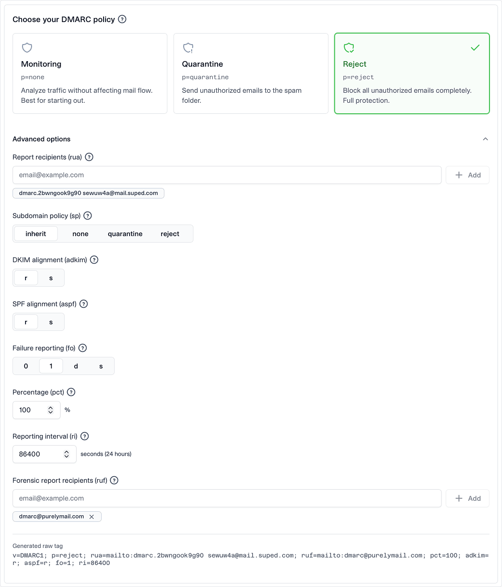
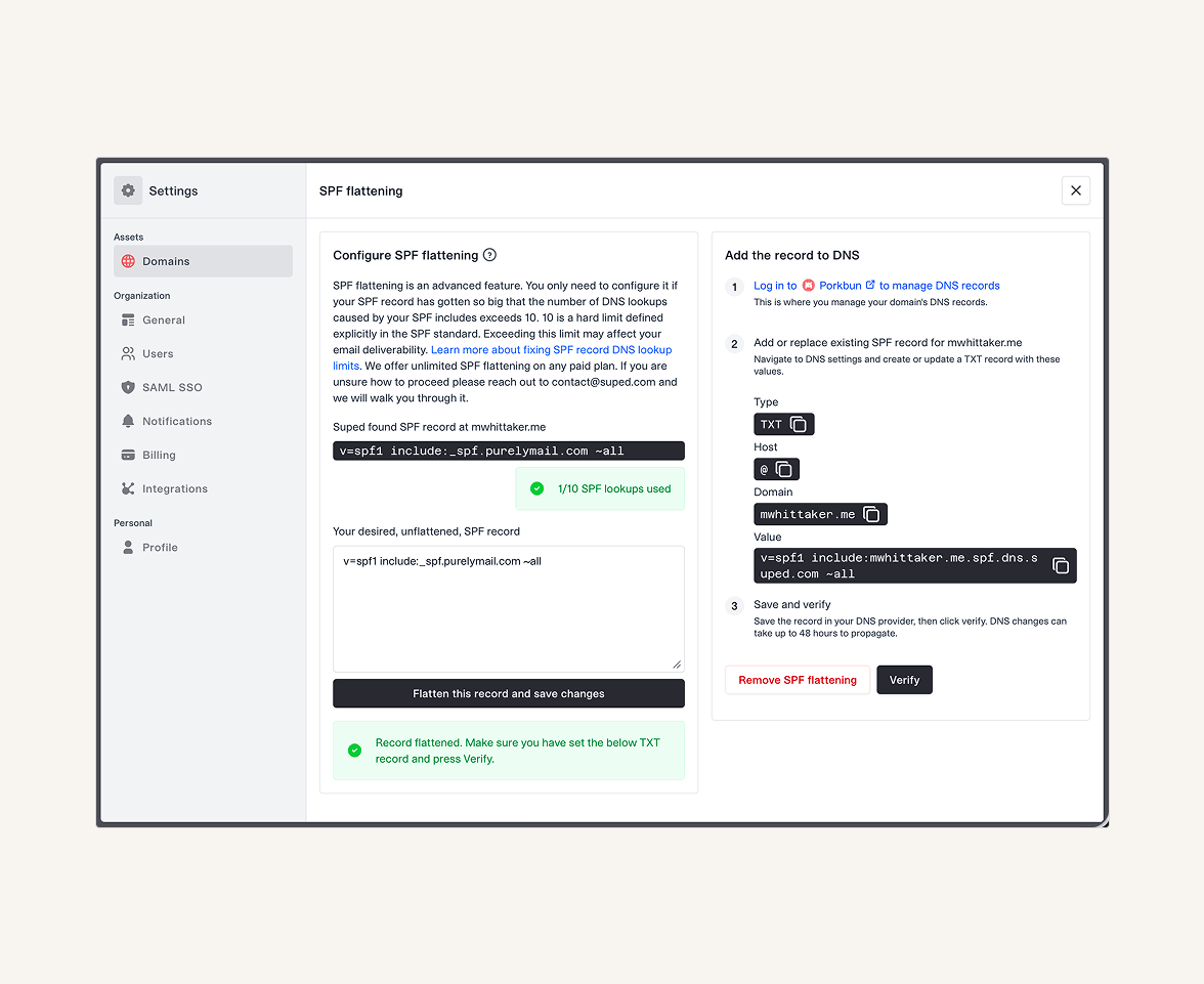
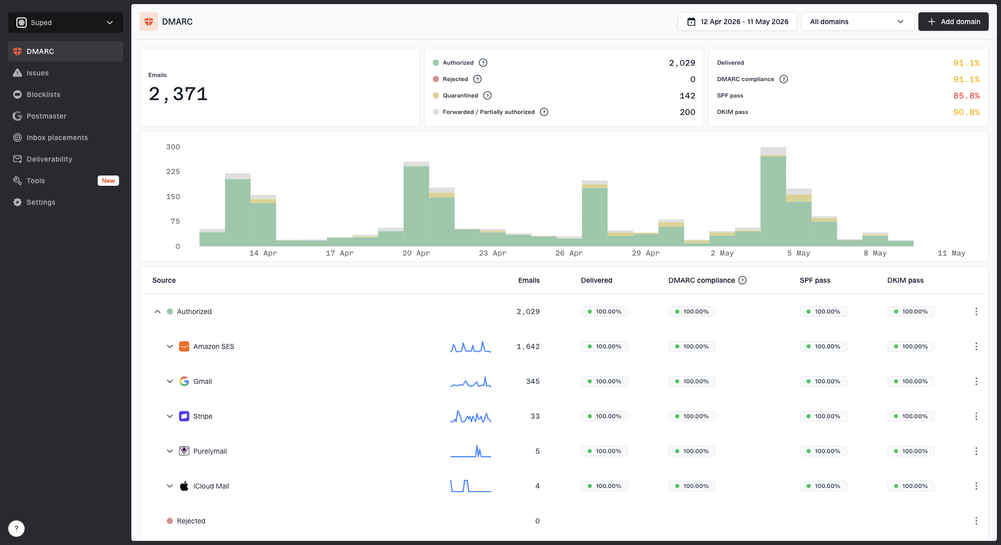
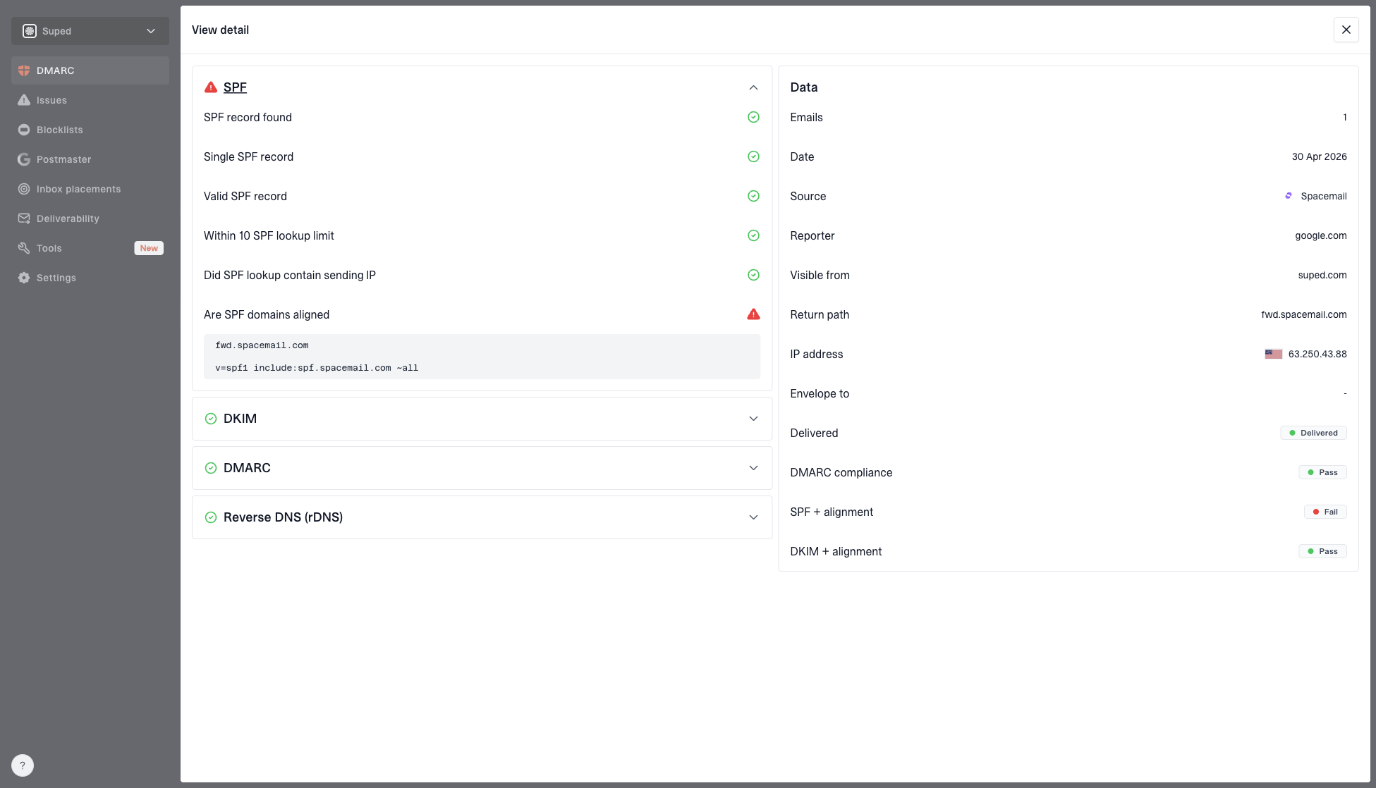
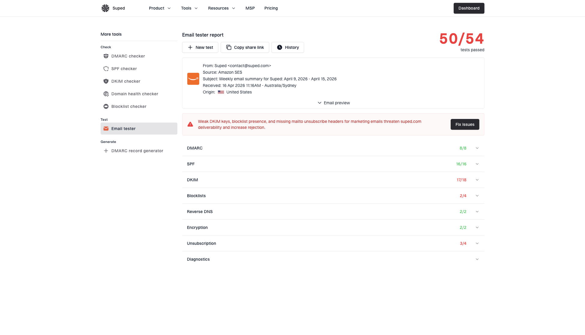
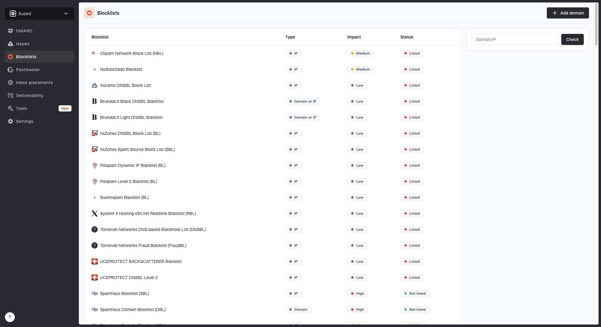
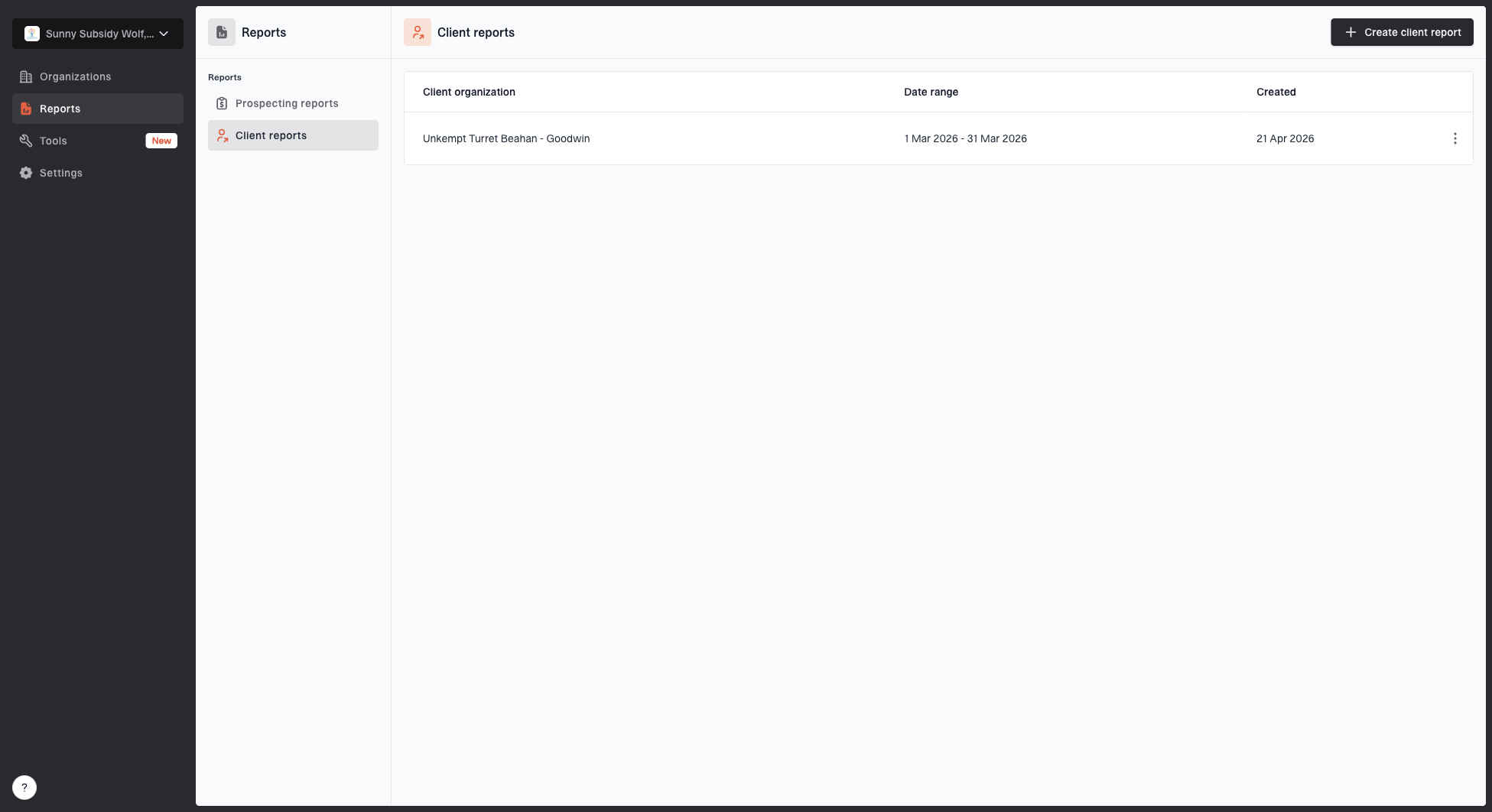
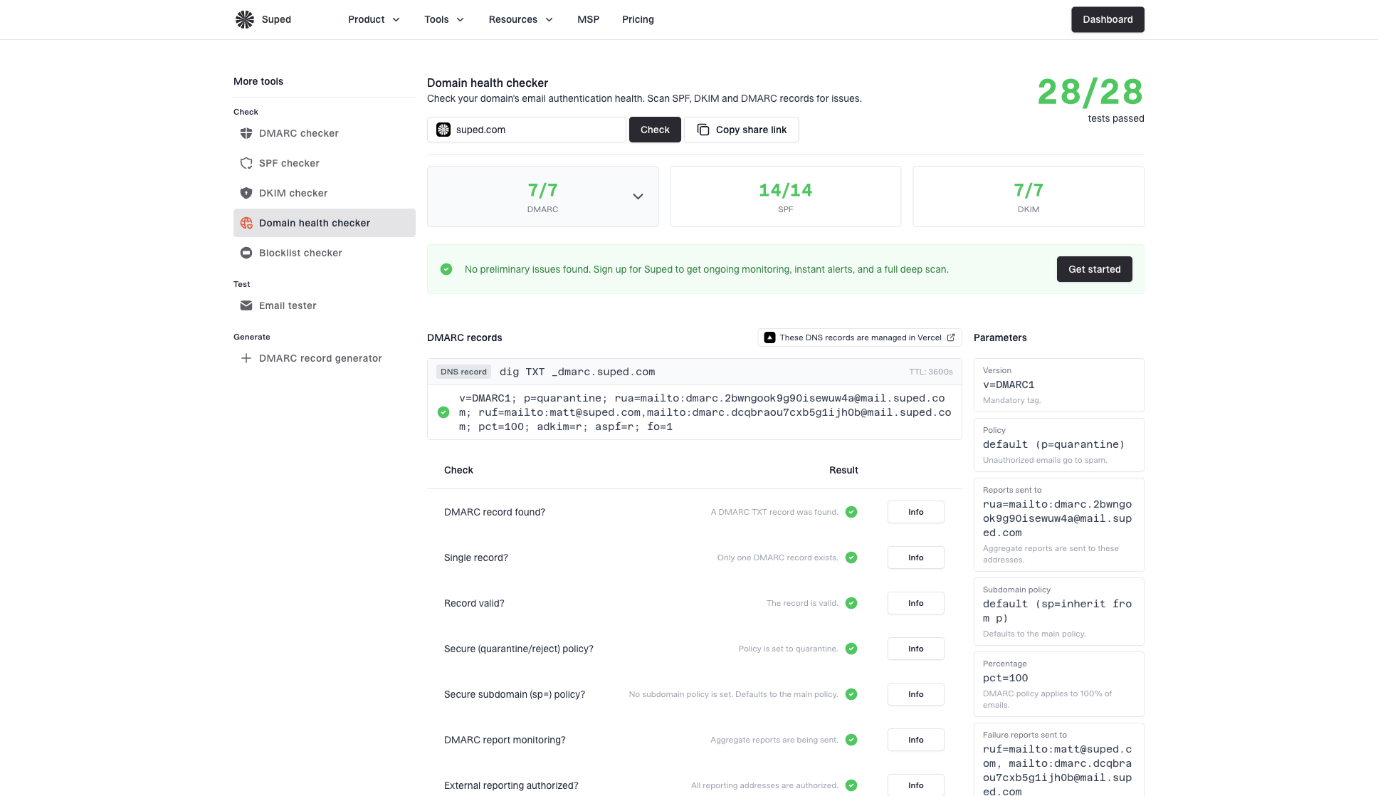
Product screenshots
Product screenshots from the docs library. Use them for product context, reviews, partner pages, and editorial coverage.