How reliable are email deliverability dashboard colors as indicators of inbox placement?
Matthew Whittaker
Co-founder & CTO, Suped
Published 2 May 2025
Updated 5 Nov 2025
6 min read
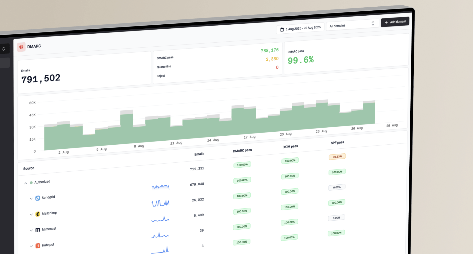
Many email deliverability dashboards simplify complex performance data into easy-to-digest color codes. A vibrant green often signals good health, while red or orange indicates potential issues. This visual shorthand is appealing, offering a quick glance at your email program's status. It can provide a sense of immediate feedback, which is incredibly helpful in a fast-paced marketing environment.
However, the big question remains: how reliable are these colors as true indicators of inbox placement? While they certainly offer a starting point, relying solely on them can be misleading. Email deliverability is a nuanced field, and a dashboard's color might only tell a fraction of the story, potentially masking underlying issues that impact whether your messages actually land in the primary inbox or end up in spam.
The visual appeal versus hidden complexities
The allure of a green dashboard is undeniable. It provides immediate reassurance that your email campaigns are seemingly on track. This visual simplicity is designed for quick interpretation, allowing marketers and senders to assess general email flow without diving into granular details. For many, a consistent green is the ultimate goal, signifying success.
Despite their appeal, these colors often represent broad delivery rates rather than precise inbox placement. An email might be delivered to the recipient's mail server, but still land in a spam folder or promotions tab. This crucial distinction between email deliverability and inbox placement is often blurred by simplified color indicators. A green light on the dashboard doesn't guarantee your message reached the primary inbox, where it has the highest chance of being seen and engaged with.
True insight into where your emails land requires looking beyond a single color. It means examining the specific metrics that contribute to a mailbox provider's decision to place an email in the inbox, spam, or elsewhere. These factors are far more granular and tell a more accurate story than any dashboard color could.
Decoding the metrics behind the hues
So, what do these dashboard colors truly signify? In many cases, they reflect whether your emails were accepted by the receiving mail server. This acceptance is the first hurdle in email delivery. However, after acceptance, a complex array of filters and algorithms determines the final destination of your email within the recipient's mailbox. This is where the simple color code often falls short.
To truly understand your inbox placement, you need to dig into metrics like engagement rates, spam complaint rates, and bounce rates. A high rate of spam complaints (even below 0.1%), low email engagement thresholds, or an increase in hard bounces can severely impact your sender reputation, pushing future emails to the spam folder, regardless of what a dashboard color suggests. These are the true indicators of your sending health.
It's important to differentiate between merely getting your email accepted by a server and actually getting it into the recipient's primary inbox. The dashboard colors might reflect the former, but the latter requires a deeper analysis of behavioral and technical metrics.
Key indicators for true inbox success
Engagement metrics: Track open rates, click-through rates, and replies to gauge recipient interest. High engagement signals positive sender reputation.
Complaint rates: Closely monitor feedback loops. Even a small number of spam complaints can severely harm your deliverability.
Spam trap hits: Avoid sending to invalid or recycled addresses. Hitting a spam trap can lead to immediate blacklisting.
Blocklist status: Regularly check if your IP or domain is on any major blocklists (or blacklists). Being listed here is a strong indicator of deliverability issues.
A multi-faceted view for accurate assessment
To gain a truly accurate picture of your email deliverability, you must adopt a holistic approach that goes beyond the quick color indicators on a single dashboard. Different mailbox providers and email service providers (ESPs) offer various data points, and consolidating these gives you a more complete understanding.
Leveraging tools like Google Postmaster Tools and Microsoft SNDS provides direct insights from major mailbox providers. Additionally, seed list testing can offer a simulation of where your emails land across various inboxes. DMARC reports provide valuable authentication data, revealing if emails are being rejected or quarantined before they even reach the filtering stage.
Combining these various data points allows you to see patterns and identify specific issues that a simple green, yellow, or red might completely overlook. It's about building a comprehensive understanding rather than relying on a single, potentially oversimplified, indicator.
Dashboard color approach
Primarily relies on visual cues like green, yellow, or red to indicate general delivery status.
Simplicity: Offers a quick, at-a-glance status for high-level monitoring.
Limited insight: Often doesn't differentiate between inbox, promotions, or spam folders.
Lagging indicators: May not reflect real-time issues accurately, especially with complex filtering.
Holistic metrics approach
Involves deep diving into various data points to understand true inbox placement and sender reputation.
Granular data: Provides detailed insights into engagement, complaints, and bounce rates.
Accurate placement: Helps identify if emails land in the primary inbox, promotions, or spam.
Proactive adjustments: Enables timely response to deliverability shifts and avoids potential issues.
Proactive steps for sustained inbox placement
Improving your email deliverability requires continuous effort and a commitment to best practices, irrespective of whether your current dashboard shows a comforting green or a concerning red. Focus on the foundational elements that influence mailbox providers' decisions.
This includes rigorous list hygiene, ensuring your email list is clean and regularly updated to remove inactive or invalid addresses. Proper email authentication, through SPF, DKIM, and DMARC records, is paramount for building trust. Additionally, crafting engaging and relevant content, managing sending volume, and adhering to optimal sending cadences are all critical for long-term inbox placement success.
Regularly performing manual checks, such as looking up your DNS records or testing your email authentication, can provide insights that automated dashboard colors might miss. These technical steps are vital for maintaining a healthy sending reputation and ensuring your emails reach their intended audience.
Sample command for SPF lookupBASH
dig example.com TXT
The full picture of email deliverability
Dashboard colors offer a convenient, high-level overview of email deliverability, providing an initial sense of your email program's health. They can be a good starting point for identifying general trends and flagging obvious issues, making them useful for routine monitoring and quick status checks.
However, relying solely on these visual indicators for true inbox placement is a mistake. The complexities of modern email filtering mean that a holistic approach, combining dashboard insights with deeper dives into engagement metrics, authentication reports, and specialized testing, is essential. Only through a comprehensive understanding of these underlying factors can you truly ensure your emails consistently reach the inbox.
Views from the trenches
Best practices
Responding promptly to throttling from mailbox providers can significantly improve deliverability and throughput.
Continuously monitor all engagement metrics, as a decline can precede larger deliverability issues not immediately visible.
Regularly clean your email lists to remove inactive or invalid recipients to maintain a strong sender reputation.
Implement robust email authentication protocols like SPF, DKIM, and DMARC for better inbox placement.
Common pitfalls
Over-relying solely on dashboard colors for an accurate, complete picture of your actual inbox placement.
Ignoring subtle shifts in key metrics like engagement or bounce rates that indicate impending deliverability problems.
Failing to adjust sending rates when mailbox providers signal throttling, which can lead to poorer reputation.
Neglecting to check for blacklisting (or blocklisting) across various public and private lists regularly.
Expert tips
Analyze the ratio of accepted messages to actual inbox placements, as these two metrics can often diverge.
Understand that dashboard colors usually indicate delivery to the server, not necessarily the recipient's primary inbox.
Even when dashboards show green, continually monitor for signs of filtering or emails going to the spam folder.
Focus on aligning your internal success metrics with objective deliverability data, not just visual dashboard cues.
Marketer view
Marketer from Email Geeks says reacting to throttle responses from mailbox providers, such as Microsoft, and backing off the sending rate resulted in being rewarded with throughput increases, emphasizing that rate matters.
July 2, 2019 - Email Geeks
Marketer view
Marketer from Email Geeks says that dashboard colors definitely provide a sense of relief, regardless of their actual meaning.