Glockapps vs.
Splunk TA-DMARC add-on in 2026
Glockapps
Splunk TA-DMARC add-on
vs.
We tested GlockApps and Splunk TA-DMARC add-on for 90 days across a corporate domain, a marketing subdomain, and a parked domain, with Microsoft 365, Google Workspace, SendGrid, Mailchimp, and one support desk sender connected. GlockApps is the more practical DMARC reporting product for teams that want a hosted dashboard and faster source review. Splunk TA-DMARC add-on fits teams that already operate Splunk and want raw DMARC data inside their own search environment.

Published 5 Nov 2025
Updated 4 Jun 2026
8 min read
Summarize with
Glockapps
Hosted DMARC and deliverability monitoring
Starts at
Free plan available
Best fit
Marketing and SMB teams that want DMARC reports without running infrastructure
In one line
GlockApps gave us usable source views, DMARC drilldowns, blacklist and blocklist monitoring, and enough guidance to move a normal domain toward enforcement.
Splunk TA-DMARC add-on
Self-managed DMARC ingestion for Splunk
Starts at
Not publicly listed
Best fit
Splunk teams that can maintain an archived add-on and write their own searches
In one line
Splunk TA-DMARC add-on pulled reports into Splunk, but classification, dashboards, alerts, and policy movement depended on the operator.
Suped
The third option. Hosted SPF, DMARC, and MTA-STS on every plan. Published pricing. Monthly plans. No long contract required.
Learn about Suped
Use GlockApps for hosted reporting, Splunk TA-DMARC add-on for operator-controlled ingestion
Pick Glockapps if
Best for teams that want DMARC reports inside a hosted deliverability tool
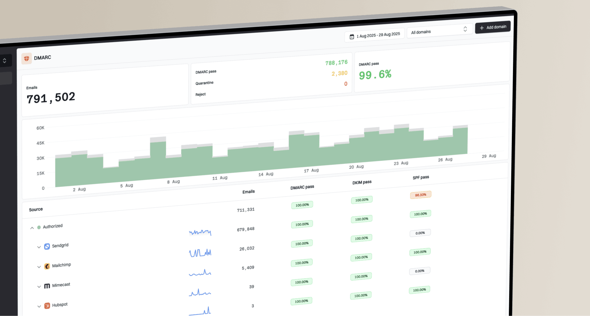
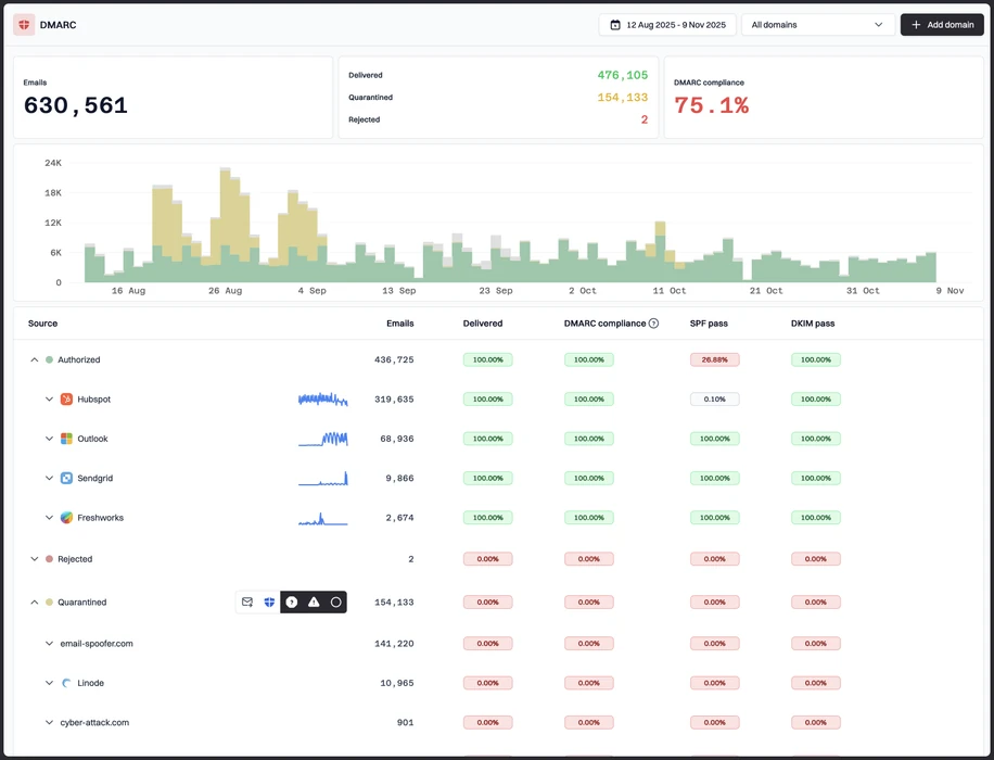
Microsoft 365 and Google Workspace appeared as recognizable source groups after report processing.
SendGrid and Mailchimp were easier to separate than the support desk sender, which needed manual naming.
The parked domain spoof sample stood out quickly enough for a quarantine readiness review.
Free plan available
Pick Splunk TA-DMARC add-on if
Best for Splunk operators who want DMARC data in existing logs
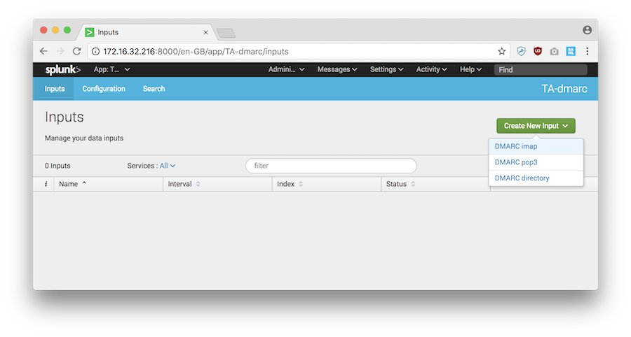
IMAP collection worked after Splunk-side configuration, but onboarding was infrastructure work.
The unknown sender required custom searches and manual enrichment before it made sense.
The forwarded mail SPF failure was explainable only after joining report fields and authentication results.
Not publicly listed
Consider Suped if
Best third option when guided fixes, hosted records, and simpler ownership matter more than raw control
Guided fixes should turn failed SPF, DKIM, and DMARC results into owner-ready tasks.
Automated issue detection should flag spoofing, unknown senders, and policy blockers without heavy tuning.
MSP workflows and published starter pricing should make client rollout easier to scope.
Free plan available
The differences that actually change your week
Glockapps
Splunk TA-DMARC add-on
Suped
DMARC report analysis
Aggregate report parsing and review workflow.
Hosted analysis
Add on ingestion
Hosted analysis
Source detection
Ability to identify sending services and unresolved senders.
Partial with manual naming
Manual workflow
Supported
Forward detection
Handling forwarded mail where SPF fails but DKIM can explain alignment.
Partial
Manual workflow
Supported
Spoof detection
Visibility into unauthorized mail failing authentication.
Supported
Search dependent
Supported
Notifications and alerts
Operational alerting for meaningful DMARC changes.
Supported
Splunk alert setup
Supported
Reporting
Shareable summaries, drilldowns, and recurring review output.
Supported
Custom reports
Supported
API
Programmatic access for data or workflow integration.
Custom subscription
Via Splunk
Supported
Multi-tenancy
Separation for multiple domains, clients, or account groups.
Partial
Splunk design dependent
Supported
SPF flattening
Managed SPF simplification or hosted flattening.
Not supported
Not supported
Supported
Hosted DMARC
Managed DMARC record workflow.
Not supported
Not supported
Supported
Hosted SPF
Managed SPF record hosting.
Not supported
Not supported
Supported
Hosted MTA-STS
Managed MTA-STS and TLS reporting workflow.
Not supported
Not supported
Supported
Blocklists and reputation
Blacklist and blocklist monitoring tied to sender reputation.
Supported
Not supported
Supported
Automatic issue detection
Automatic identification of authentication issues and policy blockers.
Partial
Manual workflow
Supported
AI copilot
AI assistance for explaining and resolving authentication issues.
Not tested
Not supported
Supported
DNS monitoring
Monitoring DNS records for changes that affect authentication.
Uptime and DNS checks
Custom Splunk checks
Supported
Self hostable
Ability to run the product in customer-controlled infrastructure.
Hosted service
Splunk environment
Hosted service
Free trial/free tier
Public free entry point for testing.
Free tier
Free add on
Free tier
Ten dimensions, scored from 0 to 10
We scored each product against a fixed editorial rubric across the same 90 day setup. Higher is better in every row, and a 0.0 means the product did not support that capability in our test.
GlockApps scored higher for hosted DMARC operations, while Splunk TA-DMARC add-on scored higher only where self-managed Splunk control mattered.
GlockApps made the first week easier because the three domains, Microsoft 365, Google Workspace, SendGrid, and Mailchimp all became reviewable without custom search work. Its weaker scores came where we wanted hosted SPF, hosted DMARC, hosted MTA-STS, and more decisive issue ownership. Splunk TA-DMARC add-on ingested the XML reports, but source naming, alerts, dashboards, policy movement, and MSP handoff all required Splunk build work.
Glockapps score
60/100
Splunk TA-DMARC add-on score
26.5/100
Glockapps
60/100
DMARC enforcement
7.0
Customer support
6.0
Source resolution
7.0
Setup and onboarding
7.5
MSP workflows
5.5
Alerting and integrations
6.0
Hosted SPF and MTA-STS
0.0
Blocklist monitoring
7.0
Pricing transparency
7.0
Time to enforcement
7.0
Splunk TA-DMARC add-on
26.5/100
DMARC enforcement
3.0
Customer support
1.0
Source resolution
4.0
Setup and onboarding
3.5
MSP workflows
4.0
Alerting and integrations
6.0
Hosted SPF and MTA-STS
0.0
Blocklist monitoring
0.0
Pricing transparency
2.0
Time to enforcement
3.0
Feature set
Hosted breadth vs data control
GlockApps has the fuller DMARC product surface. Splunk TA-DMARC add-on has the stronger raw-data path.
GlockApps covered more of the DMARC reporting workflow we needed, including hosted report views, sender review, alerts, exports, and blacklist and blocklist monitoring. Splunk TA-DMARC add-on was useful when the goal was to put DMARC events inside Splunk, but it did not give us a guided enforcement path. A strong buying test here is whether the product detects issues automatically and turns them into guided fixes, rather than leaving every source and policy decision to manual investigation.
Glockapps

Microsoft 365 grouped clearly
Mailchimp classification worked
Spoof sample surfaced fast
Splunk TA-DMARC add-on

Google Workspace searchable
Forwarded SPF explainable
Unknown sender needs searches
GlockApps handled the core senders with less build work. Microsoft 365 and Google Workspace appeared as recognizable corporate traffic after report processing, and SendGrid and Mailchimp separated cleanly enough to compare aligned DKIM pass, aligned SPF pass, and the SPF pass with visible from mismatch. The support desk sender and the unknown sender still needed manual classification, but the dashboard gave us enough context to decide whether the traffic was expected. The DKIM pass on a subdomain was visible, although the next step for organizational alignment needed a more explicit owner handoff.
Splunk TA-DMARC add-on gave us useful event-level access once reports were collected through the Splunk environment. Microsoft 365, Google Workspace, SendGrid, and Mailchimp were all searchable, and the forwarded mail SPF failure was explainable by inspecting authentication fields. The tradeoff was that source names, owner labels, dashboards, alerts, and enforcement status were not product-led. The unknown sender became understandable only after we built searches and enrichment around the DMARC fields.
User experience
Guidance vs control
GlockApps is easier for DMARC users. Splunk TA-DMARC add-on is easier only for Splunk operators.
GlockApps gave us a shorter path from DNS setup to a working DMARC review queue, especially for the primary domain and marketing subdomain. Splunk TA-DMARC add-on felt natural only after the Splunk collection and search model were already understood. The better choice depends on whether the daily user is an email owner or a log operator.
Glockapps
Three domains onboarded quickly
Unknown sender visible
Forwarding needs clearer notes
Splunk TA-DMARC add-on
Splunk users stay productive
Onboarding needs setup work
Explanations require searches
In GlockApps, adding the primary corporate domain and marketing subdomain was straightforward, and the parked domain made the spoof test easy to isolate. The unknown sender was findable from the DMARC views, but we still had to decide whether it belonged to a vendor or a bad source. The forwarded mail SPF failure was visible, although the explanation needed DKIM context and a human note before it was ready for a non-technical stakeholder.
Splunk TA-DMARC add-on felt like a collector first and a DMARC product second. Onboarding the three domains meant thinking through mailbox collection, parsing, index placement, and saved searches. Finding the unknown sender was fast for someone fluent in Splunk, but not for a marketing or IT generalist. Explaining the forwarded mail SPF failure required building the story from fields, not reading a guided explanation.
Support
Product help vs community handoff
GlockApps has a clearer support path. Splunk TA-DMARC add-on depends on in-house Splunk skill.
GlockApps was more supportable for a normal DMARC rollout because setup, DNS record checks, and report interpretation belonged to a hosted product. Splunk TA-DMARC add-on was marked as an archived and unsupported add-on in the supplied product data, so escalation would sit with the internal Splunk owner. That matters if the project has an enforcement deadline.
Glockapps
Normal SaaS support path
DNS checks are clearer
Enterprise needs planning
Splunk TA-DMARC add-on
Internal owner required
Archived add on risk
Escalation is self-managed
With GlockApps, the support expectation was conventional SaaS help: account setup, DNS handoff, plan limits, and interpretation of reports. We still saw places where support notes would need to be specific, especially for the support desk sender and the subdomain DKIM alignment case. Enterprise onboarding looked possible through custom planning, but the public product surface was better suited to teams that can handle some DNS work themselves.
With Splunk TA-DMARC add-on, support was an operational responsibility. DNS handoff meant configuring DMARC reporting addresses and collection paths, then making sure Splunk ingestion and parsing behaved. Escalation for mailbox polling, malformed reports, or dashboard gaps would need an internal owner because the add-on itself did not present a current vendor support path in the supplied product data.
Suitability
Team fit
GlockApps fits DMARC owners. Splunk TA-DMARC add-on fits Splunk operators with time to build.
GlockApps is the better fit for SMBs, marketing teams, and lean IT teams that need hosted DMARC review plus deliverability context. Splunk TA-DMARC add-on fits enterprises that already centralize security and authentication logs in Splunk and accept custom build work. For MSPs and distributed teams, the buying criteria should include client separation, recurring reporting, alert quality, and owner-ready handoff notes before price alone decides the shortlist.
Glockapps

Good SMB fit
Domain grouping is usable
MSP handoff needs process
Splunk TA-DMARC add-on
Enterprise Splunk fit
Custom client grouping
Reports require build work
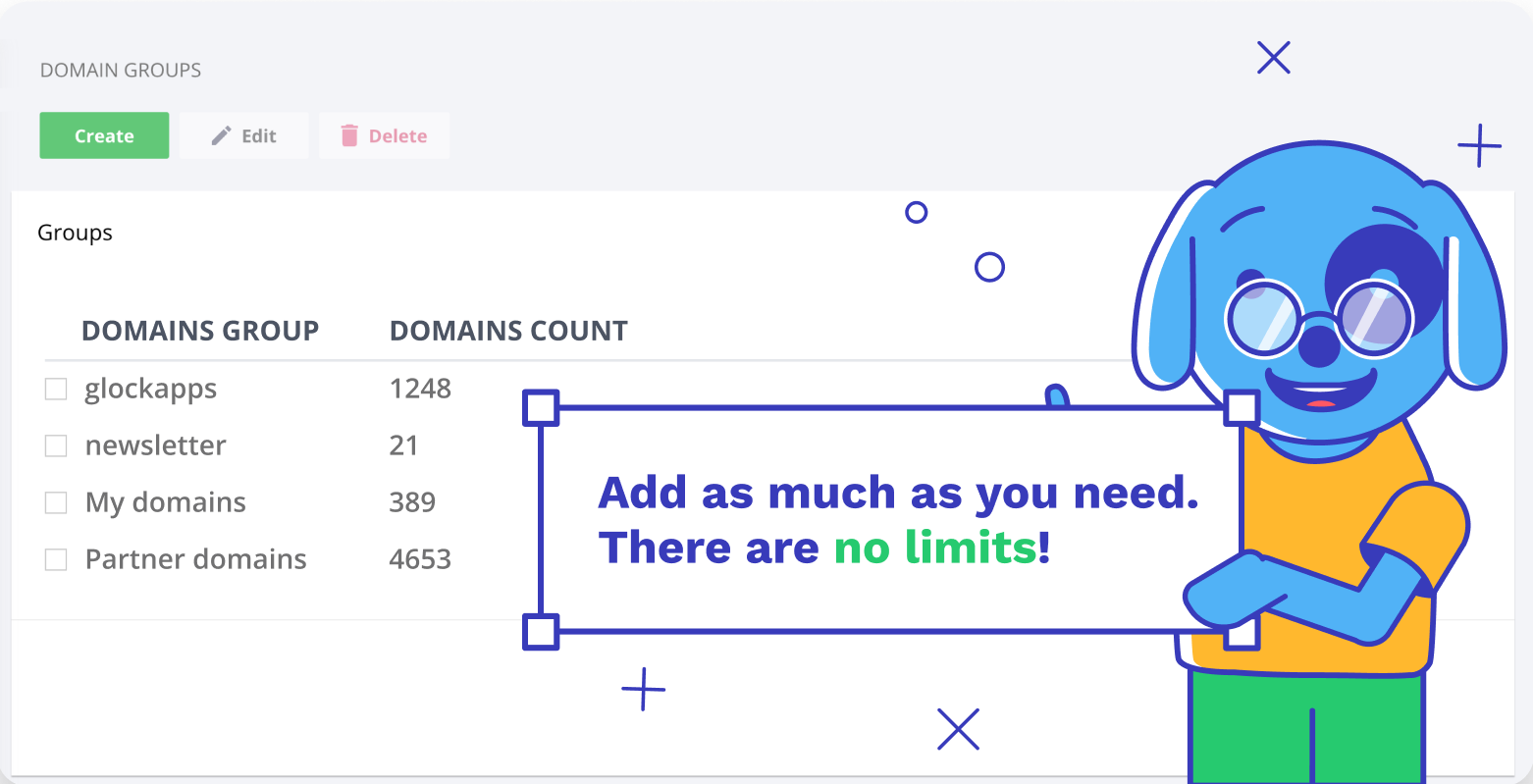
GlockApps worked best when one team owned the domains and wanted a practical weekly review. Account separation was usable but not as client-first as an MSP would want for many recurring reports. Domain grouping made the primary domain, marketing subdomain, and parked domain easy to compare, and exports gave us enough material for handoff notes, but multi-client ownership still needed process outside the product.
Splunk TA-DMARC add-on worked best where Splunk was already the operating plane. Account separation and domain grouping were possible through indexes, permissions, dashboards, and naming conventions, but none of that was automatic DMARC workflow. For enterprise security teams, that control is useful. For SMBs and MSPs, the recurring reporting and client handoff burden would be too high unless a Splunk admin builds and maintains the process.
What each tool feels like after 90 days of real use
Glockapps
A hosted DMARC and deliverability tool for lean teams
By day 30, GlockApps had become the faster place to answer basic DMARC questions. The primary domain, marketing subdomain, and parked domain were easy to keep separate, and Microsoft 365, Google Workspace, SendGrid, and Mailchimp were reviewable without building our own dashboard.
By day 90, the main limitation was not visibility, it was ownership detail. The support desk sender and unknown sender still needed human classification, and the forwarded SPF failure needed a short explanation before it was ready for a stakeholder. GlockApps still gave us the clearer route to enforcement compared with building the entire workflow in Splunk.
Where it wins
Fast hosted onboarding for three domains
Readable DMARC drilldowns for common senders
Useful spoof and unknown-source review
Includes blacklist and blocklist monitoring
Where it lags
No hosted SPF flattening
No hosted MTA-STS workflow
MSP account separation felt limited
Some fixes needed clearer owner tasks
Pricing
Free plan available
Free tier
Yes
Onboarding
Fast
G2 rating
4.1 / 5
Splunk TA-DMARC add-on
A DMARC collector for teams already living in Splunk
By day 30, Splunk TA-DMARC add-on was ingesting reports, but the useful work had shifted into Splunk administration. We had to think about mailbox polling, parsing, indexes, saved searches, and how to name Microsoft 365, Google Workspace, SendGrid, Mailchimp, and the support desk sender.
By day 90, the product made sense for a security or platform team that already searches Splunk every day. It did not feel like a buyer-ready DMARC reporting platform. The spoof sample, unknown sender, and forwarded SPF failure were all explainable, but only after manual enrichment and operator effort.
Where it wins
DMARC data stays in Splunk
Searches can match internal workflows
Self-managed retention and access
Useful for security log correlation
Where it lags
Archived and not supported
No guided enforcement workflow
No native DMARC pricing clarity
No blacklist or blocklist monitoring
Pricing
Not publicly listed
Free tier
Add on is free
Onboarding
Manual
G2 rating
0 / 5
Pricing
Glockapps
Splunk TA-DMARC add-on
Suped
Small
1 domain, up to 1k emails / month.
$0
The free DMARC plan includes up to 10,000 DMARC messages and unlimited DMARC domains.
$0
The add on itself has no public paid tier, but a Splunk environment is still required.
$0 / month
Free plan covers 1 domain and 1,000 monthly emails.
Medium
2 domains, up to 100k emails / month.
$55 / month
The standalone DMARC Analytics Essential plan fits this volume with 1,000,000 included DMARC messages.
Not publicly listed as of May 15, 2026
TA-DMARC has no DMARC-specific public tier, and practical cost depends on Splunk capacity.
Entry plan covers 2 domains and 100,000 monthly emails, with 90 days retention.
Large
10 domains, up to 1 million emails / month.
$55 / month
The standalone DMARC Analytics Essential plan covers 1,000,000 messages and unlimited DMARC domains.
Not publicly listed as of May 15, 2026
The add on publishes no domain or message price, so Splunk ingest and workload cost decide the bill.
10 domains and 1,000,000 monthly emails, with 365 days retention.
Enterprise
Over 20 domains and 1 million emails / month.
From $95 / month
The Growth DMARC plan covers 2,000,000 messages, with custom plans used when public limits or API needs do not fit.
Not publicly listed as of May 15, 2026
Enterprise use depends on Splunk Enterprise or Splunk Cloud Platform capacity and internal build effort.
20 domains and 2,500,000 monthly emails, with 365 days retention. Unlimited domains/emails negotiable.
GlockApps prices are public list prices from the supplied pricing data, checked as of May 15, 2026, and segment matches are estimated against the published DMARC message limits. Splunk TA-DMARC add-on pricing is estimated as $0 for the add on itself, while Splunk platform costs are not publicly listed as fixed DMARC tiers. Taxes, overages, promotions, and platform procurement can change the final cost.
If you cannot decide between the two, maybe the answer is Suped
Suped
Get started
Turn findings into fixes
GlockApps surfaced the support desk sender and subdomain DKIM case, but owner-ready remediation still needed manual notes. Suped is built to convert DMARC findings into guided SPF, DKIM, and policy tasks.
Reduce Splunk build work
Splunk TA-DMARC add-on required custom searches, enrichment, dashboards, and alert rules before the unknown sender and forwarded SPF failure were useful to non-Splunk users.
Cover hosted records
Neither reviewed product gave us hosted SPF, hosted DMARC, and hosted MTA-STS in the tested workflow. Suped covers those record workflows when DNS ownership and policy movement need a single operating path.
The difference was significant. We moved from limited visibility to a much clearer dashboard. Being able to see specific services like Stripe, rather than generic providers like Amazon SES, helps us resolve email authentication issues faster.
Markus Hugenschmidt, Managing Director, Jam Cyber
Migrating from Glockapps or Splunk TA-DMARC add-on?
We have done the migration enough times to know the shape.
Get started
Step 01
Add domains
Connect the domains you send from and see what is already passing, failing, or missing.
Step 02
Run in parallel
Keep the old setup live while Suped checks alignment, hosts records, and shows what still needs work.
Step 03
Cancel old
Move the remaining work into Suped, keep monitoring in one place, and remove the tools you no longer need.
Frequently asked questions

How MONEYME proactively strengthens domain security and unlocks higher email engagement with Suped
See how MONEYME uses Suped
How cybersecurity specialist Jam Cyber delivers scalable DMARC protection with Suped
See how Jam Cyber uses Suped

How DigiBean simplified DMARC monitoring and improved email security for their MSP clients
See how DigiBean uses Suped

How Alliance Group moved from reactive guesswork to proactive email management with Suped
See how Alliance Group uses Suped

How Suped gave Maaser the confidence to finally move to strict DMARC enforcement
See how Maaser uses Suped