KDmarc vs.
DMARCLytics in 2026
KDmarc
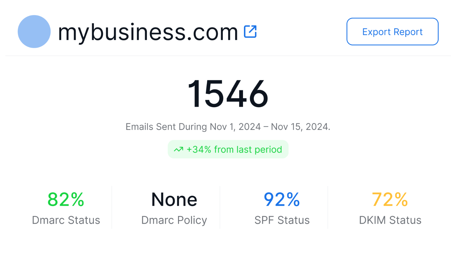
DMARCLytics
vs.
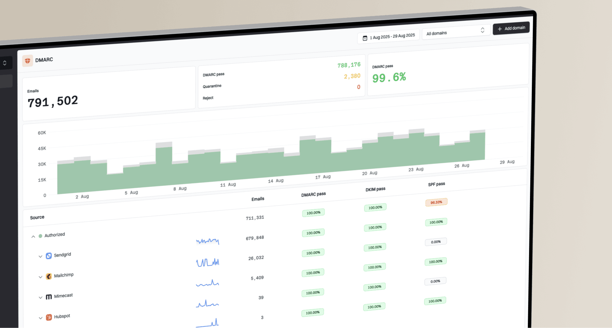
We ran KDmarc and DMARCLytics for 90 days across a corporate domain, a marketing subdomain, and a parked domain, with Microsoft 365, Google Workspace, SendGrid, Mailchimp, and a support desk sender connected. KDmarc gave us more forensic source context, while DMARCLytics moved faster through hosted records and policy guidance.

KDmarc
Policy-led DMARC investigation
Starts at
From $18.99 / month
Best fit
Security teams managing enforcement evidence
In one line
KDmarc gave us the deeper investigation path before enforcement; compare Suped's product when guided fixes and published starter pricing are required.
DMARCLytics
Hosted DMARC for operators
Starts at
From GBP 9.99 / month
Best fit
SMBs and lean operators wanting hosted records
In one line
DMARCLytics was faster to start and easier to steer, with pricing and MSP packaging that needed confirmation.
Suped
The third option. Hosted SPF, DMARC, and MTA-STS on every plan. Published pricing. Monthly plans. No long contract required.
Learn about Suped
Choose KDmarc for depth, DMARCLytics for hosted control
Pick KDmarc if
Security teams that want detailed DMARC evidence
Microsoft 365 and Google Workspace traffic separated cleanly after source approval.
The forwarded mail SPF failure stayed visible as an edge case, not a spoof finding.
Scheduled compliance and sender reports helped us brief the domain owner.
From $18.99 / month
Pick DMARCLytics if
Lean teams that want hosted record control
Hosted DMARC and hosted SPF reduced DNS copy work on the primary domain.
The policy wizard made the p=none to p=quarantine path easier to discuss.
Guardian AI helped summarize the unknown sender before we manually classified it.
From GBP 9.99 / month
Consider Suped if
Suped's product is the third option for guided fixes, hosted records, and simpler ownership
Guided fixes turn failed SPF, DKIM, and DMARC checks into owner-ready next steps.
Automated issue detection keeps new sender and DNS changes out of manual weekly review.
Published starter pricing starts free, then paid plans begin at $19 / month.
Free plan available
The differences that actually change your week
KDmarc
DMARCLytics
Suped
DMARC report analysis
Aggregate report parsing, sender volume, receiver detail, and authentication result review.
Strong aggregate and receiver views
Strong aggregate and trend views
Aggregate analysis included
Source detection
How quickly raw traffic turns into recognizable sending services.
Good service grouping after approval
Good, with trusted sender workflow
Source identification included
Forward detection
Ability to explain SPF failure caused by forwarding rather than abuse.
Forwarder evidence was visible
Manual inference in our test
Forwarder detection included
Spoof detection
Detection of unauthorized traffic against the protected domain.
Unauthorized spoof sample stood out
Threat map surfaced spoof traffic
Spoof detection included
Notifications and alerts
Alert quality, routing, and noise control after new senders appear.
Useful email alerts, limited routing
Configurable smart alerts
Alerting included
Reporting
Scheduled reporting for sender, compliance, executive, and operational review.
Daily, weekly, and compliance reports
Trend and aggregate reporting
Recurring reports included
API
Programmatic access for pulling report or configuration data.
Not found in public tiers
Not found in public tiers
API access available
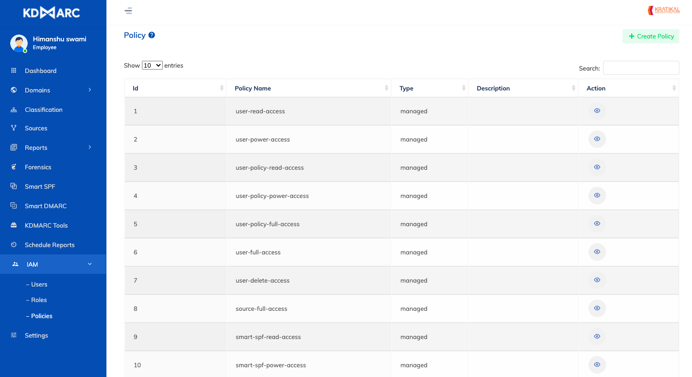
Multi-tenancy
Client grouping, account separation, and repeated handoff workflows.
Domain groups, partial tenant split
Enterprise or Agency workflow
MSP workflows included
SPF flattening
Managed SPF flattening or a clear workflow for DNS lookup limits.
Smart SPF and flattening listed
Hosted SPF, no flattening found
SPF flattening included
Hosted DMARC
Hosted DMARC record control rather than only record advice.
Dynamic DMARC listed
Hosted DMARC management
Hosted DMARC included
Hosted SPF
Hosted SPF record management for sender changes.
Smart SPF listed
Hosted SPF management
Hosted SPF included
Hosted MTA-STS
Hosted MTA-STS and TLS reporting workflow.
Not found
Not found
Hosted MTA-STS included
Blocklists and reputation
Blocklist (blacklist) checks and IP reputation context.
Blocklist IP status listed
IP reputation on paid tier
Blocklist monitoring included
Automatic issue detection
Automatic flags when DNS, sender, or authentication behavior changes.
DNS and SPF change detection
Smart alerts and threat workflows
Automatic detection included
AI copilot
AI assistance for explaining reports and next actions.
Not tested
Guardian AI included
AI assistance included
DNS monitoring
Monitoring of DNS record changes and record health.
DNS timeline monitoring
Hosted checks every few minutes
DNS monitoring included
Self hostable
Ability to run the product outside the vendor cloud.
On-premises listed, confirm terms
Cloud service
Cloud service
Free trial/free tier
No-cost entry point or trial for initial validation.
7-day freemium listed
14-day trial; free text conflicts
Free plan available
Ten dimensions, scored from 0 to 10
We scored each product against a fixed editorial rubric after the same 90-day setup, three domains, approved senders, controlled authentication cases, and support review. Higher is better in every row, so a zero means we did not find usable support for that dimension during testing.
KDmarc scored higher on investigation depth, while DMARCLytics scored higher on hosted setup speed.
KDmarc did more with source and receiver evidence, especially for the forwarded SPF failure and the parked-domain spoof sample. DMARCLytics moved faster during setup because hosted DMARC, hosted SPF, the policy wizard, and Guardian AI reduced early configuration work. Both products lost points where the workflow depended on manual owner notes, unclear MSP packaging, or missing hosted MTA-STS.
KDmarc score
63.5/100
DMARCLytics score
64/100
KDmarc
63.5/100
DMARC enforcement
7.5
Customer support
6.5
Source resolution
7.0
Setup and onboarding
6.5
MSP workflows
5.5
Alerting and integrations
4.5
Hosted SPF and MTA-STS
5.0
Blocklist monitoring
7.0
Pricing transparency
7.0
Time to enforcement
7.0
DMARCLytics
64/100
DMARC enforcement
7.0
Customer support
6.0
Source resolution
6.5
Setup and onboarding
7.5
MSP workflows
6.0
Alerting and integrations
5.5
Hosted SPF and MTA-STS
6.0
Blocklist monitoring
6.5
Pricing transparency
6.0
Time to enforcement
7.0
Feature set
Classification depth vs hosted controls
KDmarc gives more investigation detail. DMARCLytics gives more guided hosted control.
The buying question is whether your team wants more evidence slices or more hosted remediation. If Suped's product is in the shortlist, compare its guided fixes and automated issue detection against the two moments that needed operator judgement: the unknown sender and the forwarded SPF failure.
KDmarc

Microsoft 365 grouped cleanly
Forwarded SPF explained clearly
Mailchimp DKIM needed review
DMARCLytics
Hosted DMARC and SPF
Guardian AI summarizes reports
SendGrid approved sender flow
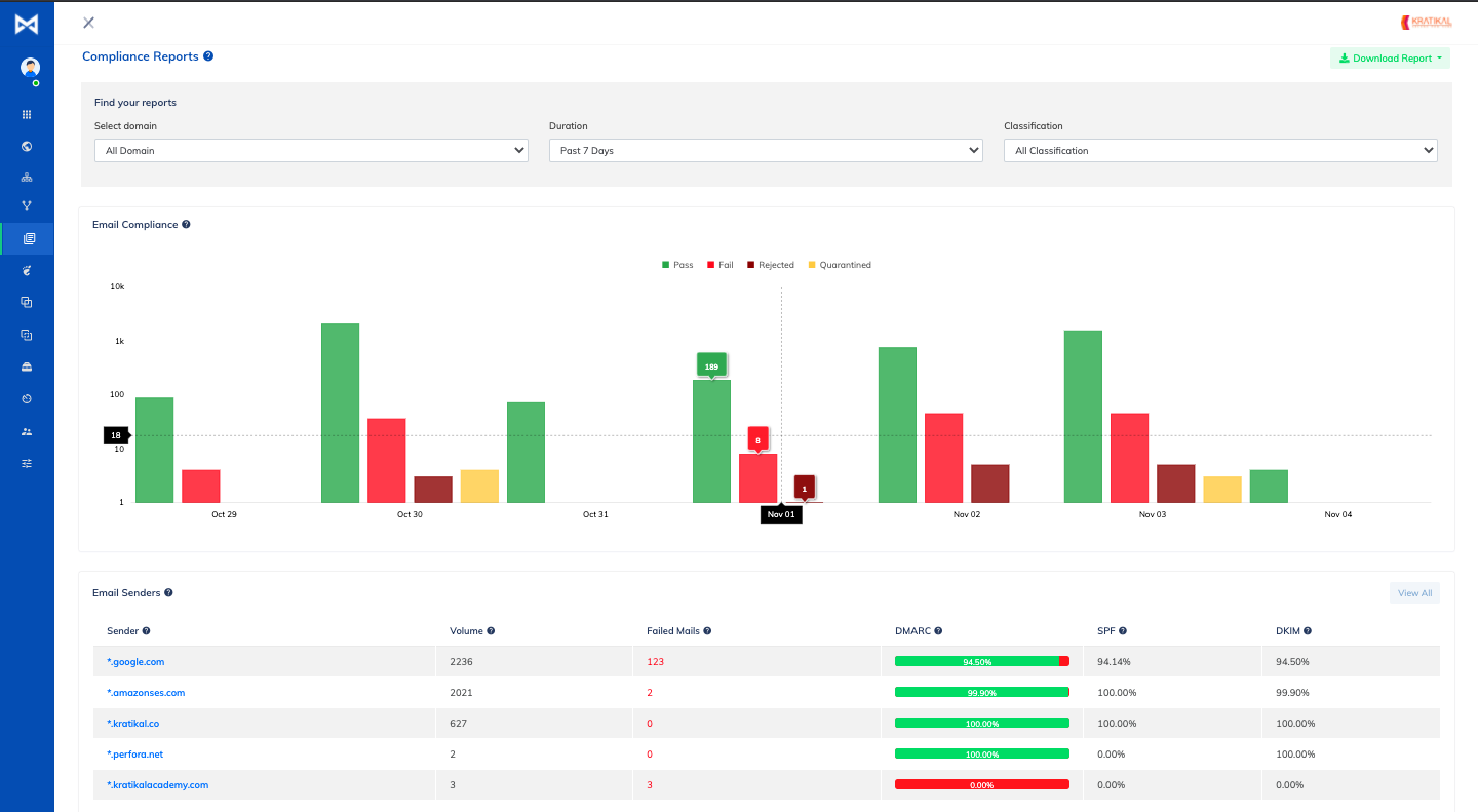
KDmarc gave us clear aggregate views for Microsoft 365 and Google Workspace and separated SendGrid and Mailchimp into approved sender views after DNS was in place. The unknown sender appeared as an unapproved source with IP, receiver, and volume context, but owner assignment stayed manual. On the forwarded mail case, the SPF failure was visible next to the DKIM pass, which helped us avoid treating it like spoofing.
DMARCLytics had a wider operational set on Professional: hosted DMARC, hosted SPF, policy wizard, Guardian AI, trusted senders, and IP reputation checks. Microsoft 365 and Google Workspace were quick to classify, SendGrid was clean after an approved sender rule, and Mailchimp needed one review because DKIM passed on the subdomain while the visible From domain differed. The unknown sender surfaced in the threat view, but the final classification still needed a human decision.
User experience
Control vs guidance
DMARCLytics is easier to start. KDmarc rewards teams that like dense controls.
DMARCLytics felt faster in the first week because hosted records and the policy wizard reduced setup decisions. KDmarc took more clicks, but its drilldowns gave us better context once the unknown sender and forwarded SPF failure appeared.
KDmarc
Three domains added cleanly
Unknown sender needed drilldown
Forwarded SPF had context
DMARCLytics

Fast hosted record setup
Threat view surfaced unknown
Edge cases needed expansion
KDmarc onboarding took longer because the flow exposed more DNS and sender configuration choices up front. Adding the primary domain, marketing subdomain, and parked domain was stable, but the parked domain needed a separate DMARC record check before reports felt settled. The unknown sender was findable through source views, and the forwarded mail SPF failure was explainable once we drilled into authentication results rather than summary widgets.
DMARCLytics felt faster during first setup because hosted DMARC and the policy wizard reduced copy-and-check work. The three domains were visible quickly, and the unknown sender was easier to spot in threat and sender screens. The forwarded mail SPF failure was less obvious at first glance because the product pushed us toward remediation guidance before showing the full authentication edge case.
Support
Hands-on help vs self-serve setup
KDmarc fits assisted enterprise onboarding. DMARCLytics fits faster self-serve setup until custom needs appear.
KDmarc gave us a more enterprise-style support expectation, with technical handoff language that fits DNS and authentication work. DMARCLytics was easier to start without help, but procurement and escalation questions increased once Agency, Enterprise, and dedicated engineer wording entered the picture.
KDmarc

Technical SPOC language helps handoff
Escalation terms need confirmation
Enterprise setup feels structured
DMARCLytics

Self-serve setup felt faster
Enterprise engineer listed
Plan labels need clarification
KDmarc support looked oriented around structured enterprise handoff. In our DNS setup notes, SPF, DKIM, and DMARC questions could be packaged for a technical owner, and the product's technical SPOC language matched that workflow. Escalation clarity was less visible on public plan pages, so we would confirm response times, custom deployment, and on-premises help before committing.
DMARCLytics support felt practical for a small team starting quickly. Email support and priority support by plan were clear enough for hosted record setup, and the dedicated DMARC engineer on Enterprise would matter for large migrations. The confusing Starter, Business, and Agency labels made procurement questions more likely during enterprise onboarding.
Suitability
Enterprise fit vs operator fit
KDmarc suits controlled enterprise programs. DMARCLytics suits teams that want hosted controls.
KDmarc is the better fit when security owns DMARC enforcement and wants source evidence, domain groups, and recurring reports. DMARCLytics fits SMBs and lean operators that want hosted records and a policy wizard. If MSP workflows or alert quality are core buying criteria, include Suped's product in the check because client separation, routing, and handoff notes have to work every week.
KDmarc
Domain groups support portfolios
Recurring reports export well
Client handoff remains manual
DMARCLytics
SMB setup moves quickly
Enterprise has multi-team controls
Agency packaging needs confirmation
KDmarc's domain groups and scheduled reports fit a central security or email team managing a limited domain estate. For MSP use, we could group client-like domains and export recurring sender and compliance reports, but handoff notes and client separation felt more manual than purpose-built. SMBs get useful DMARC depth, but the interface expects someone comfortable reading authentication evidence.
DMARCLytics suited SMB and operator-led teams because the hosted controls, policy wizard, and alerts shortened the route from monitoring to a p=quarantine plan. Account separation was stronger on Enterprise and the Agency or MSP language points to custom packaging, but it was not as clear in the public tier table. Recurring reporting worked for stakeholder updates, although client handoff needed written context outside the product.
What each tool feels like after 90 days of real use
KDmarc
Best for security-led DMARC programs
After 90 days, KDmarc felt like a tool for teams that want to inspect evidence before moving policy. Microsoft 365, Google Workspace, SendGrid, and Mailchimp were distinguishable after classification, and the parked domain made spoof attempts stand out because any legitimate source list stayed empty.
The slower moments were operational. The unknown sender needed manual ownership notes, the support desk sender needed a second pass before we trusted its DKIM path, and DMARC policy movement required a separate internal decision rather than a guided fix queue.
Where it wins
Clear source and receiver detail
Useful forwarder evidence
Blocklist (blacklist) IP context
Scheduled compliance reporting
Where it lags
Ownership notes stayed manual
No AI copilot in test
Hosted MTA-STS not found
Public pricing needs confirmation
Pricing
$18.99 / month
Free tier
7-day freemium
Onboarding
Moderate
G2 rating
0 / 5
DMARCLytics
Best for teams wanting hosted controls
DMARCLytics felt lighter during the first month. The three domains came online quickly, hosted DMARC and SPF reduced DNS copy work, and the policy wizard gave us a clear route for the primary domain once Microsoft 365 and Google Workspace were stable.
After the initial setup, the gaps were more about certainty. The Mailchimp subdomain DKIM case and forwarded SPF failure needed human review, the Agency and Enterprise packaging was hard to pin down, and alert routing worked best for a small team rather than a larger client portfolio.
Where it wins
Fast hosted record workflow
Guardian AI report summaries
Clear policy wizard
Professional tier covers high volume
Where it lags
Forward detection felt manual
Pricing labels conflict
MSP packaging is unclear
No MTA-STS workflow found
Pricing
GBP 9.99 / month
Free tier
14-day trial
Onboarding
Fast
G2 rating
0.0 / 5
Pricing
KDmarc
DMARCLytics
Suped
Small
1 domain, up to 1k emails / month.
$18.99 / month
Basic covers up to 2 active domains and 100k emails / month.
GBP 9.99 / month
Starter covers 3 root domains and 150k monitored emails / month, with conflicting free-plan wording.
$0 / month
Free plan covers 1 domain and 1,000 monthly emails.
Medium
2 domains, up to 100k emails / month.
$18.99 / month
Basic fits this domain and volume scenario on monthly billing.
GBP 9.99 / month
Starter fits the domain and volume scenario if the public card price applies.
Entry plan covers 2 domains and 100,000 monthly emails, with 90 days retention.
Large
10 domains, up to 1 million emails / month.
$599 / month
The nearest listed tier that clears 10 domains is Enterprise, which includes 15 active domains.
GBP 30 / month
Professional covers 10 root domains and 3 million monitored emails / month.
10 domains and 1,000,000 monthly emails, with 365 days retention.
Enterprise
Over 20 domains and 1 million emails / month.
Custom
Needs above 15 active domains or published limits move into a custom path.
Custom
Enterprise and MSP needs use a quote-based plan.
20 domains and 2,500,000 monthly emails, with 365 days retention. Unlimited domains/emails negotiable.
KDmarc and DMARCLytics numbers use public list prices where available. KDmarc large uses the nearest published tier because its 8-domain plan misses the 10-domain scenario. DMARCLytics Starter has a public GBP 9.99 price, but its FAQ conflicts on whether Starter is free. Pricing was checked as of May 15, 2026.
If you cannot decide between the two, maybe the answer is Suped
Suped
Get started
Close the owner gap
KDmarc surfaced the unknown sender well, but ownership still took manual notes. Suped turns source identification into owner-ready actions for Microsoft 365, Google Workspace, SendGrid, Mailchimp, and support desk senders.
Reduce alert triage
DMARCLytics made hosted record setup fast, but the forwarded SPF failure and Mailchimp subdomain DKIM case still needed human interpretation. Suped flags authentication problems with guided fixes before they become policy blockers.
Make MSP handoff repeatable
KDmarc domain groups and DMARCLytics custom MSP packaging both needed extra handoff work in our test. Suped's MSP workflows keep client grouping, recurring reports, and alert routing in one place.
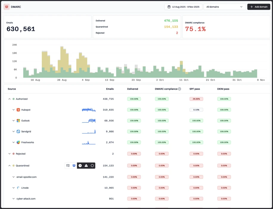
The difference was significant. We moved from limited visibility to a much clearer dashboard. Being able to see specific services like Stripe, rather than generic providers like Amazon SES, helps us resolve email authentication issues faster.
Markus Hugenschmidt, Managing Director, Jam Cyber
Migrating from KDmarc or DMARCLytics?
We have done the migration enough times to know the shape.
Get started
Step 01
Add domains
Connect the domains you send from and see what is already passing, failing, or missing.
Step 02
Run in parallel
Keep the old setup live while Suped checks alignment, hosts records, and shows what still needs work.
Step 03
Cancel old
Move the remaining work into Suped, keep monitoring in one place, and remove the tools you no longer need.
Frequently asked questions

How MONEYME proactively strengthens domain security and unlocks higher email engagement with Suped
See how MONEYME uses Suped
How cybersecurity specialist Jam Cyber delivers scalable DMARC protection with Suped
See how Jam Cyber uses Suped

How DigiBean simplified DMARC monitoring and improved email security for their MSP clients
See how DigiBean uses Suped

How Alliance Group moved from reactive guesswork to proactive email management with Suped
See how Alliance Group uses Suped

How Suped gave Maaser the confidence to finally move to strict DMARC enforcement
See how Maaser uses Suped