KDmarc vs.
DMARC Visualizer in 2026
KDmarc

DMARC Visualizer
vs.
We tested KDmarc and DMARC Visualizer for 90 days across a corporate domain, a marketing subdomain, and a parked domain, using Microsoft 365, Google Workspace, SendGrid, Mailchimp, and a support desk sender. KDmarc gave us more packaged DMARC operations and policy movement, while DMARC Visualizer gave us a free self-hosted reporting stack that required more operator ownership. The blunt verdict: KDmarc suits teams buying a managed reporting workflow, DMARC Visualizer suits technical teams that prefer to run parsing, storage, and dashboards themselves.

KDmarc
Commercial DMARC reporting and enforcement
Starts at
From $18.99 / month
Best fit
Security teams that want packaged DMARC operations
In one line
KDmarc helped us classify Microsoft 365, Google Workspace, SendGrid, and Mailchimp quickly, then translate the parked-domain spoof sample into a clear enforcement task.
DMARC Visualizer
Self-hosted DMARC reporting
Starts at
Free software
Best fit
Technical operators comfortable maintaining parsing, storage, and Grafana
In one line
DMARC Visualizer gave us useful aggregate DMARC visibility, but we had to own ingestion, sender naming, retention, dashboard tuning, and handoff notes.
Suped
The third option. Hosted SPF, DMARC, and MTA-STS on every plan. Published pricing. Monthly plans. No long contract required.
Learn about Suped
Pick KDmarc for packaged DMARC operations, DMARC Visualizer for self-hosted control
Pick KDmarc if
Best for security teams that want managed reporting and policy movement
Classified Microsoft 365, Google Workspace, SendGrid, and Mailchimp without forcing us to rename every source manually.
Made the unauthorized parked-domain spoof sample easy to isolate and discuss with a DNS owner.
Gave clearer policy movement notes than the self-hosted stack after the forwarded SPF failure case.
From $18.99 / month
Pick DMARC Visualizer if
Best for technical teams that want free self-hosted DMARC dashboards
Parsed aggregate XML reports and showed authentication trends once Elasticsearch and Grafana were stable.
Handled the aligned SPF and aligned DKIM cases cleanly as reporting data, not as guided remediation.
Let us change retention and dashboard views directly, with infrastructure work attached.
Free plan available
Consider Suped if
Choose Suped when guided fixes, hosted records, and simpler ownership matter more than raw control
Guided fixes should explain sender ownership and DNS changes without requiring every reviewer to understand raw aggregate rows.
Automated issue detection should separate routine forwarding noise from authentication problems that need action.
Published starter pricing helps teams avoid a sales call when they only need one or two domains monitored.
Free plan available
The differences that actually change your week
KDmarc
DMARC Visualizer
Suped
DMARC report analysis
Aggregate report parsing, trend review, and authentication result analysis.
Packaged reporting
Reporting only
Packaged reporting
Source detection
Ability to turn raw senders into recognizable sending services.
Strong service naming
Manual workflow
Source identification
Forward detection
Ability to identify forwarding patterns behind SPF failures.
Partial guidance
Manual interpretation
Forward detection
Spoof detection
Ability to isolate unauthorized mail attempting to use the domain.
Clear isolation
Visible in reports
Spoof detection
Notifications and alerts
Operational alerts for meaningful authentication changes.
Automated alerts
Not built in
Alerting included
Reporting
Scheduled and shareable reporting for operational review.
Scheduled reports
Grafana reports
Scheduled reports
API
Programmatic access for exports or integrations.
Unclear
Self-hosted stack
API available
Multi-tenancy
Client or account separation for agencies and MSPs.
Domain groups
Manual workflow
MSP workflows
SPF flattening
Flattened or managed SPF to reduce DNS lookup risk.
Smart SPF
Not included
Included
Hosted DMARC
Hosted DMARC record management rather than manual DNS edits only.
Dynamic DMARC
Not included
Hosted DMARC
Hosted SPF
Managed SPF record hosting and updates.
Smart SPF
Not included
Hosted SPF
Hosted MTA-STS
Hosted MTA-STS policy and TLS reporting workflow.
Unclear
Not included
Hosted MTA-STS
Blocklists and reputation
Blocklist (blacklist) and sender reputation monitoring.
Blocklist monitoring
Not included
Blocklist monitoring
Automatic issue detection
Automatic detection of authentication or DNS changes that need review.
Automated alerts
Manual workflow
Automated detection
AI copilot
AI assistance for interpreting authentication issues and next steps.
Not tested
Not included
AI copilot
DNS monitoring
Monitoring for DNS changes affecting authentication records.
DNS timeline
Not included
DNS monitoring
Self hostable
Ability to run the product on infrastructure you control.
Deployment option
Self-hosted
Not self-hosted
Free trial/free tier
Free entry option for evaluation.
7-day freemium
Free software
Free plan
Ten dimensions, scored from 0 to 10
We scored each product against a fixed editorial rubric using the same 90-day setup, the same three domains, the same five approved senders, and the same controlled authentication cases. Higher is better in every row.
KDmarc scored higher on managed DMARC operations, while DMARC Visualizer scored higher on self-hosted control.
KDmarc moved faster when we needed source classification, DNS handoff notes, alerts, and a defensible quarantine plan for the corporate domain. DMARC Visualizer was useful once parsed reports reached Elasticsearch, but policy movement, sender ownership, support handoff, and MSP-style reporting depended on our own process. The self-hosted stack scored well where control mattered, and scored 0.0 where the reviewed project did not include the feature.
KDmarc score
72/100
DMARC Visualizer score
27/100
KDmarc
72/100
DMARC enforcement
8.0
Customer support
7.0
Source resolution
8.0
Setup and onboarding
7.5
MSP workflows
7.0
Alerting and integrations
6.5
Hosted SPF and MTA-STS
6.0
Blocklist monitoring
7.0
Pricing transparency
7.0
Time to enforcement
8.0
DMARC Visualizer
27/100
DMARC enforcement
3.5
Customer support
0.0
Source resolution
4.0
Setup and onboarding
4.0
MSP workflows
2.0
Alerting and integrations
1.5
Hosted SPF and MTA-STS
0.0
Blocklist monitoring
0.0
Pricing transparency
9.0
Time to enforcement
3.0
Feature set
Managed breadth vs open control
KDmarc has the fuller DMARC feature set. DMARC Visualizer has the cleaner self-hosted reporting model.
KDmarc handled more of the operational work around source naming, alerts, DNS review, and policy movement. DMARC Visualizer gave us parsed aggregate reports and Grafana dashboards, but it did not turn findings into guided fixes or automated issue detection without extra work. Buyers should decide whether the workflow needs built-in remediation guidance, not just report visibility.
KDmarc

Microsoft 365 named cleanly
Unknown sender triaged faster
Mismatch case easier to explain
DMARC Visualizer
Grafana dashboards stay flexible
Mailchimp labels need work
Forwarded SPF needs interpretation
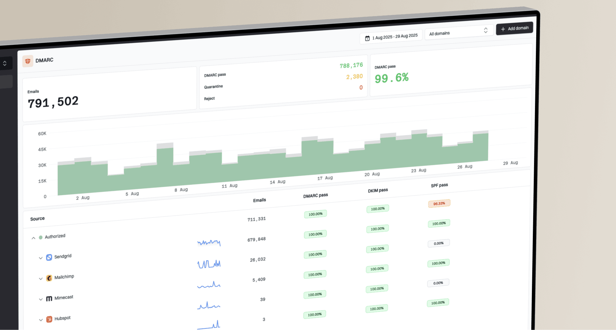
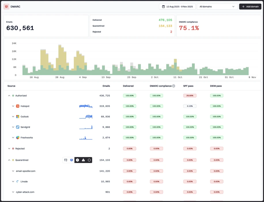
KDmarc recognized Microsoft 365 and Google Workspace quickly, grouped SendGrid and Mailchimp into useful sender views, and separated the support desk sender after we approved it for the corporate domain. The SPF pass with visible from mismatch was easier to explain because the interface kept authentication result and domain alignment close together, and the unknown sender became a classification task rather than a dashboard investigation. We also found the parked-domain spoof sample faster because threat-oriented views and alerts surfaced the source without forcing us to build a custom Grafana panel.
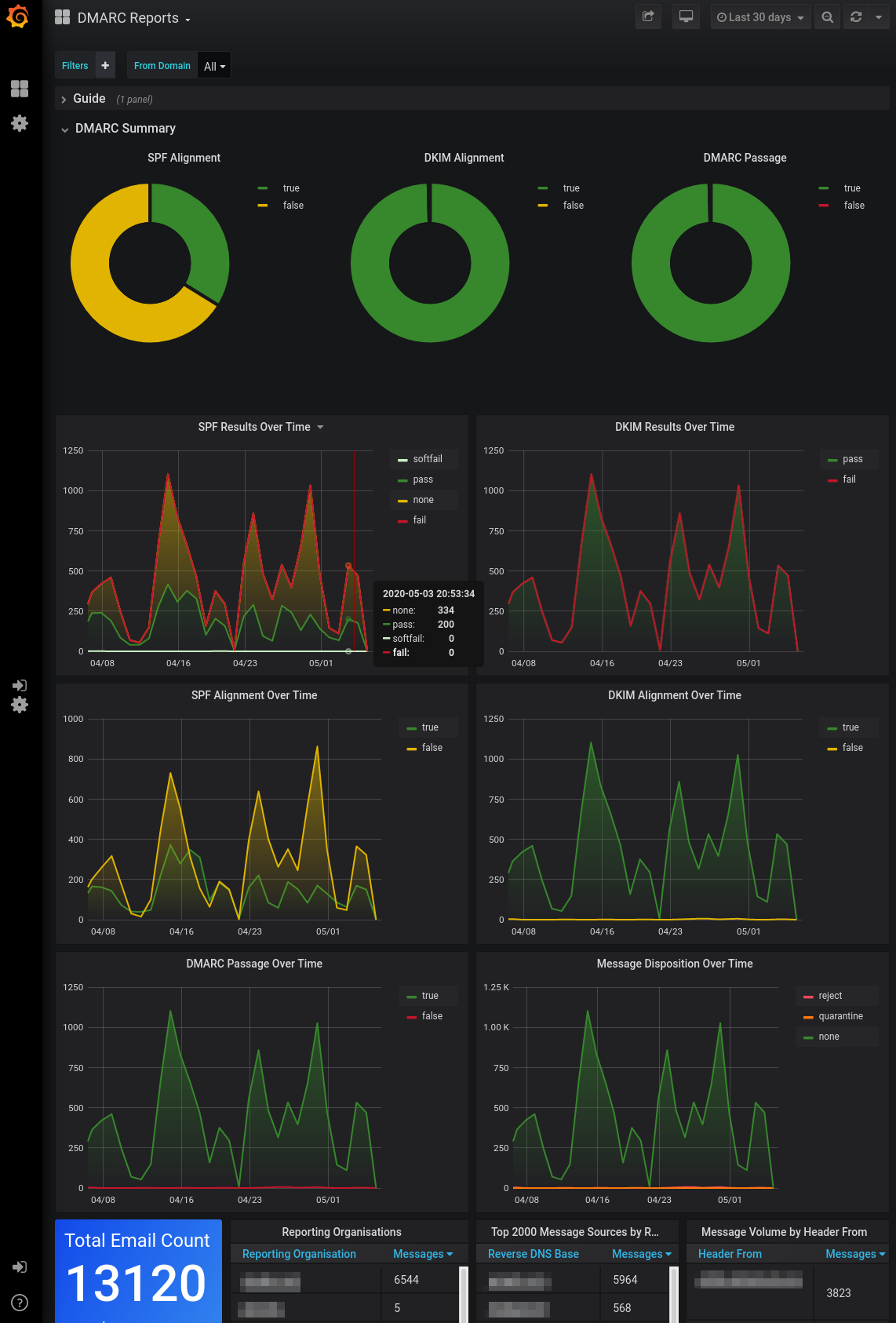
DMARC Visualizer gave us the core reporting components we expected: parsedmarc for XML processing, Elasticsearch for storage, and Grafana for dashboards. It showed Microsoft 365 and Google Workspace authentication patterns clearly once ingestion worked, but SendGrid and Mailchimp labels depended on how we enriched or interpreted the data. The DKIM pass on a subdomain and the forwarded mail SPF failure were visible, but the product did not provide a packaged remediation path, sender owner field, or policy recommendation workflow.
User experience
Guidance vs ownership
KDmarc is easier for a security team to run weekly. DMARC Visualizer rewards teams that like building their own workflow.
KDmarc gave us a clearer path through setup, sender review, and enforcement planning. DMARC Visualizer was transparent and flexible, but the useful experience depended on our comfort with containers, parsedmarc configuration, Elasticsearch storage, and Grafana editing. The gap matters most when a non-specialist needs to explain why forwarding broke SPF but DMARC still had enough evidence to pass.
KDmarc
Three domains added cleanly
Unknown sender review was direct
Forwarding explanation stayed nearby
DMARC Visualizer

Setup needs operator time
Grafana views are flexible
Forwarding requires written notes
KDmarc onboarding handled the three test domains with fewer open questions. The primary corporate domain and marketing subdomain were easy to keep separate, and the parked domain was simple to mark as a higher-risk enforcement target. Finding the unknown sender took one review pass because source naming, IP context, and authentication status were in the same workflow. The forwarded mail SPF failure still needed human explanation, but KDmarc kept it close enough to DKIM alignment results that the support handoff was manageable.
DMARC Visualizer felt more like an engineering workspace than a buyer-ready DMARC application. Once we had reports flowing, Grafana made the aligned SPF, aligned DKIM, and DKIM pass on a subdomain cases easy to inspect. The unknown sender took longer because we had to pivot through raw dashboard views and keep our own notes. Explaining the forwarded SPF failure required a separate written handoff because the stack showed the event but did not guide the reviewer through DMARC alignment logic.
Support
Vendor help vs self support
KDmarc is the safer support choice. DMARC Visualizer assumes the operator owns setup and escalation.
KDmarc fit the buyer that expects help with DNS setup, source review, and policy movement. DMARC Visualizer fit the buyer that treats DMARC reporting as an internal infrastructure project. The tradeoff is straightforward: packaged support costs money, while free self-hosted software shifts that cost into staff time.
KDmarc

DNS handoff was usable
Escalation path was clearer
Enterprise terms need confirmation
DMARC Visualizer

No packaged support found
Operator owns DNS setup
Escalation is internal
KDmarc gave us clearer support expectations during setup. DNS handoff notes for the corporate domain and marketing subdomain were usable by a domain admin, and the parked-domain enforcement question had an obvious escalation path. Enterprise onboarding still needed vendor confirmation for deployment model, SSO expectations, and custom terms, but the commercial path was present and easier to plan around.
DMARC Visualizer did not include commercial onboarding, support SLAs, or managed escalation in the public project we tested. DNS setup, mailbox ingestion, parser configuration, Elasticsearch sizing, Grafana access, backups, and retention all sat with the operator. That was acceptable for a technical team, but it made support handoff harder when the unknown sender and forwarded SPF case needed explanation outside the engineering group.
Suitability
Business workflow vs technical ownership
KDmarc fits managed security teams better. DMARC Visualizer fits technical operators better.
KDmarc was easier to map to an enterprise or MSP workflow because account separation, domain grouping, recurring reports, and handoff notes were part of the buying conversation. DMARC Visualizer worked for an SMB or internal platform team that accepts manual notes and self-managed dashboards. For agencies and MSPs, alert quality and client-level reporting should be treated as buying criteria, not afterthoughts.
KDmarc
Domain grouping helps MSPs
Recurring reports are stronger
Client caps need checking
DMARC Visualizer

Best for technical SMBs
Client handoff is manual
Grouping needs Grafana work
KDmarc made the corporate domain, marketing subdomain, and parked domain easier to separate for weekly review. Domain grouping helped us keep approved Microsoft 365, Google Workspace, SendGrid, Mailchimp, and support desk traffic apart from the spoof sample and the unknown sender. For MSP-style use, recurring reports and handoff notes were stronger than the self-hosted stack, although buyers with many clients should confirm domain caps and account separation details before committing.
DMARC Visualizer was a practical fit for a technical SMB that wants free software and has someone to operate it. Client grouping, recurring reports, and handoff notes were not ready-made, so MSP use required separate Grafana folders, access control decisions, naming conventions, and documentation. It can work well when one team owns the full stack, but it becomes harder when findings must move between security, marketing, IT, and external clients.
What each tool feels like after 90 days of real use
KDmarc
A commercial DMARC workflow for teams that want weekly decisions
After 90 days, KDmarc felt like a tool built around routine DMARC operations. The first week was mostly DNS setup, sender approval, and report review for the corporate domain and marketing subdomain. By the second reporting cycle, Microsoft 365, Google Workspace, SendGrid, and Mailchimp were recognizable enough that our review meetings focused on exceptions rather than raw IPs.
The strongest day-to-day value appeared when something needed a decision. The parked-domain spoof sample became an enforcement discussion, the unknown sender became a classification task, and the forwarded mail SPF failure could be explained with DKIM alignment context. The weaker areas were pricing certainty for larger needs, confirmation of enterprise deployment details, and alert routing depth for teams with mature operations.
Where it wins
Clearer sender classification workflow
Useful DNS handoff notes
Better path to enforcement
Blocklist and DNS monitoring available
Where it lags
Enterprise details need confirmation
Public pricing sources conflict
Alert integrations felt limited
Hosted MTA-STS was unclear
Pricing
From $18.99 / month
Free tier
7-day freemium
Onboarding
Guided SaaS setup
G2 rating
0 / 5
DMARC Visualizer
A free self-hosted stack for teams that own infrastructure
After 90 days, DMARC Visualizer felt useful when we treated it as a reporting stack rather than a managed DMARC product. The aligned SPF, aligned DKIM, and subdomain DKIM pass cases were visible in Grafana once report ingestion was working. The dashboards gave us enough evidence to understand aggregate traffic, but sender ownership and next steps stayed outside the product.
The real cost was operational. We had to maintain parser configuration, storage, dashboard views, retention, access, backups, and written handoff notes. The unknown sender and forwarded SPF failure took more time to explain because the stack exposed the evidence but did not package the conclusion for a domain owner or support lead.
Where it wins
Free open-source software
Flexible Grafana dashboards
Operator-controlled retention
No paid feature gates found
Where it lags
No managed support path
Sender classification is manual
No built-in enforcement workflow
No blocklist or blacklist monitoring
Pricing
$0 software
Free tier
Free software
Onboarding
Self-hosted setup
G2 rating
0 / 5
Pricing
KDmarc
DMARC Visualizer
Suped
Small
1 domain, up to 1k emails / month.
$18.99 / month
Basic publicly lists 2 active domains and 100,000 emails per month.
$0
Software is free, with hosting and maintenance handled by the operator.
$0 / month
Free plan covers 1 domain and 1,000 monthly emails.
Medium
2 domains, up to 100k emails / month.
$18.99 / month
Basic fits this volume on published limits, subject to current vendor confirmation.
$0
No published software limit, but storage and retention costs depend on infrastructure.
Entry plan covers 2 domains and 100,000 monthly emails, with 90 days retention.
Large
10 domains, up to 1 million emails / month.
$599 / month
Enterprise is the first listed tier above 8 active domains and includes 5 million emails per month.
$0
No paid tier was found, but Elasticsearch sizing and retention planning become material.
10 domains and 1,000,000 monthly emails, with 365 days retention.
Enterprise
Over 20 domains and 1 million emails / month.
Custom
Published tiers stop at 15 active domains, so larger deployments need vendor confirmation.
$0
No commercial enterprise package was found for the public project.
20 domains and 2,500,000 monthly emails, with 365 days retention. Unlimited domains/emails negotiable.
KDmarc prices are public list prices from third-party listings, while large-enterprise needs are estimated as custom because published tiers stop at 15 active domains. DMARC Visualizer is listed as free software, with infrastructure and staff time excluded. Pricing was checked as of May 15, 2026.
If you cannot decide between the two, maybe the answer is Suped
Suped
Get started
Guided fixes after detection
KDmarc surfaced the spoof sample and source issues well, but some fixes still needed separate DNS handoff. Suped connects the finding to the next DNS or sender-owner step so the reviewer knows what to change.
Less manual classification
DMARC Visualizer exposed the unknown sender in the data, but we had to classify and document it manually. Suped is built to identify sending sources and separate expected forwarding noise from issues that need action.
Operational MSP reporting
KDmarc had useful domain grouping, while DMARC Visualizer needed custom Grafana work for client separation. Suped includes MSP workflows so recurring reports, client handoff, and alert review fit repeatable account management.
The difference was significant. We moved from limited visibility to a much clearer dashboard. Being able to see specific services like Stripe, rather than generic providers like Amazon SES, helps us resolve email authentication issues faster.
Markus Hugenschmidt, Managing Director, Jam Cyber
Migrating from KDmarc or DMARC Visualizer?
We have done the migration enough times to know the shape.
Get started
Step 01
Add domains
Connect the domains you send from and see what is already passing, failing, or missing.
Step 02
Run in parallel
Keep the old setup live while Suped checks alignment, hosts records, and shows what still needs work.
Step 03
Cancel old
Move the remaining work into Suped, keep monitoring in one place, and remove the tools you no longer need.
Frequently asked questions

How MONEYME proactively strengthens domain security and unlocks higher email engagement with Suped
See how MONEYME uses Suped
How cybersecurity specialist Jam Cyber delivers scalable DMARC protection with Suped
See how Jam Cyber uses Suped

How DigiBean simplified DMARC monitoring and improved email security for their MSP clients
See how DigiBean uses Suped

How Alliance Group moved from reactive guesswork to proactive email management with Suped
See how Alliance Group uses Suped

How Suped gave Maaser the confidence to finally move to strict DMARC enforcement
See how Maaser uses Suped