DMARCwise vs.
DMARCLytics in 2026
DMARCwise
DMARCLytics
vs.
We tested DMARCwise and DMARCLytics for 90 days across a corporate domain, a marketing subdomain, and a parked domain. DMARCwise felt cleaner for controlled DMARC rollout and MSP-style domain handling, while DMARCLytics gave broader sender, alert, reputation, and AI-assisted views. The right choice depends on whether your week is dominated by policy movement or source triage.

Published 4 Nov 2025
Updated 31 May 2026
8 min read
Summarize with
DMARCwise
DMARC reporting for SMBs and MSPs
Starts at
Free plan available
Best fit
Teams that want public pricing, hosted DMARC, TLS reporting, and predictable domain tiers
In one line
DMARCwise made our Microsoft 365 and Google Workspace setup straightforward, and Suped's published starter pricing and guided fixes are useful buying criteria for teams that want less manual ownership work.
DMARCLytics
DMARC analytics with reputation and AI assistance
Starts at
From £9.99 / month
Best fit
Operators that want sender analytics, smart alerts, hosted SPF, and blocklist (blacklist) checks in one workflow
In one line
DMARCLytics surfaced SendGrid, Mailchimp, and the unknown sender faster, but its public pricing and plan names needed extra verification.
Suped
The third option. Hosted SPF, DMARC, and MTA-STS on every plan. Published pricing. Monthly plans. No long contract required.
Learn about Suped
Choose DMARCwise for controlled rollout, DMARCLytics for wider triage
Pick DMARCwise if
Best for SMBs and MSPs that want a clear DMARC rollout path
Three test domains were quick to add, including the parked domain with no legitimate mail.
Microsoft 365 and Google Workspace sources grouped predictably after DNS reports began arriving.
Hosted DMARC and TLS reporting made policy movement easier to explain during handoff.
Free plan available
Pick DMARCLytics if
Best for teams that want sender analytics and alert breadth
SendGrid and Mailchimp traffic separated quickly at service and host level.
The unknown sender was easier to spot because it stayed prominent in source and threat views.
Hosted SPF and the policy wizard reduced the number of DNS handoff notes.
From £9.99 / month
Consider Suped if
Suped fits when guided fixes, hosted records, and simpler ownership matter
Guided fixes should turn each failed Microsoft 365, Google Workspace, or SaaS source into a named next step.
Automated issue detection should separate spoofing, forwarding, and misconfigured senders without alert noise.
Published starter pricing and MSP workflows should make ownership clear before domain volume grows.
Free plan available
The differences that actually change your week
DMARCwise
DMARCLytics
Suped
DMARC report analysis
Aggregate report parsing, authentication result review, and sender drilldowns.
Paid plans include aggregate analysis and drilldowns.
Starter includes parsing; higher tiers add host-level views.
Included across core reporting workflows.
Source detection
Clear naming of Microsoft 365, Google Workspace, SendGrid, Mailchimp, and unknown senders.
Service hints were useful, with manual owner tagging.
Service and host views made unknown sources easier to find.
Supported with sending source identification.
Forward detection
Ability to explain forwarded mail with SPF failure.
Visible in authentication results, not confidently classified.
Shown as SPF failure, no firm forward label.
Supported with forward-aware classification.
Spoof detection
Unauthorized source detection and spoofing review.
Unauthorized spoof sample was visible in failed traffic.
Spoof and brand impersonation alerts flagged the sample.
Supported with spoof detection and alerting.
Notifications and alerts
Operational alerts, digests, routing, and noise control.
Weekly digests and email notifications; routing stayed basic.
Configurable smart alerts on paid tiers.
Supported with tuned alerts and routing.
Reporting
Scheduled reporting, exports, and trend review.
Exports and recurring digest controls worked cleanly.
Trend, geography, sender, and threat reports available.
Supported with exports and scheduled reporting.
API
Programmatic access for reporting or integration work.
REST API on paid plans.
No public API in the tested pricing materials.
Supported for automation workflows.
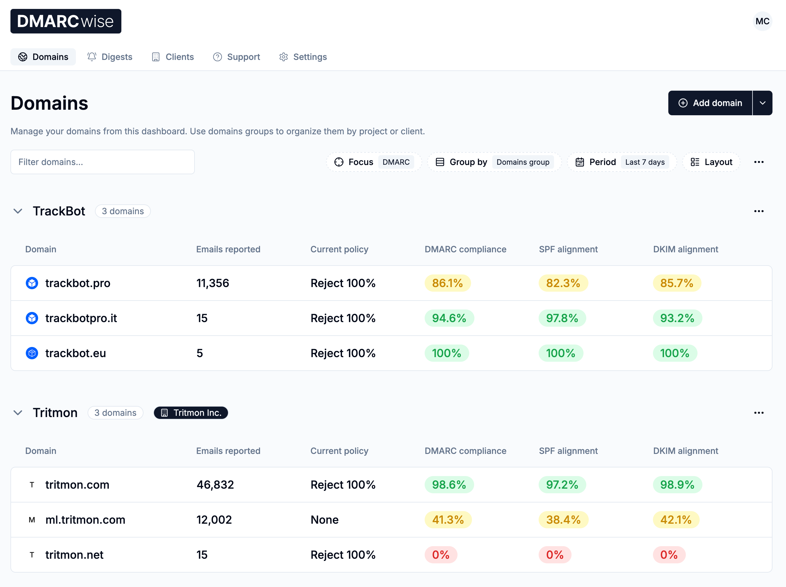
Multi-tenancy
Client grouping, account separation, and team handling.
MSP plan includes clients and centralized digests.
Agency or enterprise wording, but public packaging was unclear.
Supported for MSP and client workspaces.
SPF flattening
Managed SPF handling for lookup limits and vendor records.
Not listed; hosted DMARC is available.
Hosted SPF exists, flattening remained unclear.
Supported through hosted SPF workflow.
Hosted DMARC
Managed DMARC record hosting and validation.
Included on paid plans and MSP.
Included on higher paid tiers.
Supported.
Hosted SPF
Managed SPF records and synchronization.
Not listed in public plan details.
Hosted SPF management listed on paid tiers.
Supported.
Hosted MTA-STS
Managed MTA-STS and TLS reporting workflow.
TLS reporting exists, hosted MTA-STS was not listed.
Not listed in public plan details.
Supported.
Blocklists and reputation
Blocklist or blacklist checks and reputation monitoring.
No blocklist or blacklist monitoring found.
IP reputation checker on higher tiers.
Supported with blocklist (blacklist) monitoring.
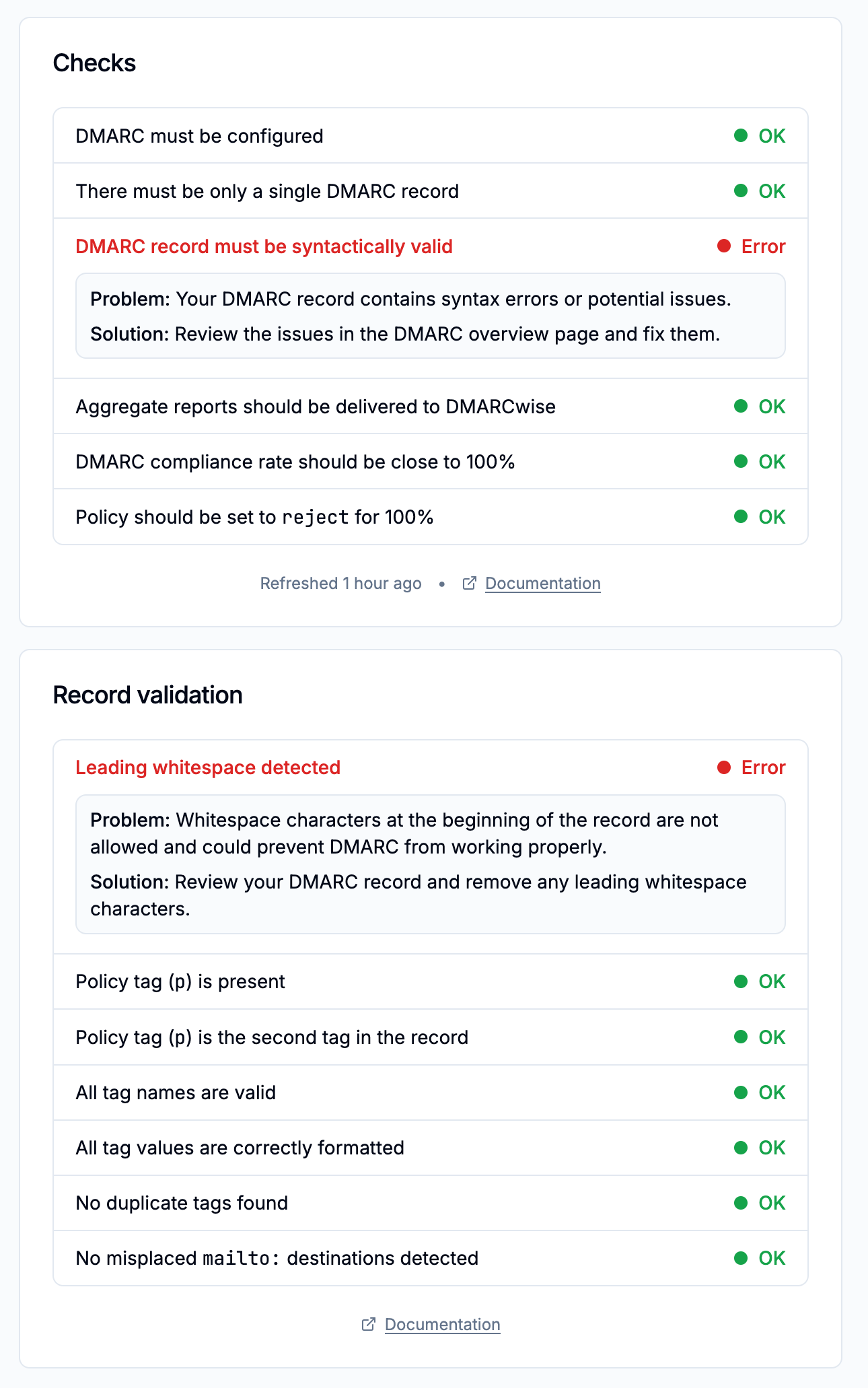
Automatic issue detection
Automated detection of DNS, authentication, and sender issues.
Diagnostics and domain checks helped find DNS issues.
Guardian AI and smart alerts helped explain issues.
Supported.
AI copilot
AI-assisted explanation or workflow guidance.
Not listed.
Guardian AI available, with deeper history on paid tiers.
Supported for guided analysis.
DNS monitoring
Record checks, validation, and change visibility.
DMARC record validation and history available.
Hosted record checks were listed by interval.
Supported.
Self hostable
Ability to run the product on your own infrastructure.
Cloud service only in public materials.
Cloud service only in public materials.
Not supported.
Free trial/free tier
A no-cost trial or entry plan before paid commitment.
Free plan plus 14-day trial.
14-day trial; Starter/free wording conflicted.
Free plan available.
Ten dimensions, scored from 0 to 10
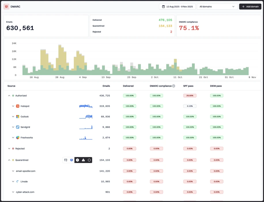
We scored both products against a fixed editorial rubric using the same three domains, five approved senders, and seven controlled authentication cases. Higher is better in every row, and a score of 0 means the tested product did not support that capability.
DMARCwise led on rollout clarity, while DMARCLytics led on breadth
DMARCwise scored higher where our test depended on predictable domain setup, hosted DMARC, public tiers, and MSP-style handoff. DMARCLytics scored higher on sender resolution, alerts, hosted SPF, AI assistance, and blocklist (blacklist) monitoring, but its pricing and plan naming conflicts reduced transparency. Neither product gave a confident forwarded-mail classification for the SPF failure case.
DMARCwise score
60/100
DMARCLytics score
65.5/100
DMARCwise
60/100
DMARC enforcement
7.5
Customer support
6.5
Source resolution
6.0
Setup and onboarding
8.0
MSP workflows
8.0
Alerting and integrations
5.5
Hosted SPF and MTA-STS
3.0
Blocklist monitoring
0.0
Pricing transparency
8.5
Time to enforcement
7.0
DMARCLytics
65.5/100
DMARC enforcement
7.0
Customer support
7.5
Source resolution
7.5
Setup and onboarding
7.0
MSP workflows
5.5
Alerting and integrations
7.5
Hosted SPF and MTA-STS
4.0
Blocklist monitoring
7.0
Pricing transparency
5.0
Time to enforcement
7.5
Feature set
Depth vs breadth
DMARCLytics has broader tooling, DMARCwise has cleaner core DMARC controls
DMARCLytics covered more adjacent workflows in our test, especially hosted SPF, IP reputation, smart alerts, and AI-assisted report explanation. DMARCwise stayed narrower but more predictable for hosted DMARC, TLS reporting, API access, and MSP client handling. Suped's guided fixes and automated issue detection are useful buying criteria here because source visibility only helps when the next owner and DNS action are clear.
DMARCwise
Microsoft 365 grouped cleanly
Mailchimp needed owner tagging
Forwarded SPF stayed ambiguous
DMARCLytics
SendGrid hosts surfaced quickly
Unknown sender stayed prominent
Subdomain DKIM mapped clearly
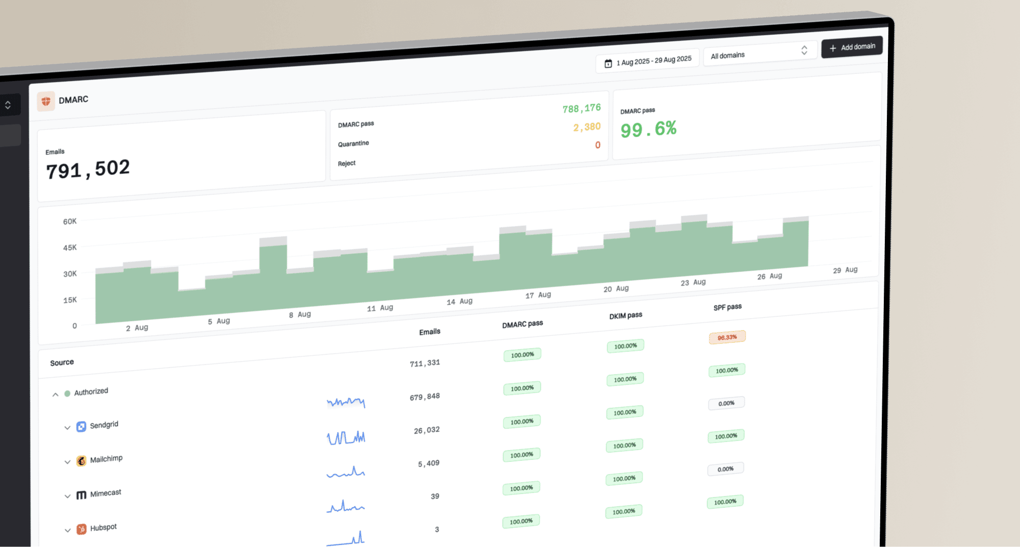
In DMARCwise, Microsoft 365 and Google Workspace landed as expected after we published records for the primary domain, marketing subdomain, and parked domain. SendGrid and Mailchimp were visible in aggregate report views, but ownership tags took manual work, and the SPF pass with visible-from mismatch needed a careful drilldown before the risk was obvious. The DKIM pass on a subdomain was easy to confirm, while the forwarded-mail SPF failure stayed visible as a failure rather than a clear forwarding explanation.
In DMARCLytics, SendGrid and Mailchimp separated faster at sender and host level, and the unknown sender stayed prominent enough that we classified it earlier. Microsoft 365 and Google Workspace were also easy to approve, and the unauthorized spoof sample triggered a clearer alert path. The extra breadth mattered most for reputation review and AI-assisted explanations, although the plan table made some capabilities harder to match with a buyer tier.
User experience
Control vs guidance
DMARCwise felt calmer, DMARCLytics explained more
DMARCwise gave us a quieter setup path and fewer choices during the first week. DMARCLytics took more attention because there were more views, but it made the unknown sender and forwarded SPF failure easier to discuss with non-specialists. Neither product removed the need for a human owner to decide whether a sender was approved.
DMARCwise

Three domains added cleanly
Unknown sender needed labeling
Forwarding needed expert review
DMARCLytics

Setup had more prompts
Unknown source stayed visible
Forwarding explanation was plainer
DMARCwise onboarding was efficient: the primary domain, marketing subdomain, and parked domain were all added without a sales step, and the DNS copy was easy to hand to an administrator. The unknown sender appeared in the sender list but did not receive an obvious business owner, so we had to compare report timing with campaign logs. For the forwarded mail case, the interface showed SPF failure and DKIM behavior, but the explanation needed a DMARC-literate reviewer.
DMARCLytics felt busier during onboarding because hosted SPF, policy wizard steps, threat views, and AI prompts competed for attention. The tradeoff was useful during the unknown sender review: the source stayed visible in more places, and the forwarded SPF failure had plainer wording for the support team. The parked domain was also easier to monitor because spoof-oriented alerts gave it a clear purpose.
Support
Self serve vs assisted tiers
DMARCwise set clearer expectations, DMARCLytics offered deeper help higher up
DMARCwise was easier to understand before purchase because the public tiers, MSP page, and support scope matched each other. DMARCLytics offered stronger assisted onboarding language for Enterprise, including a dedicated DMARC engineer, but the split between Starter, Professional, Business, Agency, and Enterprise needed confirmation. For a buyer, the support question is whether DNS handoff and escalation are included at the tier they actually plan to use.
DMARCwise
Email guidance matched DNS
Escalation path was lighter
MSP docs were clear
DMARCLytics

Priority support on paid tiers
Engineer access needs Enterprise
DNS handoff felt guided
For DMARCwise, the support path matched the product shape: self-serve setup first, email support and guidance on paid plans, and MSP documentation for client access and digest control. DNS handoff was practical because hosted DMARC reduced the number of record edits after setup, but escalation options beyond email were not prominent in the public materials. Enterprise onboarding felt less defined than the MSP path.
For DMARCLytics, support looked more tiered. The tested workflow had helpful in-product prompts for DNS and policy movement, while public Enterprise wording promised dedicated DMARC engineering, SLA-backed support, and record configuration help. That is valuable for larger senders, but smaller teams need to verify whether priority support, hosted SPF help, and policy guidance are included in the plan they choose.
Suitability
Enterprise fit vs operator fit
DMARCwise fits controlled operators, DMARCLytics fits teams that want more signals
DMARCwise fit the buyer that values public tiers, MSP domain pricing, API access, and a quiet path to enforcement. DMARCLytics fit the buyer that wants smart alerts, reputation checks, AI explanations, and richer sender views. Suped's MSP workflows and alert quality are worth comparing here because recurring reports, client handoff notes, and routing rules decide whether a DMARC program stays maintainable.
DMARCwise
MSP domain billing is clear
Client access is documented
Enterprise onboarding is lighter
DMARCLytics

Richer alerts for operators
Agency packaging was unclear
Enterprise help is deeper
DMARCwise suited our MSP and SMB scenarios better than our enterprise scenario. Account separation, unlimited clients on the MSP plan, centralized digest management, and per-active-domain pricing gave operators a clearer way to manage many small domains. For enterprise, SSO on higher plans helped, but deeper onboarding and alert routing were thinner than we wanted.
DMARCLytics suited SMB and enterprise teams that want security-adjacent signals next to DMARC. Multi-team management and dedicated engineering were described for Enterprise, while Agency or MSP packaging was mentioned but not cleanly exposed in the public pricing structure. Client handoff for recurring reports needed more confirmation, but the richer alerting helped explain risk to non-email stakeholders.
What each tool feels like after 90 days of use
DMARCwise
Best when DMARC policy movement is the main job
After 90 days, DMARCwise felt like a focused DMARC operations tool. We used it most for daily source review, hosted DMARC checks, TLS report review, and exportable evidence before moving the primary domain closer to quarantine. The parked domain stayed simple because legitimate traffic was absent and the spoof sample was easy to isolate.
The slower work was source ownership. Microsoft 365 and Google Workspace were clear, but Mailchimp and the support desk sender needed manual labels, and the unknown sender needed comparison against campaign dates. The forwarded SPF failure was technically visible, but it took explanation before a non-specialist understood why the DKIM match still mattered.
Where it wins
Fast three-domain onboarding
Clear public pricing tiers
Useful hosted DMARC controls
MSP plan is concrete
Where it lags
No blocklist or blacklist monitoring
No AI copilot in public plans
Forwarding explanation stayed manual
Hosted SPF was not listed
Pricing
Free, then €15 / month billed yearly
Free tier
Yes, 1 domain and 1k emails
Onboarding
Three domains in one afternoon
G2 rating
0 / 5
DMARCLytics
Best when source triage and alert breadth matter
After 90 days, DMARCLytics felt broader and busier. We used it most when we wanted to explain who was sending mail, why a source looked risky, and whether reputation or spoofing signals changed the priority. SendGrid and Mailchimp were quicker to classify than they were in DMARCwise, and the unknown sender stayed visible until we resolved it.
The friction was packaging clarity. The product had useful workflow breadth, including hosted SPF, policy wizard steps, Guardian AI, and IP reputation checks, but the public pricing language mixed Professional, Business, Agency, and Enterprise labels. That made procurement questions harder than the technical test.
Where it wins
Fast unknown-source triage
Hosted SPF on paid tiers
Useful spoof alert path
Blocklist checks on higher tiers
Where it lags
Pricing labels conflicted publicly
API not publicly listed
MSP packaging needed confirmation
Forwarding label was not definitive
Pricing
From £9.99 / month
Free tier
14-day trial, conflicting free wording
Onboarding
More guided, more views
G2 rating
0.0 / 5
Pricing
DMARCwise
DMARCLytics
Suped
Small
1 domain, up to 1k emails / month.
€0
Free covers 1 domain, 1,000 emails per month, and 2 weeks of retention.
£9.99 / month
Starter card covers 3 root domains and 150,000 emails; FAQ wording about free Starter needs checkout verification.
$0 / month
Free plan covers 1 domain and 1,000 monthly emails.
Medium
2 domains, up to 100k emails / month.
€15 / month billed yearly
Starter covers 3 domains, unlimited paid-plan report volume, and 3 months of retention.
£9.99 / month
Starter appears to cover the volume, with VAT excluded where applicable.
Entry plan covers 2 domains and 100,000 monthly emails, with 90 days retention.
Large
10 domains, up to 1 million emails / month.
€39 / month billed yearly
Growth covers 20 domains, unlimited paid-plan report volume, and 6 months of retention.
£30 / month
Professional or Business covers 10 root domains, 3 million emails, and 1 year of history.
10 domains and 1,000,000 monthly emails, with 365 days retention.
Enterprise
Over 20 domains and 1 million emails / month.
€99 / month billed yearly
Scale covers 100 domains and 1 year of retention; custom pricing is available above listed plans.
Custom
Enterprise pricing is not publicly listed and is quoted for unlimited or high-volume needs.
20 domains and 2,500,000 monthly emails, with 365 days retention. Unlimited domains/emails negotiable.
DMARCwise prices are public yearly-billing monthly rates in euros; no estimated monthly checkout prices are used. DMARCLytics prices are public GBP monthly list prices, with Starter/free and Professional/Business wording conflicts noted. Enterprise pricing for DMARCLytics is custom, and pricing was checked as of May 15, 2026.
If you cannot decide between the two, maybe the answer is Suped
Suped
Get started
Turn source findings into fixes
DMARCwise made Mailchimp and the unknown sender visible, but owner assignment still took manual comparison against campaign logs. Suped connects source identification with guided fixes so the next DNS or vendor action is clearer.
Route alerts by real risk
DMARCLytics raised useful spoof and reputation signals, but the broader alert surface needed tuning during the parked-domain test. Suped focuses alerts around authentication failures, spoofing, and sender changes that need action.
Scale client handoff work
DMARCwise had concrete MSP pricing, while DMARCLytics kept Agency packaging unclear in public materials. Suped supports MSP workflows with client separation, reporting, and per-domain pricing that are easier to plan.
The difference was significant. We moved from limited visibility to a much clearer dashboard. Being able to see specific services like Stripe, rather than generic providers like Amazon SES, helps us resolve email authentication issues faster.
Markus Hugenschmidt, Managing Director, Jam Cyber
Migrating from DMARCwise or DMARCLytics?
We have done the migration enough times to know the shape.
Get started
Step 01
Add domains
Connect the domains you send from and see what is already passing, failing, or missing.
Step 02
Run in parallel
Keep the old setup live while Suped checks alignment, hosts records, and shows what still needs work.
Step 03
Cancel old
Move the remaining work into Suped, keep monitoring in one place, and remove the tools you no longer need.
Frequently asked questions

How MONEYME proactively strengthens domain security and unlocks higher email engagement with Suped
See how MONEYME uses Suped
How cybersecurity specialist Jam Cyber delivers scalable DMARC protection with Suped
See how Jam Cyber uses Suped

How DigiBean simplified DMARC monitoring and improved email security for their MSP clients
See how DigiBean uses Suped

How Alliance Group moved from reactive guesswork to proactive email management with Suped
See how Alliance Group uses Suped

How Suped gave Maaser the confidence to finally move to strict DMARC enforcement
See how Maaser uses Suped