User experience
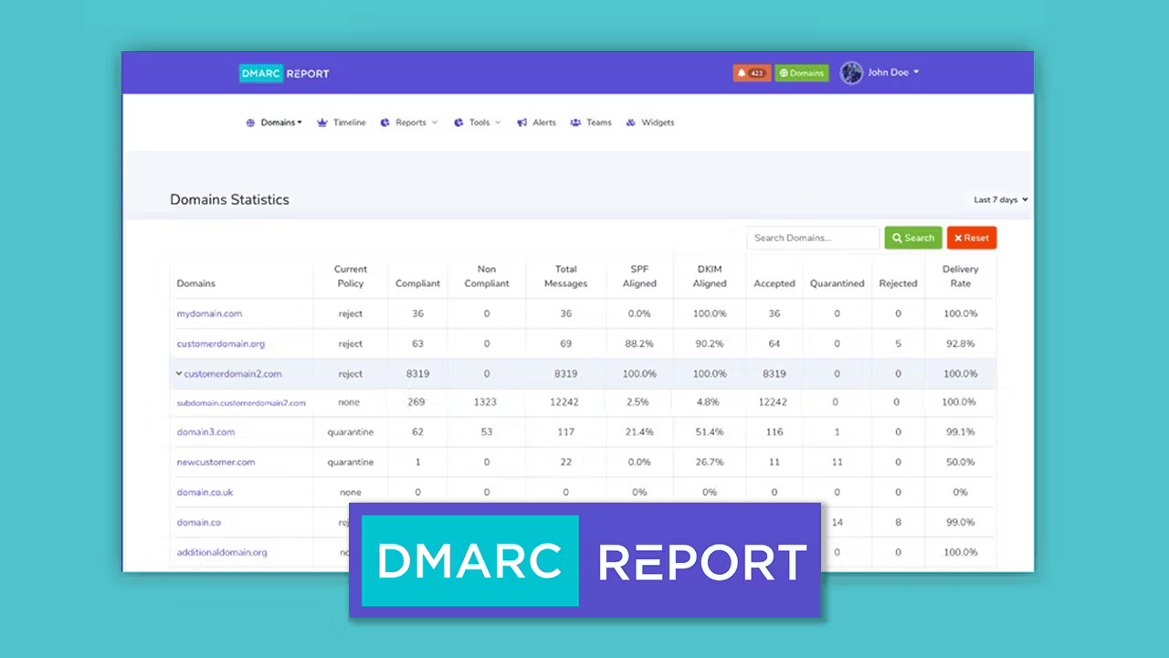
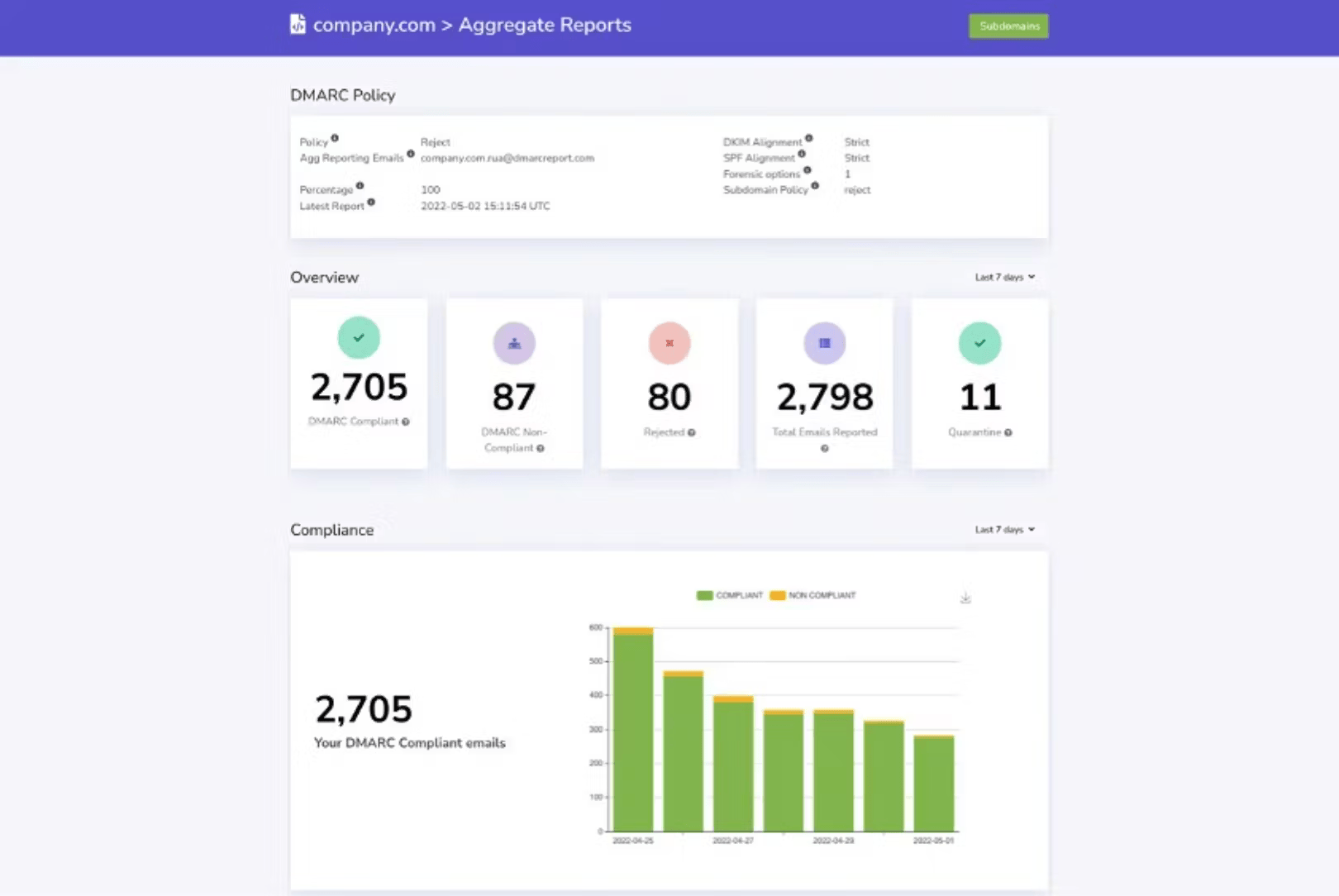
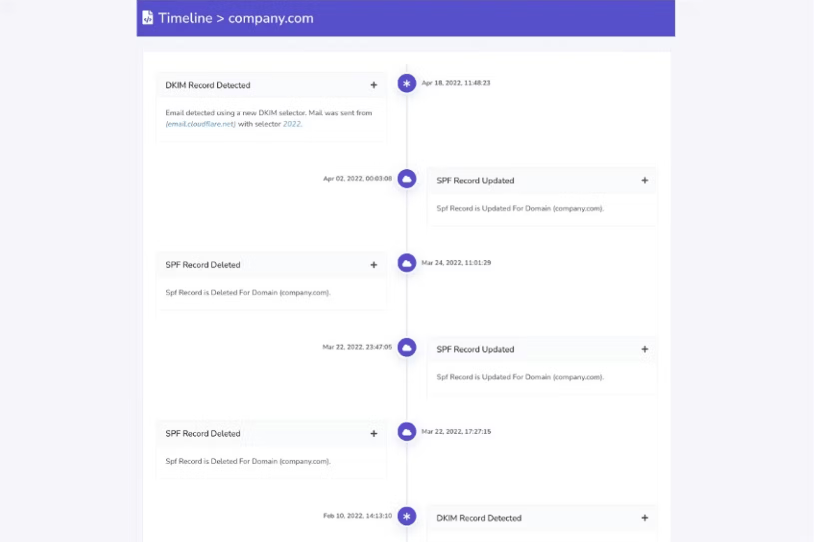
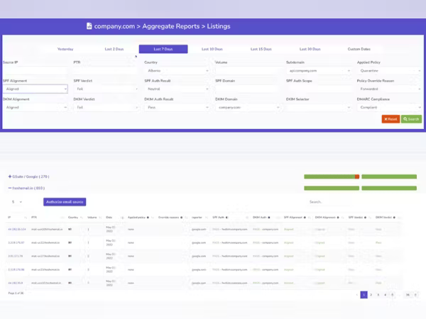
From our experience, DMARC Report generally offers an easy-to-use platform with a clear, logical interface. We found the step-by-step setup process for adding domains particularly helpful, guiding us through the necessary DNS configurations. The dashboards are designed to provide quick insights, often using visual cues like green/red indicators to highlight issues.
However, some users, including ourselves, have noted that while functional, the user interface (UI) could benefit from a more modern and polished aesthetic. Navigation can occasionally feel a bit clunky, and some of the more advanced features might require a short learning curve for those unfamiliar with deeper DMARC concepts, despite the overall ease of use.
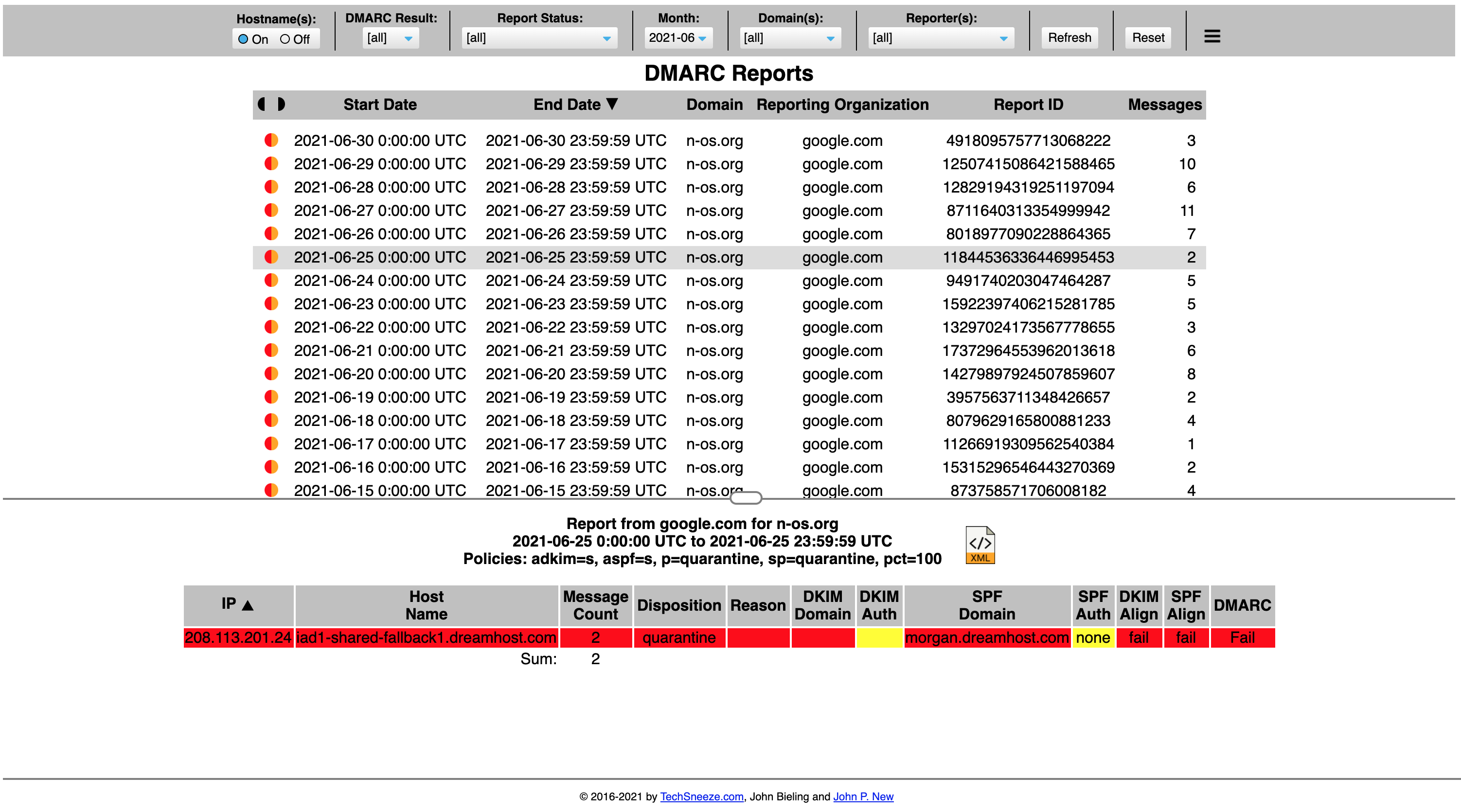
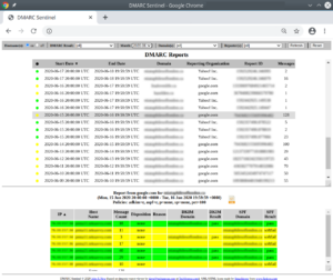
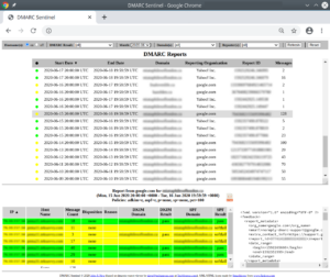
The user experience for Docker DMARC Reports is fundamentally different, catering to a highly technical audience. Since it's a self-hosted solution, the initial 'user experience' involves setting up a Docker environment, configuring databases, and managing DNS records, which demands significant command-line proficiency and system administration skills.
Once deployed, the web viewer provides a functional, albeit basic, interface for inspecting reports. It's not a polished, guided experience like a SaaS platform, but rather a direct display of parsed data. We found that users looking for a plug-and-play solution would likely find this challenging, as it requires a hands-on approach to every aspect of its operation.












 4.8 / 5(325)
 0 / 5(0)
